 kage
kage
mermaidonline.live
Design analysis
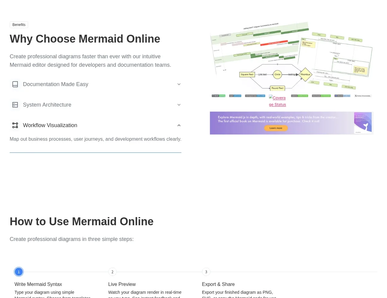
This benefits section uses an accordion-like list on the left and a supporting diagram image on the right. One expanded row shows how progressive disclosure can keep a long feature explanation compact.
Prompt preview
## Reference images

Study these alongside the description below: hierarchy, rhythm, spacing, colour. Build for the product you are asked about, using this design language.

- Component: https://kage-design-assets.t3.tigrisfiles.io/components/mermaidonline-live/7b9ecc63-d7b9-4b92-a5d2-b69508fba7f2-1792152744-5.webp
- Full page it was cut from: https://kage-design-assets.t3.tigrisfiles.io/screenshots/mermaidonline-live/7b9ecc63-d7b9-4b92-a5d2-b69508fba7f2-1792152710959-full.webp
- Component on Kage: https://kage.design/component/mermaidonline-live-feature-grid-3

## Before you start
Ask what differentiates the user's product and which benefits deserve expanded detail. Apply these interaction and visual rules to that product.

Build a split benefits section with a strong heading and intro on the left, three accordion rows beneath it, and a supportive product visual on the right. Each row should have a small icon, title, chevron, and optional description; show one row expanded by default while keeping the others compact. Use #ffffff, charcoal #303238, gray #747980, pale blue/green accents, 1px #e4e4e4 separators, and 0–8px corner radius. Use 36–56px section padding and a 44px heading. The visual should be framed rather than decorative, with responsive cropping and an accessible alt label. Animate expansion subtly and support keyboard interaction.

Never: use logos, product names, copy, illustrations, or imagery from the reference.
More components

 Data-to-action engine
Salience · Feature grid
Data-to-action engine
Salience · Feature grid
 Actionable alert workflow
Salience · Feature grid
Actionable alert workflow
Salience · Feature grid
 Trust proof and core outcomes
Salience · Feature grid
Trust proof and core outcomes
Salience · Feature grid
 Three-step implementation flow
Salience · Feature grid
Three-step implementation flow
Salience · Feature grid
 What analytics misses
Salience · Feature grid
What analytics misses
Salience · Feature grid

 Workflow features and capabilities
CrewTower Mod for Claude Code · Feature grid
Workflow features and capabilities
CrewTower Mod for Claude Code · Feature grid