 kage
kage
mermaidonline.live
Design analysis
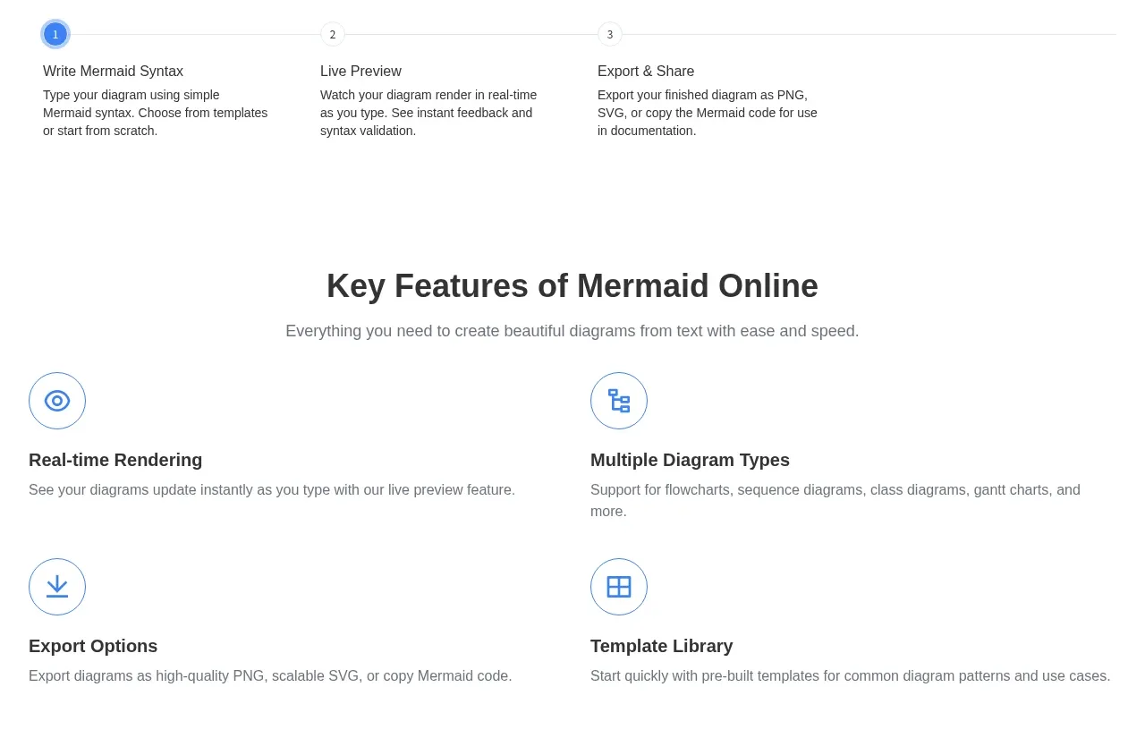
A horizontal three-step explainer turns the product journey into a simple progression from entering syntax to previewing and exporting. Number markers and a connecting line establish order at a glance.
Prompt preview
## Reference images

Study these alongside the description below: hierarchy, rhythm, spacing, colour. Build for the product you are asked about, using this design language.

- Component: https://kage-design-assets.t3.tigrisfiles.io/components/mermaidonline-live/7b9ecc63-d7b9-4b92-a5d2-b69508fba7f2-1792152744-6.webp
- Full page it was cut from: https://kage-design-assets.t3.tigrisfiles.io/screenshots/mermaidonline-live/7b9ecc63-d7b9-4b92-a5d2-b69508fba7f2-1792152710959-full.webp
- Component on Kage: https://kage.design/component/mermaidonline-live-feature-grid-4

## Before you start
Ask what the user's ideal first-use journey is and identify its three clearest stages. Build a product-specific process section using these principles.

Create a three-step horizontal workflow with a heading and short intro above it. Use numbered circular markers connected by a thin line, then place a short title and two-line explanation under each marker. Highlight the first or active stage with a blue filled circle while keeping inactive stages neutral. Use white background, #303238 headings, #767a80 descriptions, blue #4285df, pale gray #ededed, 24–32px column gaps, and generous top/bottom whitespace. On mobile, turn the sequence vertical and keep the connector visible. Ensure the structure communicates order without relying on color alone.

Never: use logos, product names, copy, illustrations, or imagery from the reference.
More components

 Data-to-action engine
Salience · Feature grid
Data-to-action engine
Salience · Feature grid
 Actionable alert workflow
Salience · Feature grid
Actionable alert workflow
Salience · Feature grid
 Trust proof and core outcomes
Salience · Feature grid
Trust proof and core outcomes
Salience · Feature grid
 Three-step implementation flow
Salience · Feature grid
Three-step implementation flow
Salience · Feature grid
 What analytics misses
Salience · Feature grid
What analytics misses
Salience · Feature grid

 Workflow features and capabilities
CrewTower Mod for Claude Code · Feature grid
Workflow features and capabilities
CrewTower Mod for Claude Code · Feature grid