 kage
kage
mermaidonline.live
Design analysis
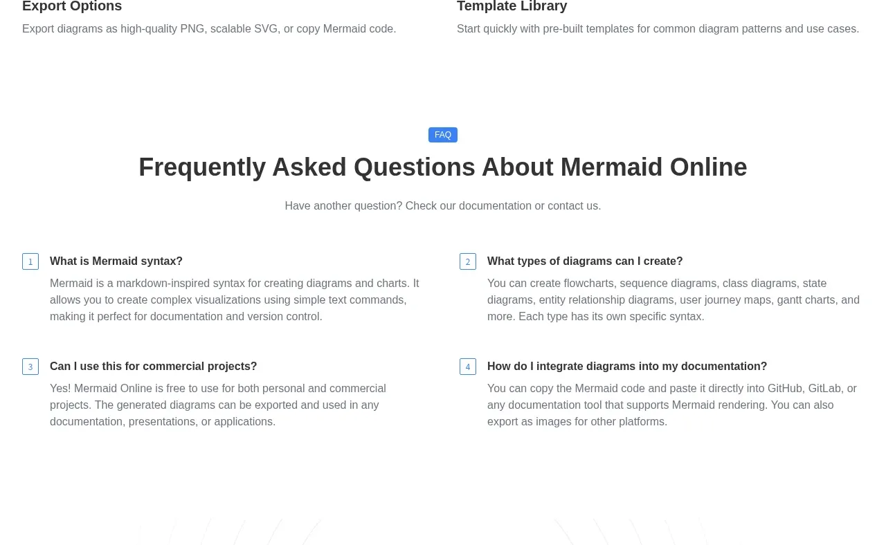
A sparse two-column feature grid emphasizes four core capabilities using outlined circular icons, bold titles, and short descriptions. The generous whitespace keeps the technical benefits approachable.
Prompt preview
## Reference images

Study these alongside the description below: hierarchy, rhythm, spacing, colour. Build for the product you are asked about, using this design language.

- Component: https://kage-design-assets.t3.tigrisfiles.io/components/mermaidonline-live/7b9ecc63-d7b9-4b92-a5d2-b69508fba7f2-1792152745-7.webp
- Full page it was cut from: https://kage-design-assets.t3.tigrisfiles.io/screenshots/mermaidonline-live/7b9ecc63-d7b9-4b92-a5d2-b69508fba7f2-1792152710959-full.webp
- Component on Kage: https://kage.design/component/mermaidonline-live-feature-grid-5

## Before you start
Ask which four capabilities are most important for the user's product and what tone its brand should use. Apply these reusable layout rules.

Build a centered feature section with an eyebrow or heading, a one-line introduction, and four feature items in a two-column grid. Each item has a circular outlined icon, a concise title, and one short explanatory paragraph. Use a white background, 44–52px heading, 15–16px body text, charcoal #34363a, muted gray #73777d, and blue #4285df for icon strokes. Use 24–32px grid gaps, 1px blue-gray icon circles, and minimal card chrome; emphasize hierarchy through spacing rather than heavy boxes. Add hover/focus feedback to each item only if it is clickable.

Never: use logos, product names, copy, illustrations, or imagery from the reference.
More components

 Data-to-action engine
Salience · Feature grid
Data-to-action engine
Salience · Feature grid
 Actionable alert workflow
Salience · Feature grid
Actionable alert workflow
Salience · Feature grid
 Trust proof and core outcomes
Salience · Feature grid
Trust proof and core outcomes
Salience · Feature grid
 Three-step implementation flow
Salience · Feature grid
Three-step implementation flow
Salience · Feature grid
 What analytics misses
Salience · Feature grid
What analytics misses
Salience · Feature grid

 Workflow features and capabilities
CrewTower Mod for Claude Code · Feature grid
Workflow features and capabilities
CrewTower Mod for Claude Code · Feature grid