kage
kage
milliseconds.ai
Design analysis
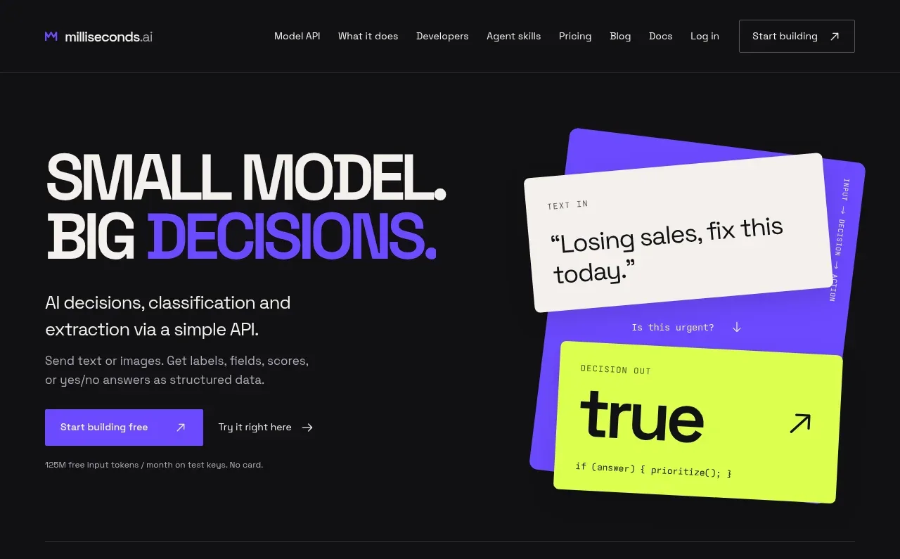
The hero uses oversized stacked typography, a single vivid accent color, and a playful product-output composition to explain the promise quickly. The left column carries the message and actions while the right visual makes the API result tangible.
Prompt preview
## Reference images

Study these alongside the description below: hierarchy, rhythm, spacing, colour. Build for the product you are asked about, using this design language.

- Component: https://kage-design-assets.t3.tigrisfiles.io/components/milliseconds-ai/6fac96f3-e489-4913-80bc-8c862b5f9e82-1790056992-1.webp
- Full page it was cut from: https://kage-design-assets.t3.tigrisfiles.io/screenshots/milliseconds-ai/6fac96f3-e489-4913-80bc-8c862b5f9e82-1790056904819-full.webp
- Component on Kage: https://kage.design/component/milliseconds-hero

## Before you start
Ask what the user's product does, who the ideal customer is, and which action matters most. Apply the design principles below to that product and brand.

Create a full-width hero directly beneath the navigation on a near-black background (`#101012`). Use a two-column layout with roughly 52% text and 48% visual space, 44px left/right page padding, and 72–96px top/bottom breathing room. Set a short all-caps or eyebrow label in 10–11px monospaced lettering, then a very large condensed or tightly tracked headline around 58–64px with 0.88–0.95 line-height. Put one phrase in the product's bright accent color (a saturated violet such as `#6845ff`) while the rest is warm white (`#f3f1ed`). Follow with 18px explanatory copy in muted gray, a smaller supporting sentence, and two actions: a filled accent button and a quieter text link with an arrow. Include a small reassurance line below the actions.

For the right side, build an original abstract interface/result composition from layered cards rather than an illustration: a tilted violet panel behind an off-white input card and a neon-lime output card (`#d7ff36`), with thin borders, dark text, slight rotation, and restrained shadows. Make the visual responsive by stacking it below the copy on mobile. Add subtle hover movement only to the cards and clear focus states to buttons.

Never: copy the reference headline, product name, logo, exact card text, illustrations, imagery, or exact composition.