 kage
kage
modeinspect.com

Design analysis
This section works by making a complex workflow contrast instantly scannable: two matched cards, a strong time metric, and opposing status bullets create a clear before-and-after story. The restrained dark palette and lime accent focus attention on the faster path without turning the chart into a dashboard.
Prompt preview
## Reference images

Study these alongside the description below: hierarchy, rhythm, spacing, colour. Build for the product you are asked about, using this design language.

- Component: https://kage-design-assets.t3.tigrisfiles.io/components/modeinspect/f4214789-eaef-4abd-8d9d-34964c707234-1789106493-8.webp
- Full page it was cut from: https://kage-design-assets.t3.tigrisfiles.io/screenshots/modeinspect/f4214789-eaef-4abd-8d9d-34964c707234-1789106455022-full.webp
- Component on Kage: https://kage.design/component/modeinspect-chart

## Before you start
Ask the user what their product does, who it is for, and what brand personality, colour palette, and typography system they want to use. Then apply the principles below to create an original comparison chart for their product—not a copy of the reference.

## Build this section
Create a responsive, dark-theme comparison chart that contrasts a slow, fragmented workflow with a faster, integrated workflow. It should feel like a persuasive product-marketing section rather than an analytical dashboard.

### Layout and alignment
- Place a short, centered section heading and supporting paragraph above the chart.
- Underneath, use two equal-width cards in a two-column grid with a generous gap. Stack them vertically on narrow screens.
- Keep both cards aligned to the same top and internal rhythm so the comparison can be scanned horizontally.
- Each card should contain, in order: a small eyebrow label, a concise title, a short explanation, one oversized primary metric with a smaller qualifier, a divider, and a checklist of supporting points.
- Make the improved workflow card visually dominant through a subtle accent border, restrained tinted background, and a compact outcome badge in its top-right area.
- Use generous outer margins and prevent the card content from becoming too wide. The section should feel spacious and editorial.

### Typography hierarchy
- Use a modern sans-serif with clean, slightly technical proportions.
- Make the main heading large, light-weight, and tightly tracked; use a two-line wrap when needed.
- Supporting copy should be smaller, muted, and comfortably readable with a relaxed line height.
- Eyebrows should be uppercase, monospace or monospaced-looking, widely tracked, and visibly secondary.
- Card titles should be medium-to-large and compact.
- The primary metric should be the largest element inside each card, with the qualifier noticeably smaller and lower contrast.
- Keep body copy and list text around 14–16px with sufficient line height.

### Spacing and sizing
- Use a large vertical gap between the heading block and cards.
- Give cards substantial padding, around 36–40px on desktop and 24px on mobile.
- Maintain a consistent 20–28px rhythm between eyebrow, title, description, metric, divider, and list.
- Give the metric enough breathing room to act as the card’s visual anchor.
- Ensure list rows have comfortable vertical separation and align icons with the first line of text.

### Colour and contrast
- Start with a near-black page background, approximately `#0B0B0B` to `#101010`.
- Use a slightly lighter charcoal for the neutral card, approximately `#121212` to `#171717`.
- Use warm off-white for primary text, approximately `#F2F2EE`, and cool gray for supporting text, approximately `#8D8D8A`.
- Use a yellow-green accent for the winning path, approximately `#B8F34A` to `#D0FF63`.
- Add only a very subtle olive-green wash behind the highlighted card, keeping the background mostly dark.
- Neutral status icons can use dim gray; positive check icons should use the accent colour with dark centers or dark glyphs for clear contrast.
- Keep the design high contrast but avoid pure white and excessive saturated colour.

### Borders, radius, and surfaces
- Give each card a thin, low-contrast border around 1px, approximately `rgba(255,255,255,0.14)` for the neutral card.
- Use a slightly warmer or olive-tinted border for the highlighted card, approximately `rgba(190,245,75,0.35)`.
- Use a medium rounded corner, around 16–20px; do not make the cards pill-shaped.
- Use flat surfaces or an extremely subtle gradient only. Avoid glossy glassmorphism, heavy shadows, and decorative textures.
- Separate the metric area from the checklist with a thin horizontal divider that follows the card’s accent treatment.
- Make the outcome badge compact, rounded, and filled with the accent colour; use dark text inside it.

### Interaction and responsive behaviour
- This chart can remain primarily static, but add a restrained hover state: slightly brighten the relevant border and lift the card by 1–2px.
- Keep the two cards equally readable at rest; do not hide comparison content behind tabs or accordions.
- On mobile, stack the cards with the highlighted workflow after or before the neutral one according to the product narrative, preserving the same internal hierarchy.
- Ensure long titles, metrics, and list items wrap gracefully without causing horizontal overflow.
- Use semantic headings, lists, and accessible colour contrast.

### Content guidance
- Write original product-specific labels, workflow names, metrics, and checklist items based on the user’s product.
- Keep the contrast concrete: show the old process as fragmented and the improved process as direct, integrated, or accelerated.
- Use one memorable metric per card, but do not invent unsupported claims; allow placeholders or request real data when necessary.

## Never
- Never use logos, product names, copy, illustrations, or imagery from the reference.
- Never reproduce the exact wording, numbers, labels, or brand identity from the reference.
- Never copy the exact card proportions, spacing values, or visual treatment if they do not suit the user’s product.
- Never turn the component into a dense analytics dashboard.
- Never rely on colour alone to communicate which workflow is preferable.
More components
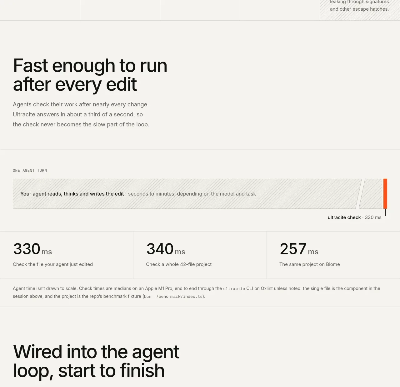
 Fast feedback timing comparison
Ultracite v8 · Chart
Fast feedback timing comparison
Ultracite v8 · Chart
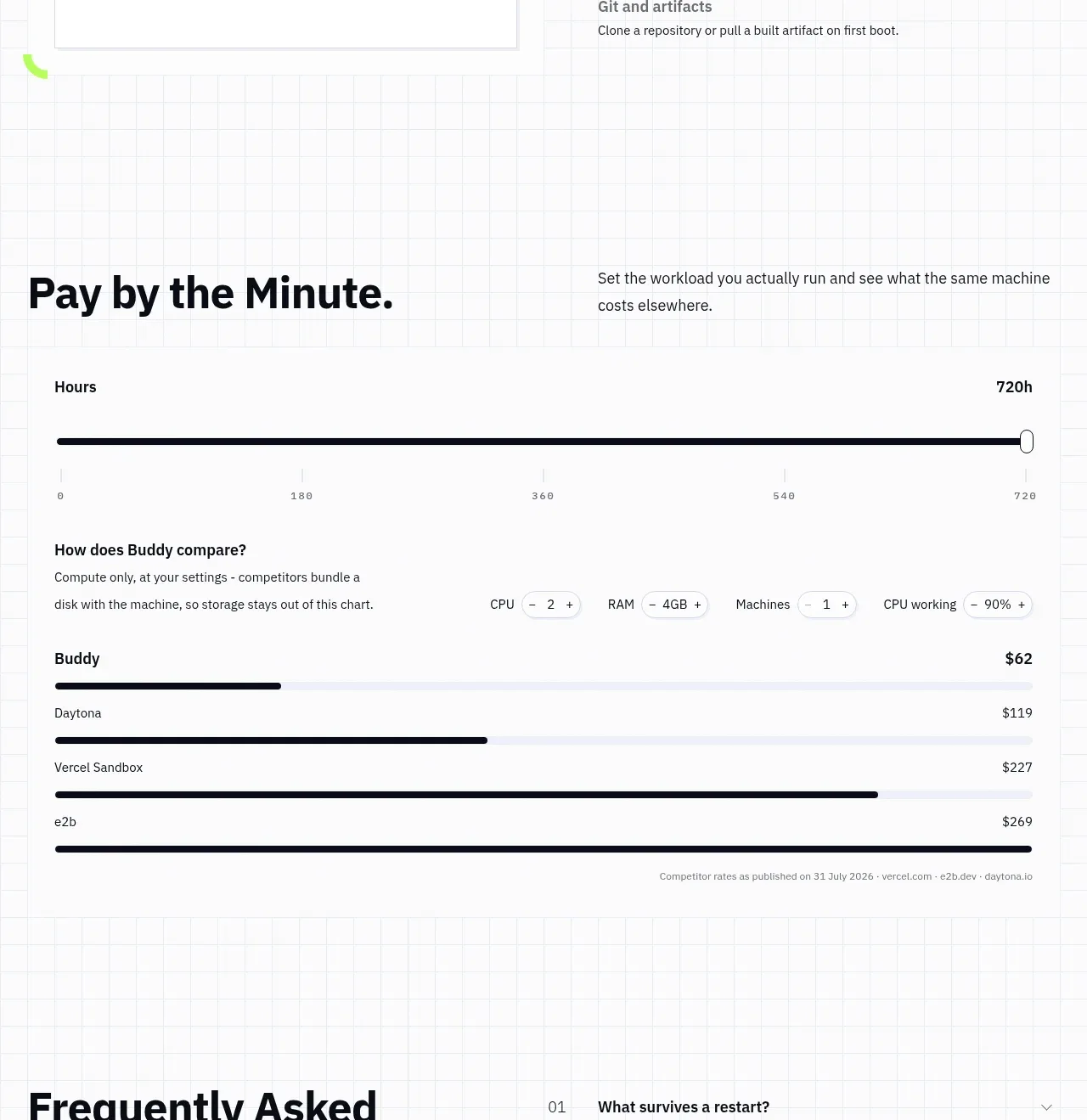
 Usage and cost comparison
AI Sandboxes by Buddy · Chart
Usage and cost comparison
AI Sandboxes by Buddy · Chart
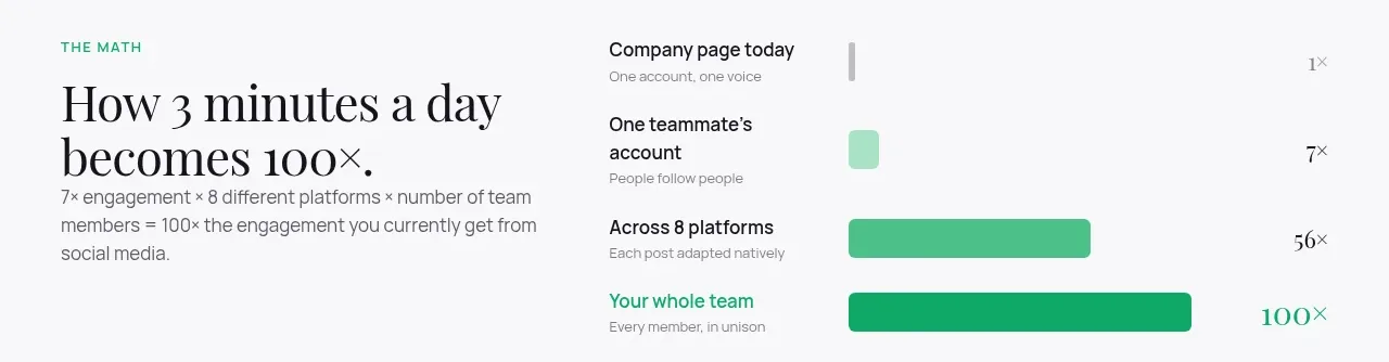
 Time-to-impact comparison
Agent Craft · Chart
Time-to-impact comparison
Agent Craft · Chart
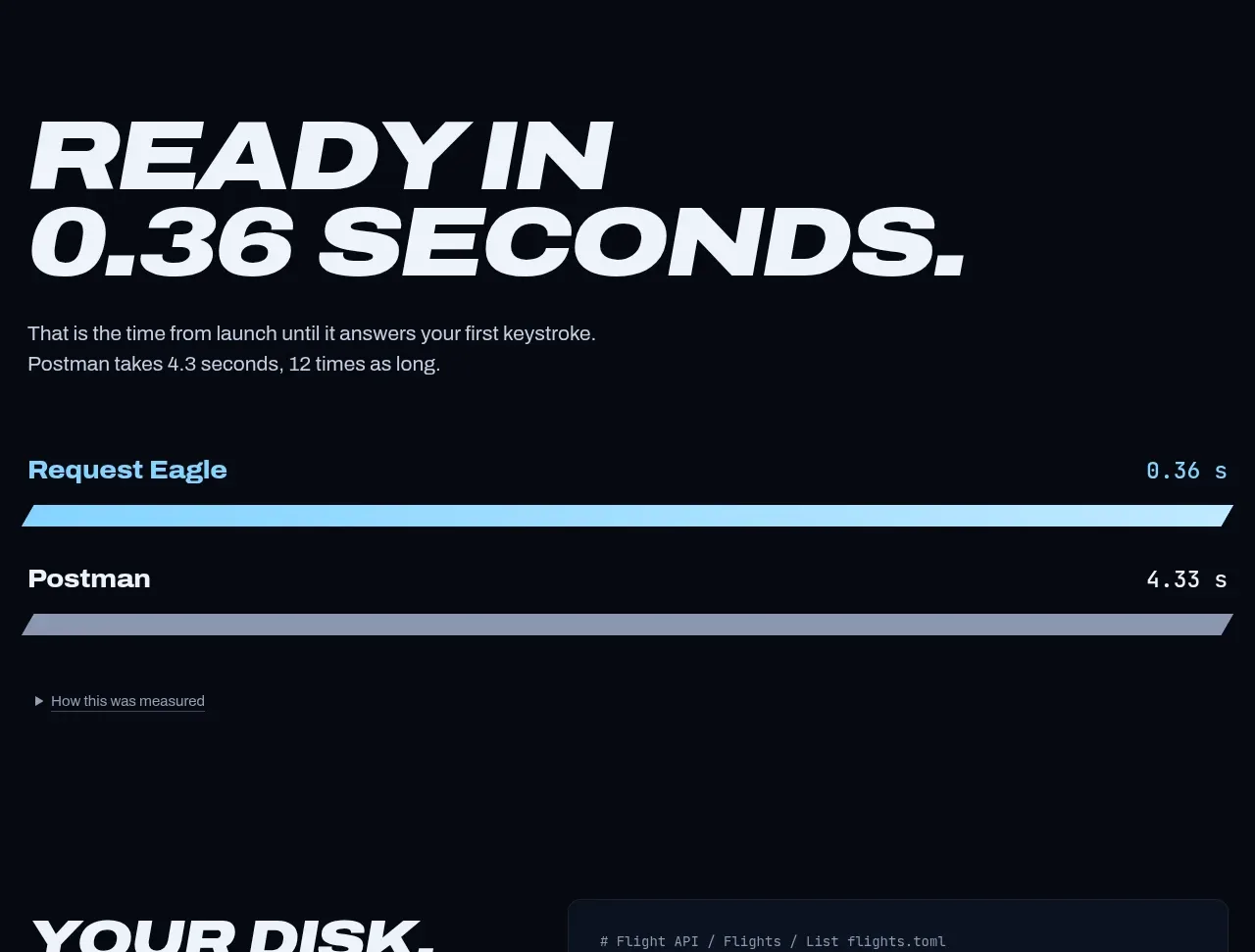
 Performance comparison chart
Request Eagle · Chart
Performance comparison chart
Request Eagle · Chart
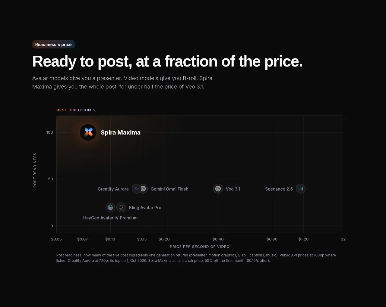
 Value positioning scatter chart
Spira Maxima · Chart
Value positioning scatter chart
Spira Maxima · Chart
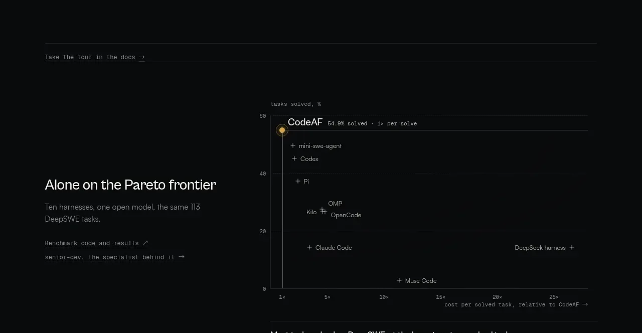
 Benchmark and Pareto proof
CodeAF · Chart
Benchmark and Pareto proof
CodeAF · Chart