kage
monish.cc
Design analysis
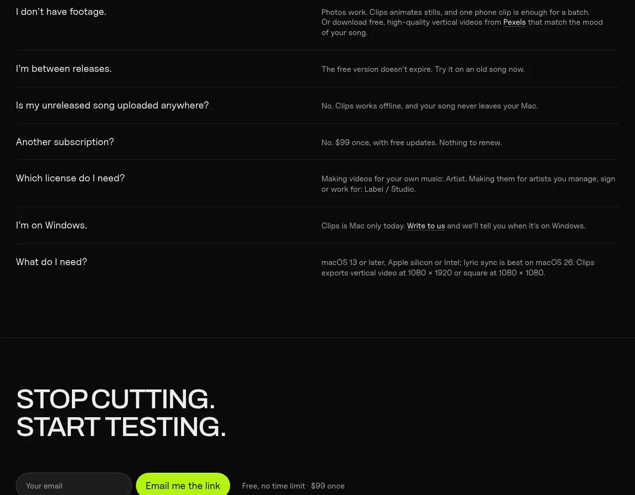
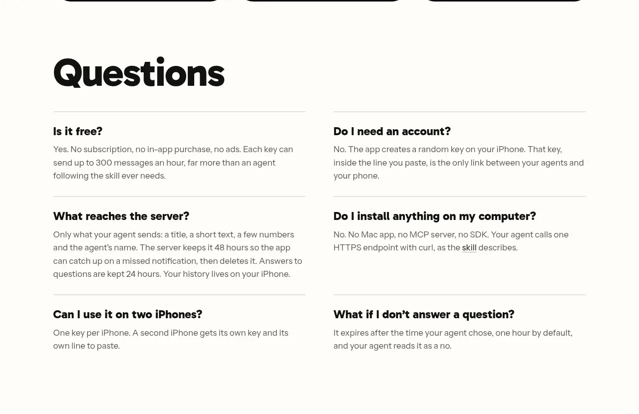
A two-column FAQ uses bold questions and concise muted answers separated by light horizontal rules, with six entries and substantial breathing room.
Prompt preview
## Reference images

Study these alongside the description below: hierarchy, rhythm, spacing, colour. Build for the product you are asked about, using this design language.

- Component: https://kage-design-assets.t3.tigrisfiles.io/components/monish/5f3b5863-2239-4773-833d-591642a3d58f-1792821776-7.webp
- Full page it was cut from: https://kage-design-assets.t3.tigrisfiles.io/screenshots/monish/5f3b5863-2239-4773-833d-591642a3d58f-1792821722168-full.webp
- Component on Kage: https://kage.design/component/monish-faq

## Before you start
Ask what concerns prevent users from adopting the product and what factual answers, limits, and privacy details should be addressed. Apply the principles to those questions.

Create a spacious FAQ section with a large heading followed by a two-column grid of six question-and-answer items. Each item has a bold 16–18px question, a 14–16px muted answer, and a subtle horizontal divider. Use #FFFDF8 background, #080808 headings, #6E6E6E body text, and a light gray divider #D9D7D0. Keep questions scannable, line length around 45–60 characters, and use 32–48px row gaps. If using accordion interaction on smaller screens, animate height and rotate a plus icon while keeping the desktop layout open.

Never use logos, product names, copy, illustrations, or imagery from the reference.