 kage
kage
naise.ai
Design analysis
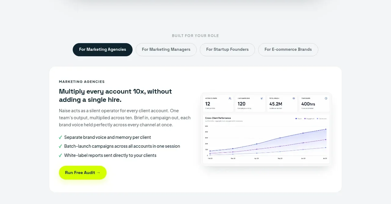
A role selector leads into a white feature card that combines a focused benefit statement, checklist, CTA, and supporting dashboard visual.
Prompt preview
## Reference images

Study these alongside the description below: hierarchy, rhythm, spacing, colour. Build for the product you are asked about, using this design language.

- Component: https://kage-design-assets.t3.tigrisfiles.io/components/naise-ai/7a5a1374-ad41-4c97-8974-81f691da0cb9-1790229777-4.webp
- Full page it was cut from: https://kage-design-assets.t3.tigrisfiles.io/screenshots/naise-ai/7a5a1374-ad41-4c97-8974-81f691da0cb9-1790229706709-full.webp
- Component on Kage: https://kage.design/component/naise-feature-grid

## Before you start
Ask what the user's product and brand are, then apply these principles to that product rather than reproducing this reference.

Build a role-based feature section with a small centered eyebrow and a pill-style tab row for several audiences. Below it, place a large rounded white card on a pale gray canvas, using a two-column layout: the copy column has an eyebrow, outcome-led heading, paragraph, three or four green-check benefits, and a lime CTA; the visual column has a compact reporting/dashboard mockup. Use #f5f7f7 for the section, white cards, #10242d headings, #5f6b70 body text, lime #c9ff00 for active states, 18–24px radii, and 32–48px internal padding. Active tabs should use a dark filled pill; inactive tabs should be outlined or softly filled. Collapse to a vertical card on mobile.

Never: use logos, product names, copy, illustrations, or imagery from the reference.
More components

 Spend visibility and daily-cost breakdown
Subscrr · Feature grid
Spend visibility and daily-cost breakdown
Subscrr · Feature grid
 Reminders and simple setup flow
Subscrr · Feature grid
Reminders and simple setup flow
Subscrr · Feature grid

 Security and permissions cards
NotchPop · Feature grid
Security and permissions cards
NotchPop · Feature grid
 Focused feature cards
NotchPop · Feature grid
Focused feature cards
NotchPop · Feature grid
 Interactive product demonstration
NotchPop · Feature grid
Interactive product demonstration
NotchPop · Feature grid
 Quiet information cards
NotchPop · Feature grid
Quiet information cards
NotchPop · Feature grid