 kage
kage
naise.ai
Design analysis
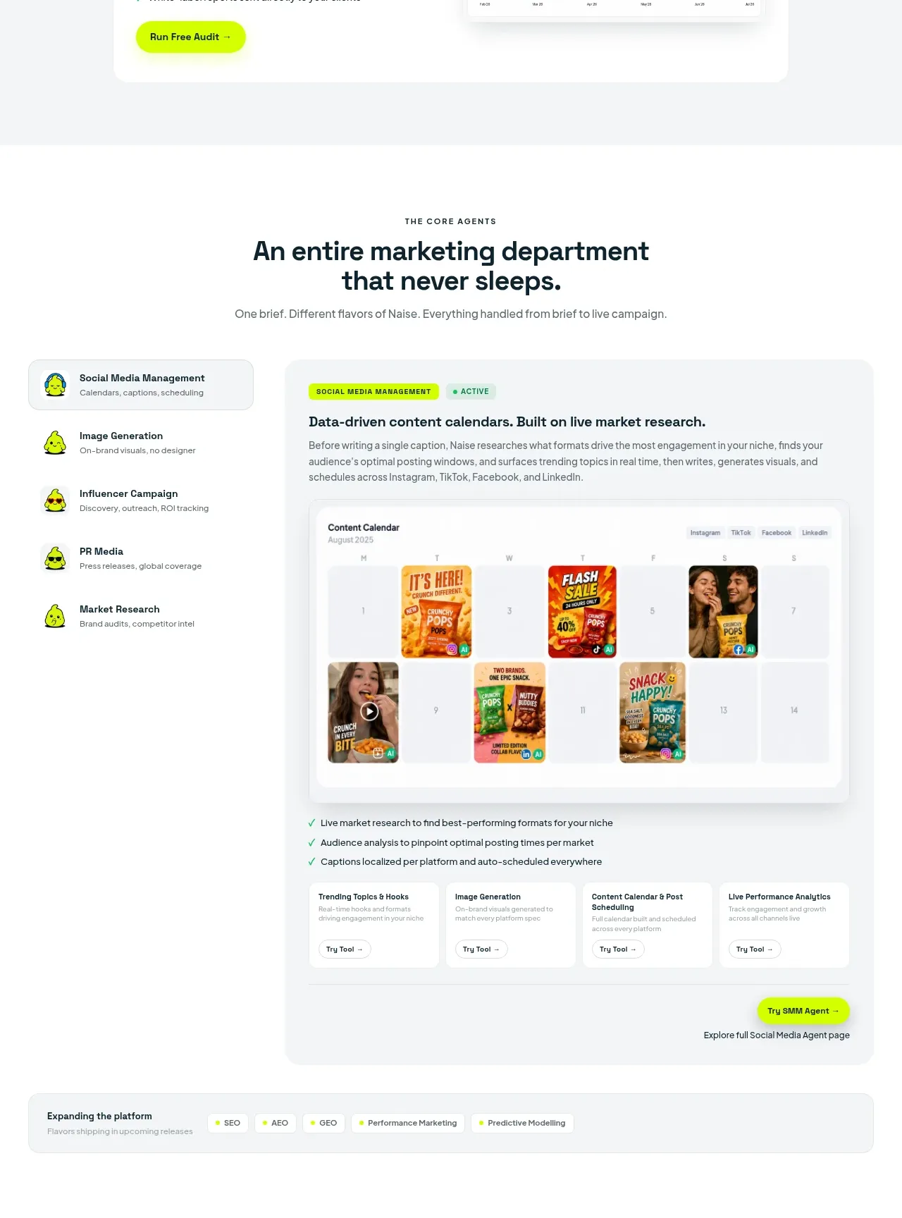
A broad capabilities section combines a role list on the left with a detailed active-agent panel, rich product UI, supporting checks, and secondary tool cards.
Prompt preview
## Reference images

Study these alongside the description below: hierarchy, rhythm, spacing, colour. Build for the product you are asked about, using this design language.

- Component: https://kage-design-assets.t3.tigrisfiles.io/components/naise-ai/7a5a1374-ad41-4c97-8974-81f691da0cb9-1790229778-5.webp
- Full page it was cut from: https://kage-design-assets.t3.tigrisfiles.io/screenshots/naise-ai/7a5a1374-ad41-4c97-8974-81f691da0cb9-1790229706709-full.webp
- Component on Kage: https://kage.design/component/naise-feature-grid-2

## Before you start
Ask what the user's product and brand are, then apply these principles to that product rather than reproducing this reference.

Create a capabilities section with a centered eyebrow, large headline, and short subtitle. Below, use a two-column application-style layout: a narrow left rail lists 4–6 capabilities with small friendly icons and one dark or highlighted active row; the larger right panel has a pale gray surface, an active status chip, an outcome-focused heading, explanatory copy, a large calendar/analytics interface mockup, a short checklist, and a row of 3–4 compact related-tool cards with individual actions. Use white and #f4f6f6 surfaces, dark #10242d typography, lime accents #c9ff00, mint confirmations #bdebd1, 16–22px radii, and subtle elevation. Ensure the left rail remains usable as tabs and the active content changes on interaction. Stack the rail above the panel on mobile.

Never: use logos, product names, copy, illustrations, or imagery from the reference.
More components

 Spend visibility and daily-cost breakdown
Subscrr · Feature grid
Spend visibility and daily-cost breakdown
Subscrr · Feature grid
 Reminders and simple setup flow
Subscrr · Feature grid
Reminders and simple setup flow
Subscrr · Feature grid

 Security and permissions cards
NotchPop · Feature grid
Security and permissions cards
NotchPop · Feature grid
 Focused feature cards
NotchPop · Feature grid
Focused feature cards
NotchPop · Feature grid
 Interactive product demonstration
NotchPop · Feature grid
Interactive product demonstration
NotchPop · Feature grid
 Quiet information cards
NotchPop · Feature grid
Quiet information cards
NotchPop · Feature grid