kage
kage
naise.ai
Design analysis
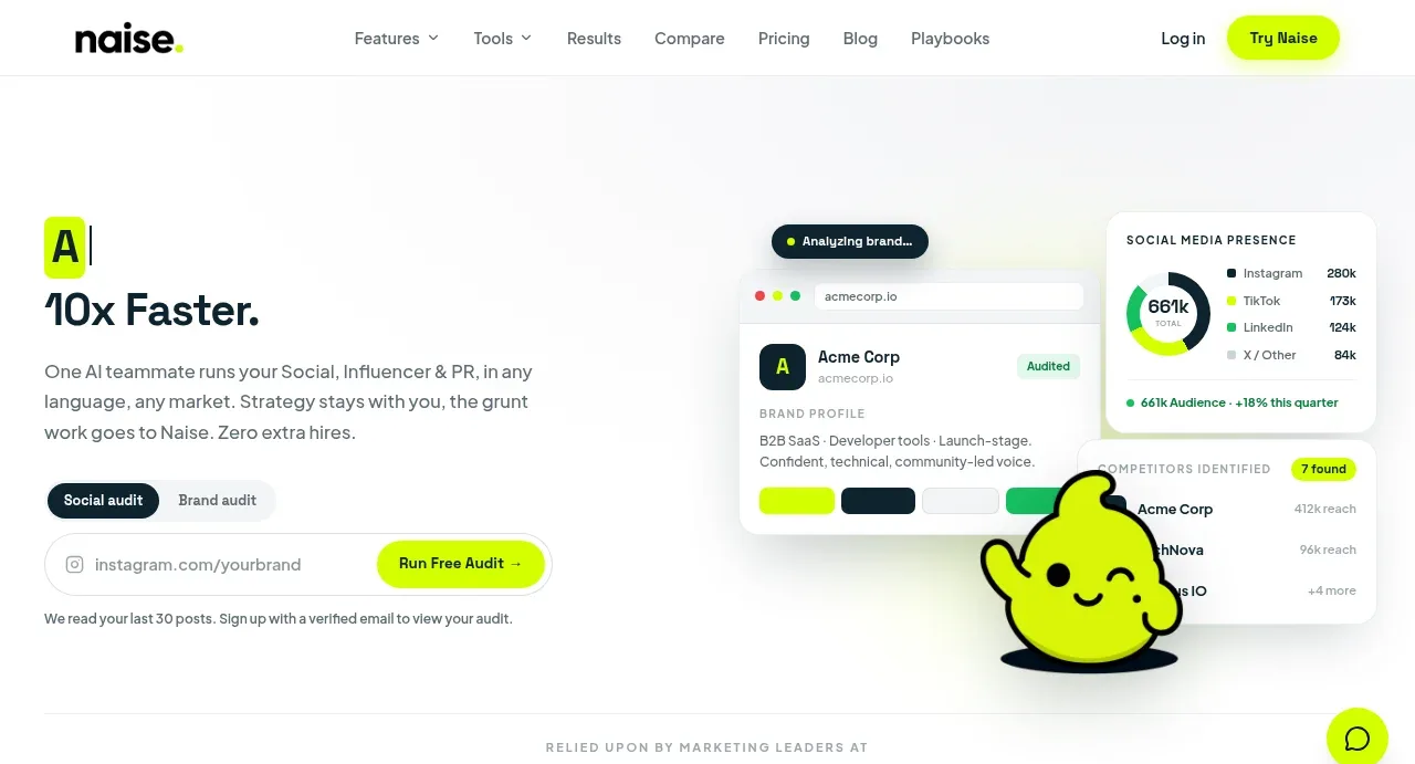
The hero pairs a sharp promise and supporting paragraph with segmented audit controls, an input-like CTA, and a layered analytics product visual that gives the offer immediate credibility.
Prompt preview
## Reference images

Study these alongside the description below: hierarchy, rhythm, spacing, colour. Build for the product you are asked about, using this design language.

- Component: https://kage-design-assets.t3.tigrisfiles.io/components/naise-ai/7a5a1374-ad41-4c97-8974-81f691da0cb9-1790229776-1.webp
- Full page it was cut from: https://kage-design-assets.t3.tigrisfiles.io/screenshots/naise-ai/7a5a1374-ad41-4c97-8974-81f691da0cb9-1790229706709-full.webp
- Component on Kage: https://kage.design/component/naise-hero

## Before you start
Ask what the user's product and brand are, then apply these principles to that product rather than reproducing this reference.

Create a two-column hero directly below the navigation. Give the left column a small lime-highlighted lead-in, a large dark headline with a short emphasized benefit, concise supporting copy, a segmented toggle, and a wide input/action row ending in a vivid primary button. Give the right column a layered, slightly overlapping analytics interface made from rounded white cards, status chips, small charts or lists, and one friendly abstract brand accent. Use an off-white background #fff, dark text #10242d, lime #c9ff00, muted copy #637078, soft shadows, 16–22px card radii, and generous 64–88px vertical padding. Keep the headline approximately 42–56px with tight line-height; supporting text 15–17px. Make the CTA prominent and include a small reassurance line beneath it. Stack the columns gracefully on mobile.

Never: use logos, product names, copy, illustrations, or imagery from the reference.