 kage
kage
naise.ai
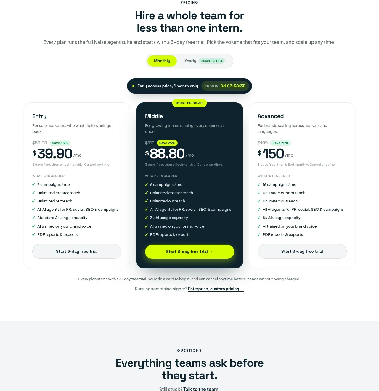
Design analysis
The pricing area uses a billing toggle, urgency/status strip, and three plans with the middle tier visually prioritized without hiding the comparison details.
Prompt preview
## Reference images

Study these alongside the description below: hierarchy, rhythm, spacing, colour. Build for the product you are asked about, using this design language.

- Component: https://kage-design-assets.t3.tigrisfiles.io/components/naise-ai/7a5a1374-ad41-4c97-8974-81f691da0cb9-1790229779-9.webp
- Full page it was cut from: https://kage-design-assets.t3.tigrisfiles.io/screenshots/naise-ai/7a5a1374-ad41-4c97-8974-81f691da0cb9-1790229706709-full.webp
- Component on Kage: https://kage.design/component/naise-pricing-table

## Before you start
Ask what the user's product and brand are, then apply these principles to that product rather than reproducing this reference.

Create a pricing section with a centered eyebrow, two-line heading, supporting sentence, monthly/yearly segmented billing toggle, and an optional compact announcement strip. Show three equal pricing cards: entry, recommended middle, and advanced. Each card needs a plan name, audience description, old/new price treatment, billing qualifier, included-features list with checkmarks, and a full-width trial or purchase button. Make the recommended card dark navy #10242d with white text and lime button, while the other cards remain white with fine borders #e6ebe8. Use 18–22px radii, 28–36px padding, lime #c9ff00, and strong price typography around 36–48px. Include small enterprise/help text beneath. Make the toggle update prices and visibly mark the selected state.

Never: use logos, product names, copy, illustrations, or imagery from the reference.
More components
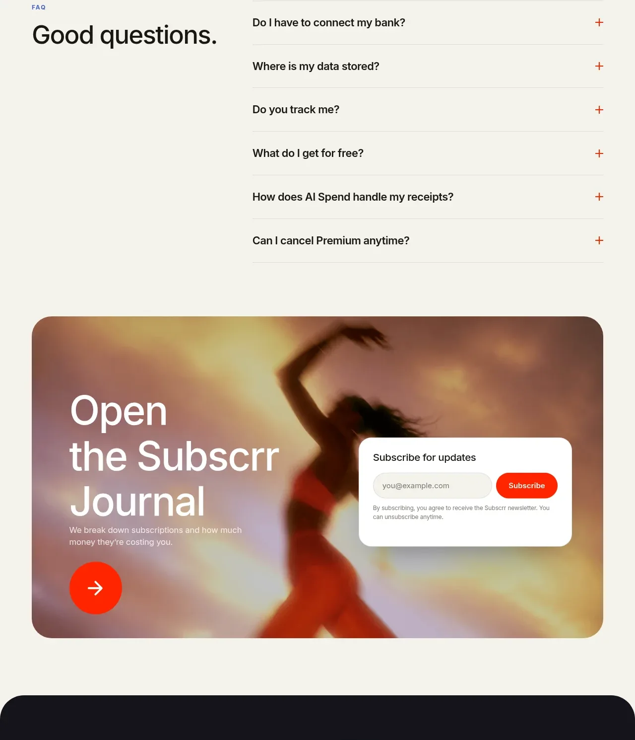
 Free and premium pricing comparison
Subscrr · Pricing table
Free and premium pricing comparison
Subscrr · Pricing table
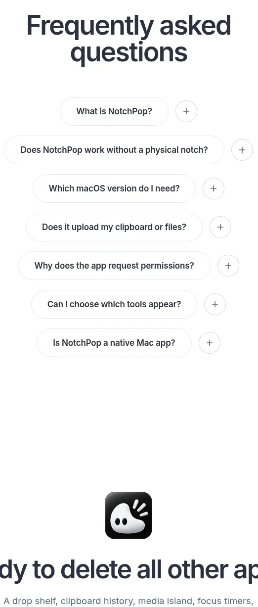
 One-time purchase pricing
NotchPop · Pricing table
One-time purchase pricing
NotchPop · Pricing table
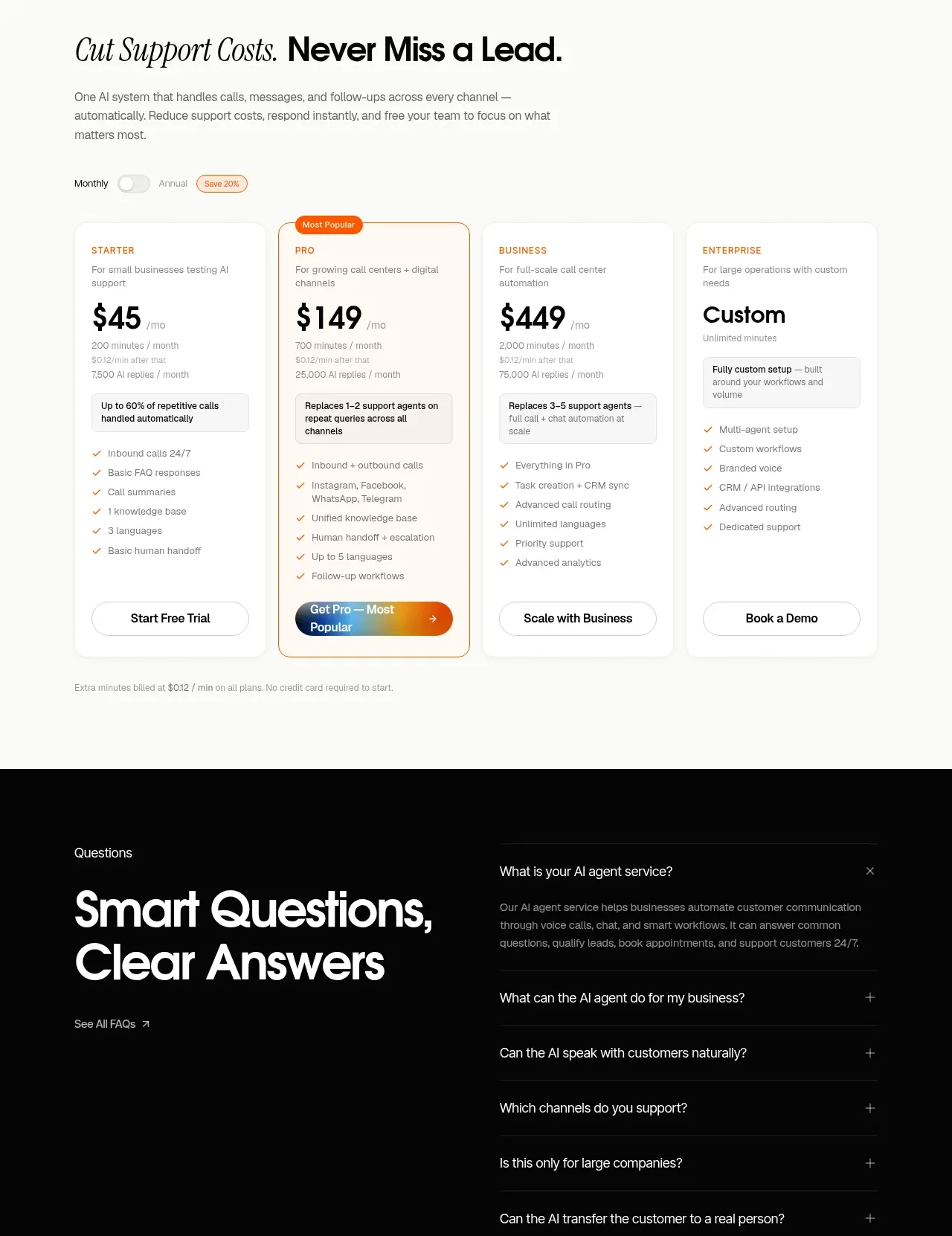
 Support plan pricing
IntellAgents.io · Pricing table
Support plan pricing
IntellAgents.io · Pricing table
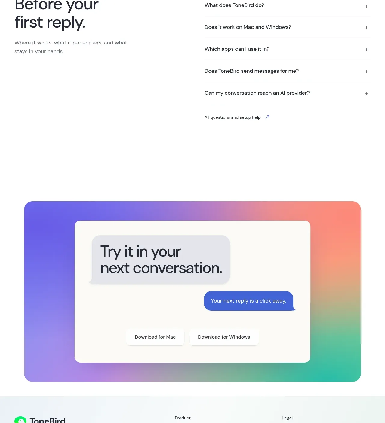
 Four-tier pricing table
ToneBird · Pricing table
Four-tier pricing table
ToneBird · Pricing table
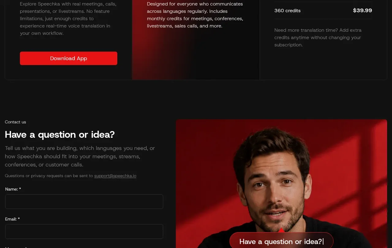
 Trial and subscription plans
Speechka · Pricing table
Trial and subscription plans
Speechka · Pricing table
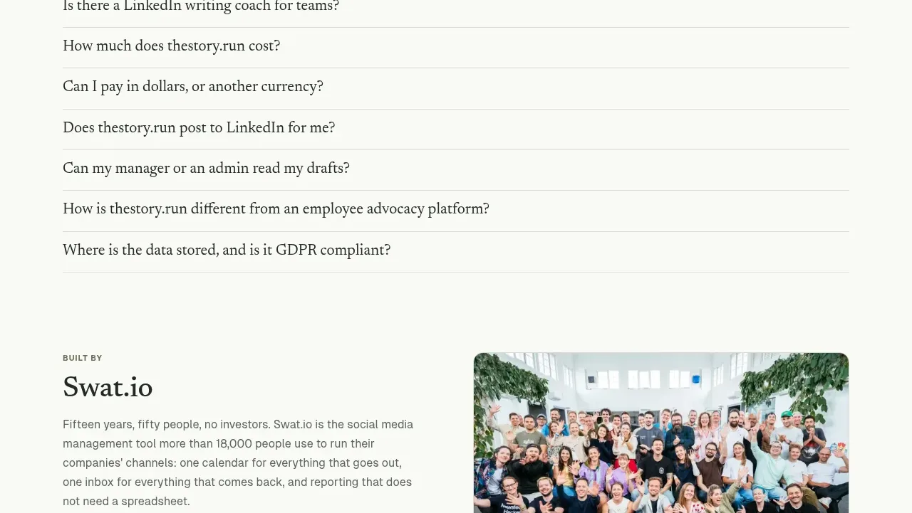
 Simple usage-based pricing
thestory.run · Pricing table
Simple usage-based pricing
thestory.run · Pricing table