 kage
kage
coretechlabs.co
Design analysis
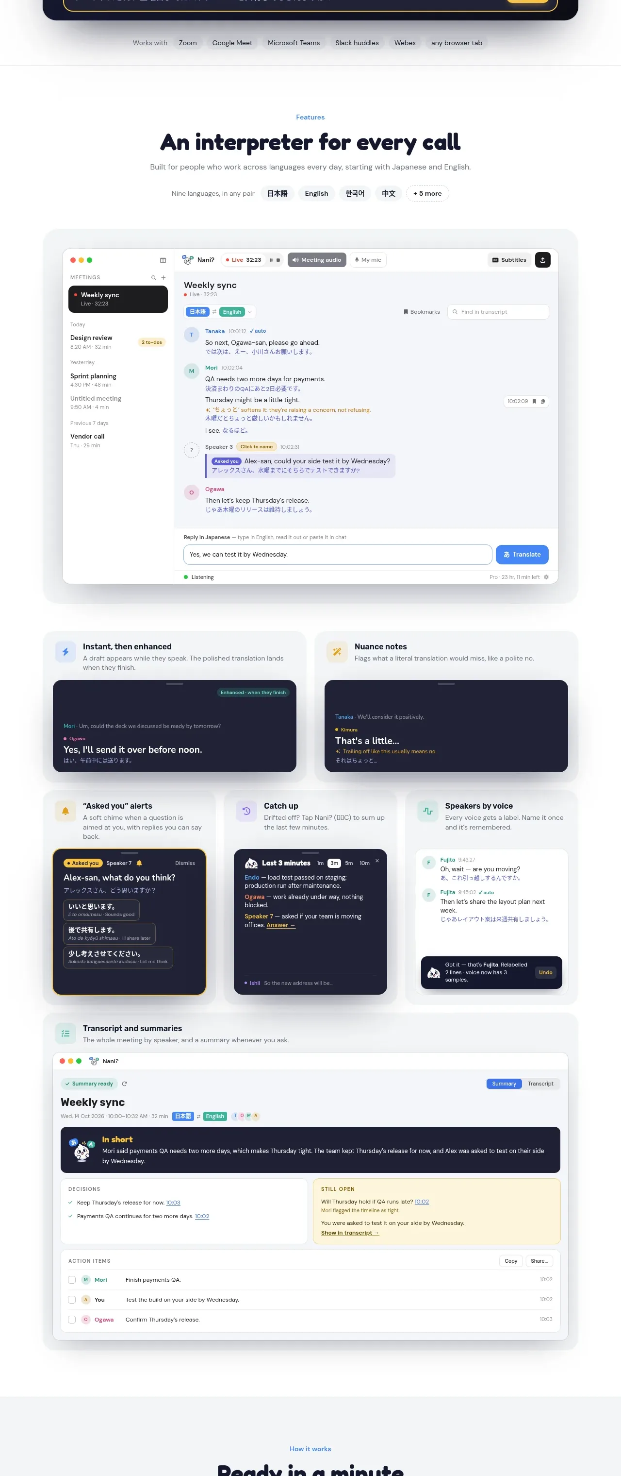
A long feature section introduces the product promise, then uses one large interface screenshot and a varied grid of smaller feature cards to make capabilities tangible.
Prompt preview
## Reference images

Study these alongside the description below: hierarchy, rhythm, spacing, colour. Build for the product you are asked about, using this design language.

- Component: https://kage-design-assets.t3.tigrisfiles.io/components/nani/f548445b-7dd2-48a7-847f-0684381711f2-1792217069-2.webp
- Full page it was cut from: https://kage-design-assets.t3.tigrisfiles.io/screenshots/nani/f548445b-7dd2-48a7-847f-0684381711f2-1792217012251-full.webp
- Component on Kage: https://kage.design/component/nani-feature-grid

## Before you start
Ask what the user's product's most important capabilities are and what visual language the brand should use. Then build an original feature showcase using the structure below.

Start with a centered eyebrow, a large friendly heading, supporting copy, and a compact row of language/category pills. Follow with one large rounded application screenshot centered within a lightly tinted panel. Below it, arrange feature modules in an asymmetric responsive grid: two wider cards first, then three smaller cards, and finish with a full-width transcript or summary card. Each module should pair a small colored icon or badge with a concise title and explanation, then show a realistic but invented interface fragment. Alternate light surfaces with dark navy interface previews to create rhythm. Use white cards on #f7f8f9, deep navy #17192f for dark previews, pale blue/green/yellow/lilac accents, 1px borders around #e7e9ed, 16–24px radii, soft low-contrast shadows, and 24–32px internal padding. Keep all text aligned to a consistent content grid and allow screenshots to crop naturally on mobile. Add subtle hover elevation to cards, but do not make the section feel like a dashboard gallery.

Never: reuse logos, product names, copy, illustrations, or imagery from the reference.
More components

 Data-to-action engine
Salience · Feature grid
Data-to-action engine
Salience · Feature grid
 Actionable alert workflow
Salience · Feature grid
Actionable alert workflow
Salience · Feature grid
 Trust proof and core outcomes
Salience · Feature grid
Trust proof and core outcomes
Salience · Feature grid
 Three-step implementation flow
Salience · Feature grid
Three-step implementation flow
Salience · Feature grid
 What analytics misses
Salience · Feature grid
What analytics misses
Salience · Feature grid

 Workflow features and capabilities
CrewTower Mod for Claude Code · Feature grid
Workflow features and capabilities
CrewTower Mod for Claude Code · Feature grid