 kage
kage
coretechlabs.co
Design analysis
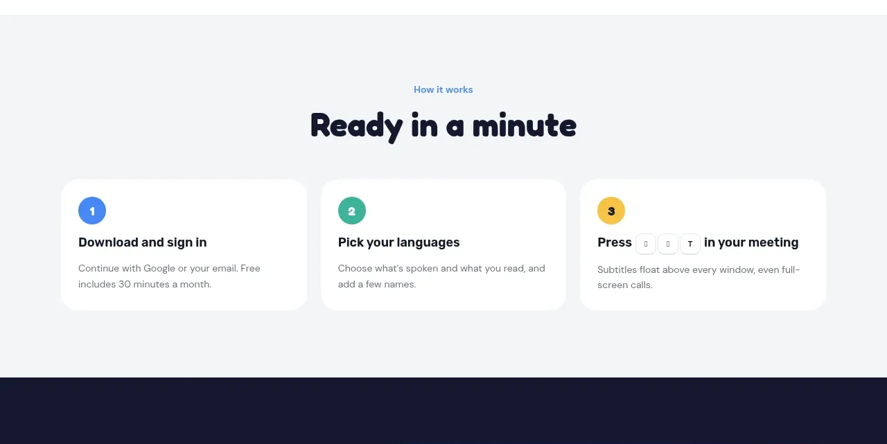
A quiet tinted band explains adoption in three numbered cards, making the product feel fast and easy to start using.
Prompt preview
## Reference images

Study these alongside the description below: hierarchy, rhythm, spacing, colour. Build for the product you are asked about, using this design language.

- Component: https://kage-design-assets.t3.tigrisfiles.io/components/nani/f548445b-7dd2-48a7-847f-0684381711f2-1792217069-3.webp
- Full page it was cut from: https://kage-design-assets.t3.tigrisfiles.io/screenshots/nani/f548445b-7dd2-48a7-847f-0684381711f2-1792217012251-full.webp
- Component on Kage: https://kage.design/component/nani-feature-grid-2

## Before you start
Ask what the user's product setup journey is and what brand style should shape the onboarding explanation. Then apply the following structure.

Build a lightly tinted horizontal how-it-works section with a small eyebrow, a centered rounded display heading, and three equal cards in a responsive row. Each card has a colored numbered circle, a short action-oriented title, and two lines of supporting detail. Use generous whitespace, white cards, minimal borders, and a clear left-to-right sequence. Set the background near #f4f5f7, heading text #17192f, body text #737783, and number accents in blue, green, and yellow. Use 16–20px card radii, 20–24px padding, and moderate gaps. Cards should stack vertically on narrow screens while preserving the numbered progression.

Never: reuse logos, product names, copy, illustrations, or imagery from the reference.
More components

 Data-to-action engine
Salience · Feature grid
Data-to-action engine
Salience · Feature grid
 Actionable alert workflow
Salience · Feature grid
Actionable alert workflow
Salience · Feature grid
 Trust proof and core outcomes
Salience · Feature grid
Trust proof and core outcomes
Salience · Feature grid
 Three-step implementation flow
Salience · Feature grid
Three-step implementation flow
Salience · Feature grid
 What analytics misses
Salience · Feature grid
What analytics misses
Salience · Feature grid

 Workflow features and capabilities
CrewTower Mod for Claude Code · Feature grid
Workflow features and capabilities
CrewTower Mod for Claude Code · Feature grid