 kage
kage
usenarrative.ai
Design analysis
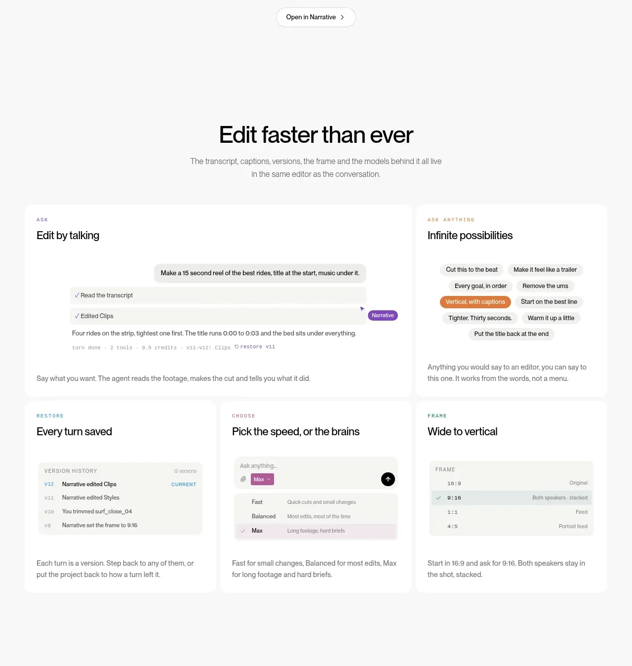
The section turns the product promise into six concrete capabilities using a strong heading followed by a two-row card grid, with miniature interface examples and concise explanations.
Prompt preview
## Reference images

Study these alongside the description below: hierarchy, rhythm, spacing, colour. Build for the product you are asked about, using this design language.

- Component: https://kage-design-assets.t3.tigrisfiles.io/components/narrative/6cc395b9-2f9b-4168-8f15-3f16c6d79112-1789538584-3.webp
- Full page it was cut from: https://kage-design-assets.t3.tigrisfiles.io/screenshots/narrative/6cc395b9-2f9b-4168-8f15-3f16c6d79112-1789538531078-full.webp
- Component on Kage: https://kage.design/component/narrative-feature-grid

## Before you start
Ask what the user's product does, which workflows matter most, and what visual system their brand uses. Translate those answers into an original feature grid.

Build a feature section with a centered heading and supporting sentence, followed by six cards arranged as three columns by two rows on desktop. Each card should have a tiny uppercase eyebrow, a clear feature title, a lightweight UI snippet or abstract interface state, and one short benefit sentence. Make the first row feel like the primary workflow and the second row like supporting controls. Use a warm white background, white cards against a barely gray page, 1px rgba(0,0,0,.05) borders, 12–16px radius, 24px internal padding, and a 36–44px heading. Keep card heights consistent and align snippets so the grid feels calm rather than busy. On mobile, collapse to one column while retaining visual hierarchy.

Never: use the reference's logo, product name, copy, illustrations, imagery, or distinctive branded assets.
More components

 Authentication product capabilities
tiun. · Feature grid
Authentication product capabilities
tiun. · Feature grid
 Customer data and user management
tiun. · Feature grid
Customer data and user management
tiun. · Feature grid
 Problem and unified solution narrative
tiun. · Feature grid
Problem and unified solution narrative
tiun. · Feature grid
 Integration and agent workflow
tiun. · Feature grid
Integration and agent workflow
tiun. · Feature grid
 Billing and checkout capabilities
tiun. · Feature grid
Billing and checkout capabilities
tiun. · Feature grid

 Receiving money channels
Payflip · Feature grid
Receiving money channels
Payflip · Feature grid