kage
kage
usenarrative.ai
Design analysis
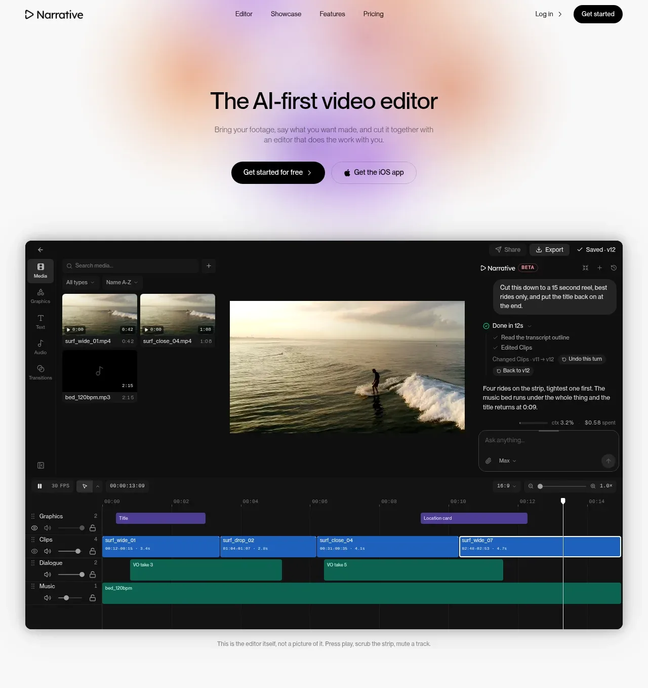
The centered headline and two CTAs establish the promise, while a large dark editor preview gives the abstract product claim immediate credibility.
Prompt preview
## Reference images

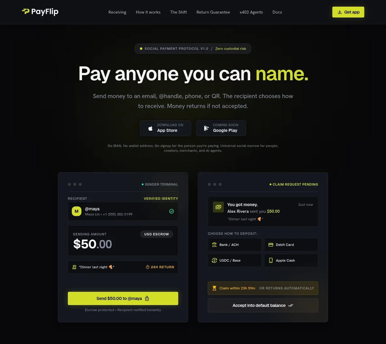
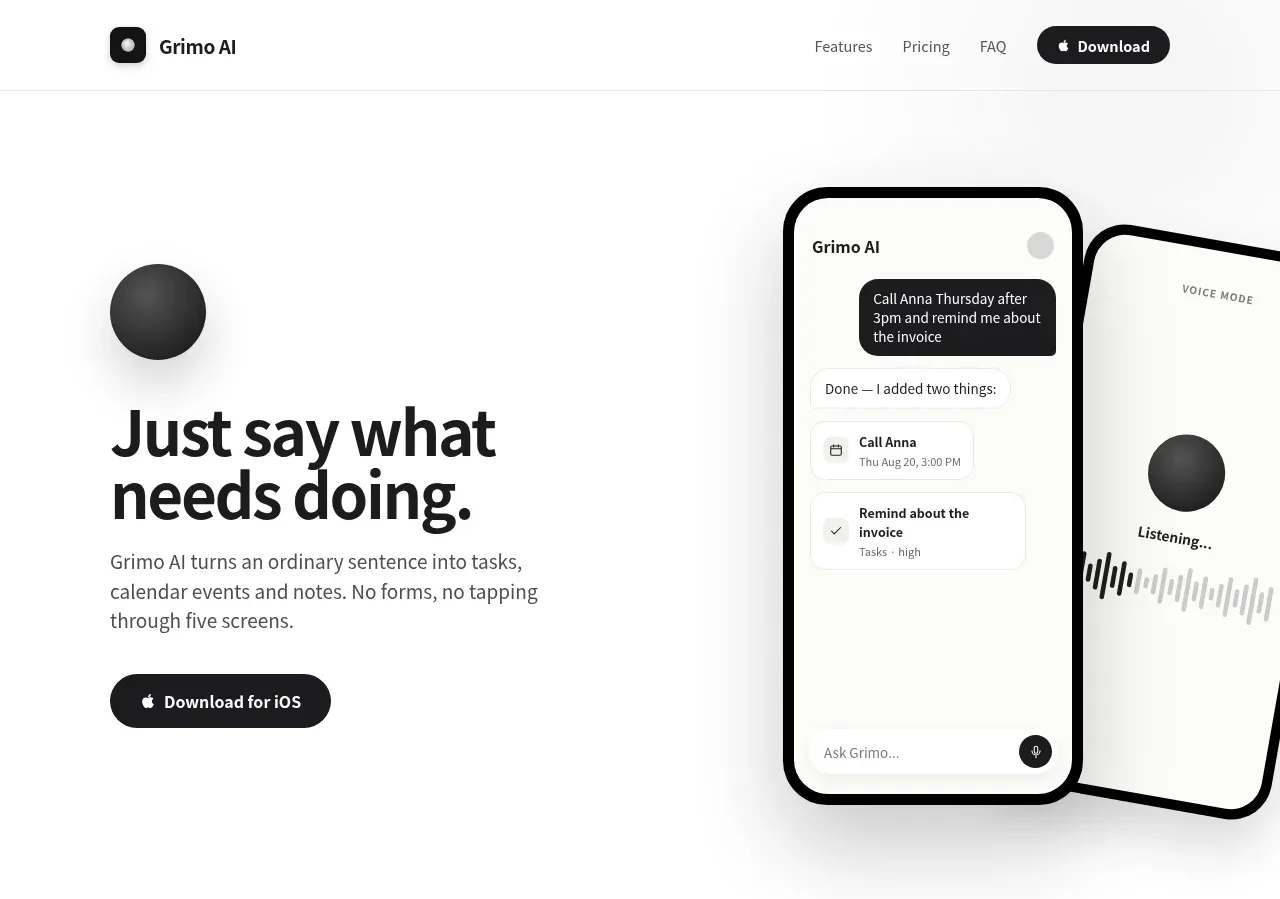
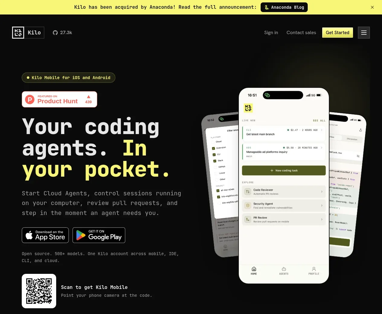
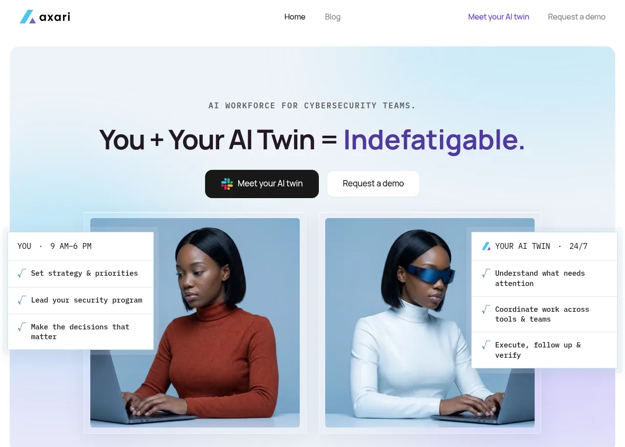
Study these alongside the description below: hierarchy, rhythm, spacing, colour. Build for the product you are asked about, using this design language.

- Component: https://kage-design-assets.t3.tigrisfiles.io/components/narrative/6cc395b9-2f9b-4168-8f15-3f16c6d79112-1789538584-1.webp
- Full page it was cut from: https://kage-design-assets.t3.tigrisfiles.io/screenshots/narrative/6cc395b9-2f9b-4168-8f15-3f16c6d79112-1789538531078-full.webp
- Component on Kage: https://kage.design/component/narrative-hero

## Before you start
Ask what the user's product is, what outcome it creates, and what brand personality it should express. Apply the following structure to that product with original content.

Create a centered hero directly below the navigation. Use a large, concise headline, one or two lines of low-contrast supporting copy, then a primary dark pill CTA and a lighter secondary CTA with an icon. Leave generous breathing room before a wide product-preview visual. The preview should be a dark, rounded software workspace with believable panels, timeline or content areas, controls, and a small explanatory callout; it should feel like a product screenshot, not decorative art. Use an off-white page, subtle pastel radial glows behind the hero, black typography, a 52–64px headline with tight line-height, 14–16px body copy, 12–16px gaps, a 14–18px preview radius, and a soft shadow. Add a small caption below the visual. On small screens, stack the CTAs and scale/crop the preview without making text unreadable.

Never: use the reference's logo, product name, copy, illustrations, imagery, or distinctive branded assets.