 kage
kage
usenarrative.ai
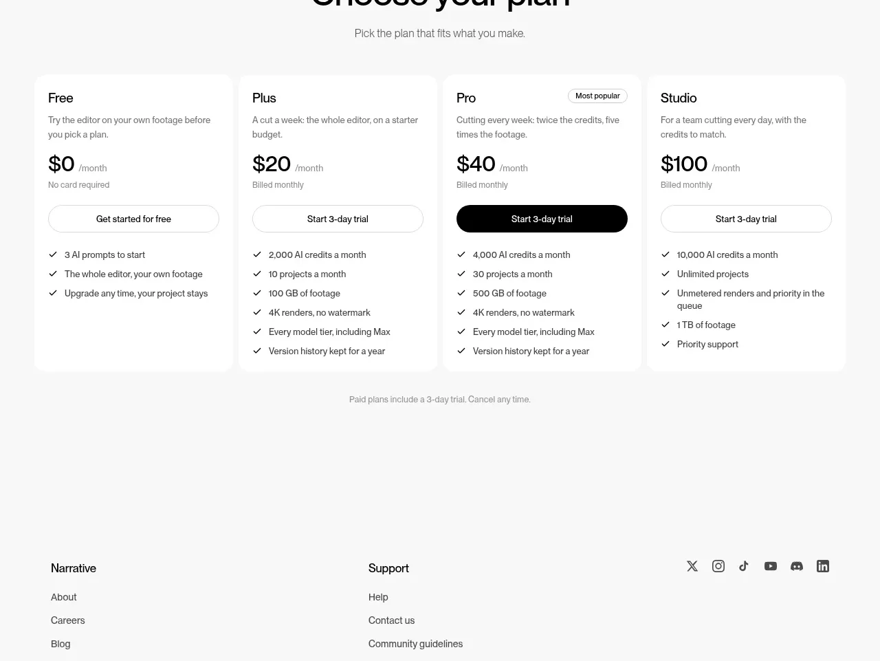
Design analysis
A centered pricing introduction precedes four clearly comparable plans, with one visually emphasized tier and compact feature checklists.
Prompt preview
## Reference images

Study these alongside the description below: hierarchy, rhythm, spacing, colour. Build for the product you are asked about, using this design language.

- Component: https://kage-design-assets.t3.tigrisfiles.io/components/narrative/6cc395b9-2f9b-4168-8f15-3f16c6d79112-1789538585-5.webp
- Full page it was cut from: https://kage-design-assets.t3.tigrisfiles.io/screenshots/narrative/6cc395b9-2f9b-4168-8f15-3f16c6d79112-1789538531078-full.webp
- Component on Kage: https://kage.design/component/narrative-pricing-table

## Before you start
Ask what the user's product offers, how plans differ, whether billing is monthly or annual, and which tier should be recommended. Then design a fresh pricing system around those answers.

Build a pricing section with a centered heading, short subtitle, and four equal plan cards. Each card needs a plan name, one-line audience description, prominent price with billing cadence, CTA, and a concise checklist of included capabilities. Visually emphasize one recommended tier with a dark filled CTA, a small badge, or a subtle border while keeping all cards comparable. Use a near-white background, white cards, very light borders/shadows, 12–16px radius, 20–24px padding, 30–40px heading, and 14px supporting text. Keep checkmarks aligned and make the entire comparison accessible; include a monthly/annual toggle only if it helps the user's real pricing model. Add a quiet note below for trial, cancellation, or billing details.

Never: use the reference's logo, product name, copy, illustrations, imagery, or distinctive branded assets.
More components
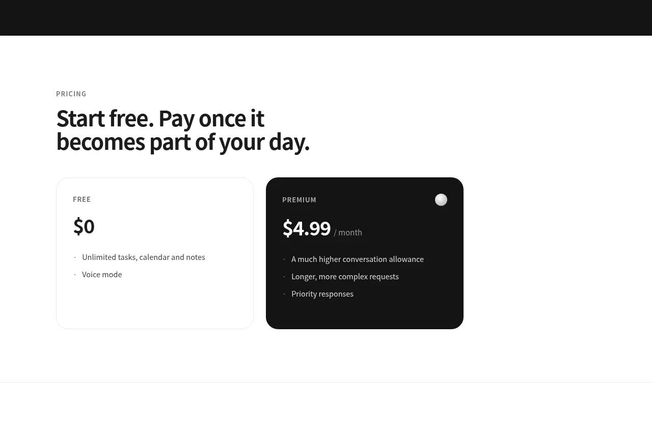
 Free and premium pricing
Grimo AI · Pricing table
Free and premium pricing
Grimo AI · Pricing table
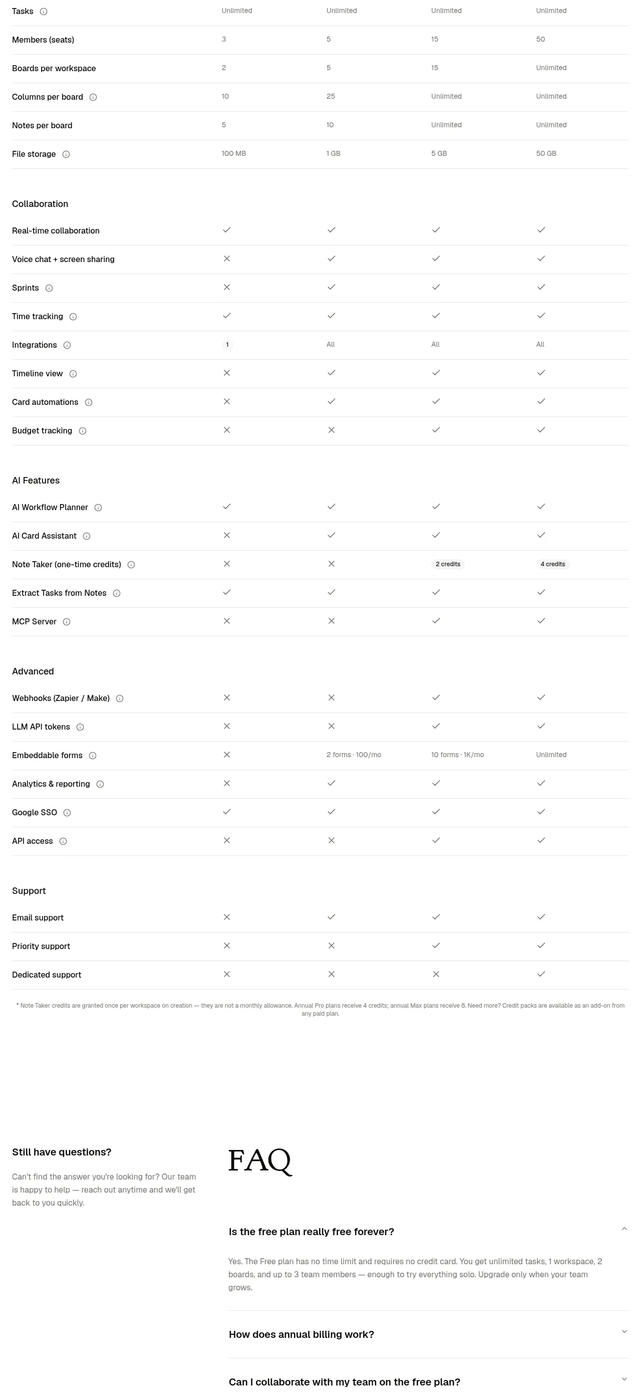
 Transparent pricing comparison
is.team · Pricing table
Transparent pricing comparison
is.team · Pricing table
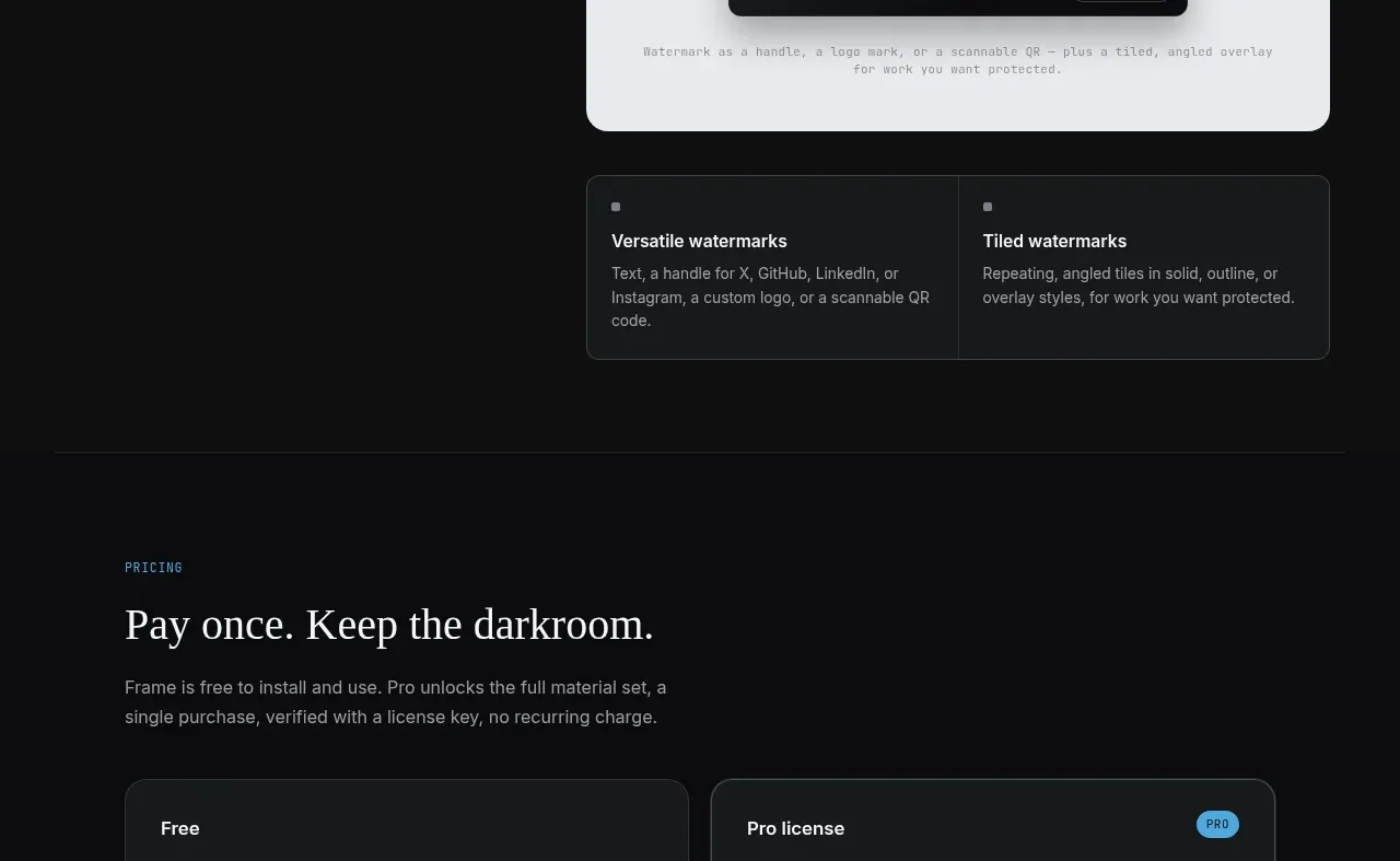
 Free and paid license pricing
Portfolio Frame · Pricing table
Free and paid license pricing
Portfolio Frame · Pricing table
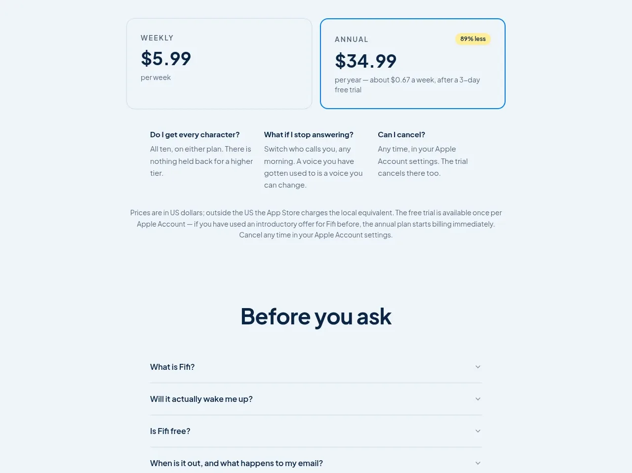
 Simple subscription pricing
Fifi · Pricing table
Simple subscription pricing
Fifi · Pricing table
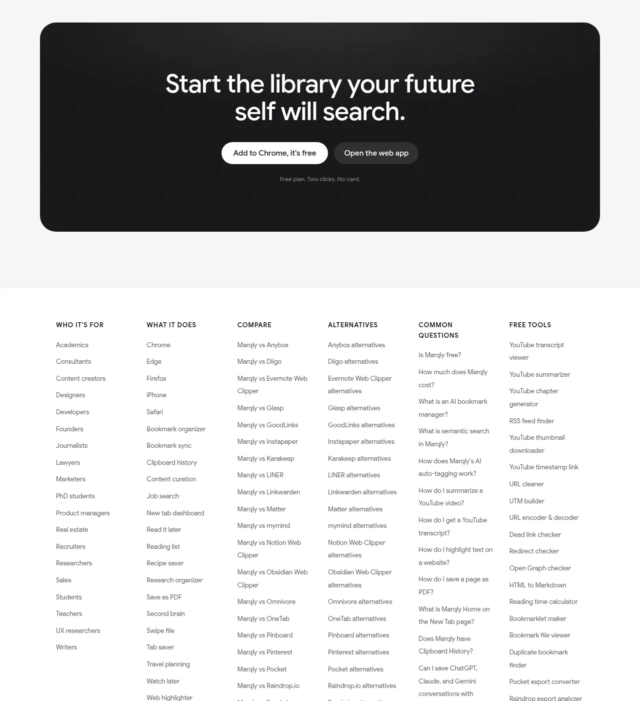
 Free and pro pricing
Marqly 6.0 · Pricing table
Free and pro pricing
Marqly 6.0 · Pricing table
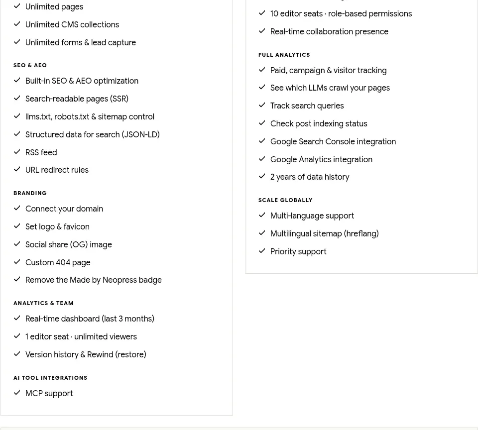
 Traffic-scaled pricing
Neopress · Pricing table
Traffic-scaled pricing
Neopress · Pricing table