 kage
kage
navige.ai
Design analysis
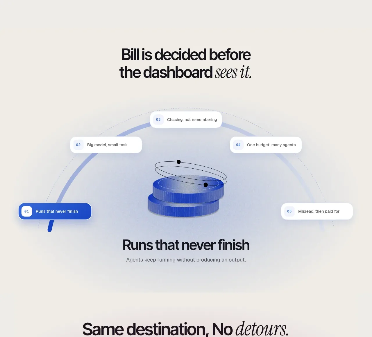
An editorial headline frames a central process illustration with numbered callouts, followed by a concise benefit statement about preventing unfinished runs.
Prompt preview
## Reference images

Study these alongside the description below: hierarchy, rhythm, spacing, colour. Build for the product you are asked about, using this design language.

- Component: https://kage-design-assets.t3.tigrisfiles.io/components/navige/e3ee1ee4-7855-4062-a956-cf327122240e-1792130700-4.webp
- Full page it was cut from: https://kage-design-assets.t3.tigrisfiles.io/screenshots/navige/e3ee1ee4-7855-4062-a956-cf327122240e-1792130598253-full.webp
- Component on Kage: https://kage.design/component/navige-feature-grid

## Before you start
Ask what workflow problem the user's product solves and what visual metaphor best explains it. Apply the principles below to that product rather than reproducing this reference.

Build a feature-explanation section with a centered two-line heading, supporting copy, and a large visual stage beneath it. Use a pale neutral background #f3f2ee and a soft blue atmospheric glow. Inside the stage, show an abstract process object or diagram with five small numbered callout pills positioned around it; one active callout may use cobalt #2457d6 while the others use white translucent surfaces. Follow the visual with a concise benefit heading and one-sentence explanation. Use 42–52px display type, 14–16px body type, 12px callout type, and 20px corner radii.

Callouts should be selectable and update the highlighted state of the diagram; provide an accessible tab order and a non-animated fallback.

Never: use logos, product names, copy, illustrations, or imagery from the reference.
More components

 Data-to-action engine
Salience · Feature grid
Data-to-action engine
Salience · Feature grid
 Actionable alert workflow
Salience · Feature grid
Actionable alert workflow
Salience · Feature grid
 Trust proof and core outcomes
Salience · Feature grid
Trust proof and core outcomes
Salience · Feature grid
 Three-step implementation flow
Salience · Feature grid
Three-step implementation flow
Salience · Feature grid
 What analytics misses
Salience · Feature grid
What analytics misses
Salience · Feature grid

 Workflow features and capabilities
CrewTower Mod for Claude Code · Feature grid
Workflow features and capabilities
CrewTower Mod for Claude Code · Feature grid