 kage
kage
navige.ai
Design analysis
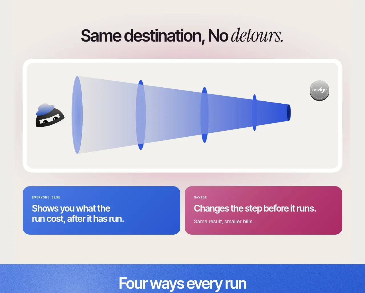
The section contrasts a broad, inefficient path with a direct governed path using a large framed diagram and two contrasting explanatory cards.
Prompt preview
## Reference images

Study these alongside the description below: hierarchy, rhythm, spacing, colour. Build for the product you are asked about, using this design language.

- Component: https://kage-design-assets.t3.tigrisfiles.io/components/navige/e3ee1ee4-7855-4062-a956-cf327122240e-1792130700-5.webp
- Full page it was cut from: https://kage-design-assets.t3.tigrisfiles.io/screenshots/navige/e3ee1ee4-7855-4062-a956-cf327122240e-1792130598253-full.webp
- Component on Kage: https://kage.design/component/navige-feature-grid-2

## Before you start
Ask what inefficient journey your user's product simplifies and what comparison would make that value obvious. Apply the principles below to that product rather than reproducing this reference.

Create a comparison feature section with an editorial heading at the top, then a large white framed diagram card with a thick rounded border and a vivid blue dimensional shadow. Visualize a diffuse multi-step route becoming a narrower direct route using abstract shapes, not literal screenshots. Beneath it, place two equal comparison cards: a blue card for the conventional approach and a magenta card for the improved approach. Use #2457d6, #c13b7a, #f5f4ef, and near-black #111217; use 18–24px radii and 28px padding. Labels should be small uppercase or eyebrow text, followed by a short bold statement.

Allow the comparison to animate only on hover or scroll when reduced motion is disabled. Keep the message understandable without the illustration.

Never: use logos, product names, copy, illustrations, or imagery from the reference.
More components

 Data-to-action engine
Salience · Feature grid
Data-to-action engine
Salience · Feature grid
 Actionable alert workflow
Salience · Feature grid
Actionable alert workflow
Salience · Feature grid
 Trust proof and core outcomes
Salience · Feature grid
Trust proof and core outcomes
Salience · Feature grid
 Three-step implementation flow
Salience · Feature grid
Three-step implementation flow
Salience · Feature grid
 What analytics misses
Salience · Feature grid
What analytics misses
Salience · Feature grid

 Workflow features and capabilities
CrewTower Mod for Claude Code · Feature grid
Workflow features and capabilities
CrewTower Mod for Claude Code · Feature grid