 kage
kage
navige.ai
Design analysis
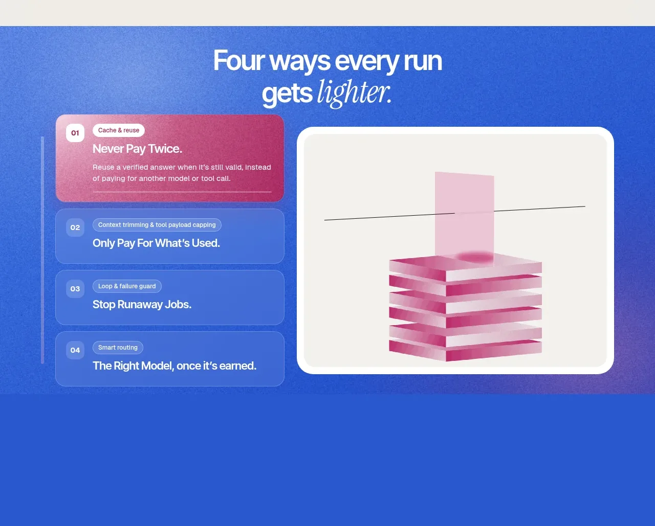
A saturated blue feature band combines a numbered vertical list on the left with a single abstract visual panel on the right, making four benefits scannable.
Prompt preview
## Reference images

Study these alongside the description below: hierarchy, rhythm, spacing, colour. Build for the product you are asked about, using this design language.

- Component: https://kage-design-assets.t3.tigrisfiles.io/components/navige/e3ee1ee4-7855-4062-a956-cf327122240e-1792130701-6.webp
- Full page it was cut from: https://kage-design-assets.t3.tigrisfiles.io/screenshots/navige/e3ee1ee4-7855-4062-a956-cf327122240e-1792130598253-full.webp
- Component on Kage: https://kage.design/component/navige-feature-grid-3

## Before you start
Ask what four strongest product benefits should be highlighted and what brand colour can carry a full-bleed section. Apply the principles below to that product rather than reproducing this reference.

Build a full-width cobalt feature band #2d5fd5 with a centered white heading and a two-column content area. Put four vertically stacked selectable feature rows on the left, each with a number, small category label, and concise title; highlight the first row with a magenta-to-rose surface #c64079 and keep the others translucent blue. Put a large warm-white framed visual panel on the right with a simple abstract diagram. Use white text, 16–18px row radii, 20–24px gaps, and a strong 40–52px heading.

Clicking a row should update the visual panel and active styling. On mobile, place the list above the visual and preserve the active state with keyboard controls.

Never: use logos, product names, copy, illustrations, or imagery from the reference.
More components

 Data-to-action engine
Salience · Feature grid
Data-to-action engine
Salience · Feature grid
 Actionable alert workflow
Salience · Feature grid
Actionable alert workflow
Salience · Feature grid
 Trust proof and core outcomes
Salience · Feature grid
Trust proof and core outcomes
Salience · Feature grid
 Three-step implementation flow
Salience · Feature grid
Three-step implementation flow
Salience · Feature grid
 What analytics misses
Salience · Feature grid
What analytics misses
Salience · Feature grid

 Workflow features and capabilities
CrewTower Mod for Claude Code · Feature grid
Workflow features and capabilities
CrewTower Mod for Claude Code · Feature grid