kage
kage
neopress.ai
Design analysis
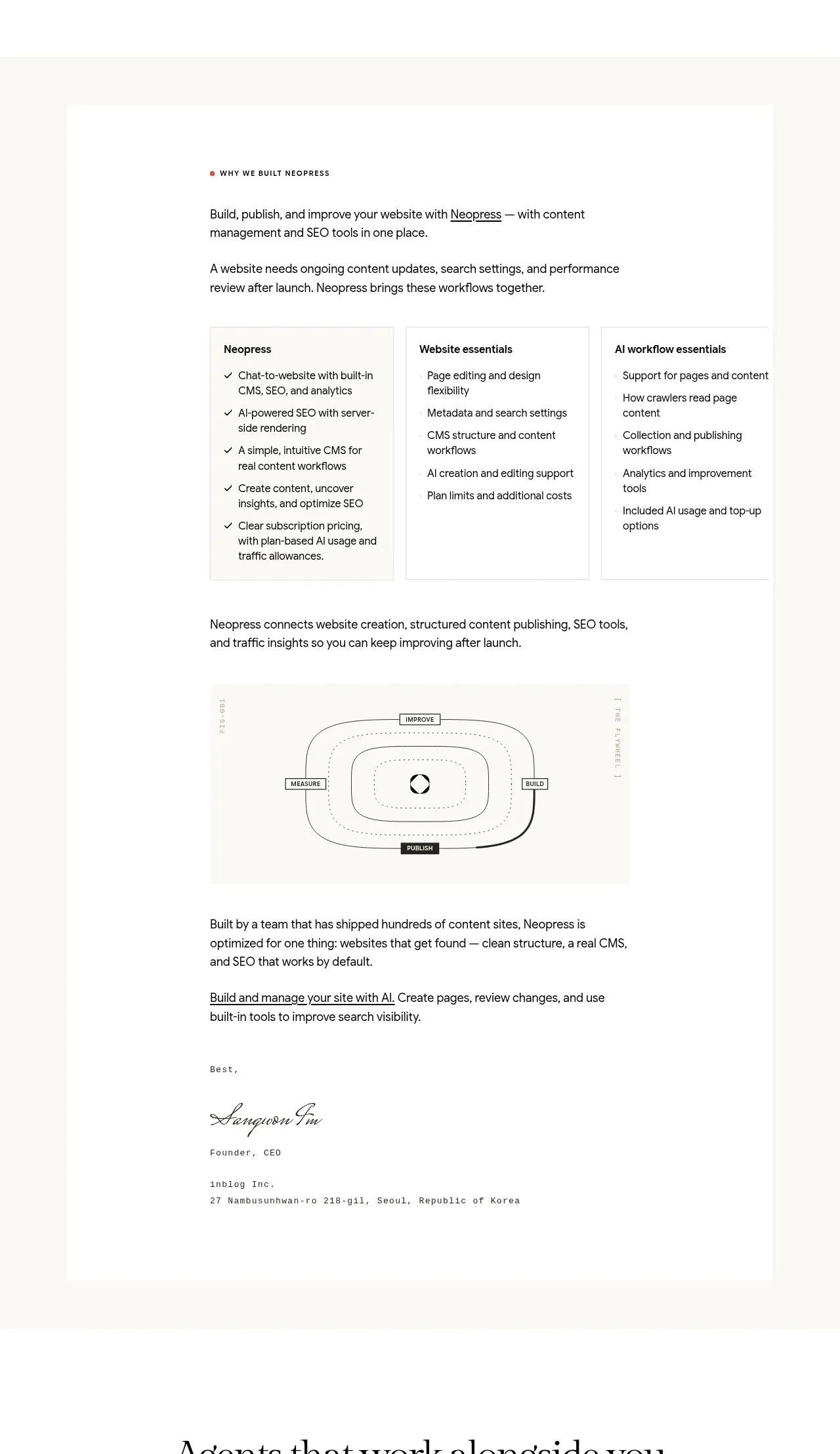
A long, centered editorial card explains the product philosophy with an eyebrow, introductory copy, three-column capability summary, a process diagram, and a founder-style close.
Prompt preview
## Reference images

Study these alongside the description below: hierarchy, rhythm, spacing, colour. Build for the product you are asked about, using this design language.

- Component: https://kage-design-assets.t3.tigrisfiles.io/components/neopress/126c1916-850c-4473-b9b4-49923d5d31e2-1789365755-6.webp
- Full page it was cut from: https://kage-design-assets.t3.tigrisfiles.io/screenshots/neopress/126c1916-850c-4473-b9b4-49923d5d31e2-1789365678746-full.webp
- Component on Kage: https://kage.design/component/neopress-card

## Before you start
Ask what principles, capabilities, and proof points define the user's product. Then turn those answers into an original long-form product philosophy section.

### Design language
- Place the content in a centered white card inside a subtly contrasting warm page background; constrain reading width and use a clear vertical narrative.
- Start with a tiny uppercase eyebrow and a concise serif or display heading, followed by readable sans-serif paragraphs. Use a three-column list block for capabilities with bold mini-headings and checkmarked bullets.
- Break the long content with a simple abstract process diagram or system map using thin lines, labels, and one small accent node; do not rely on illustration.
- Use `#ffffff` card surfaces, `#faf9f5` surrounding background, `#161616` text, `#6d6b65` secondary copy, `#dfdcd4` borders, and a muted coral accent (`#d96f55`).
- Keep generous internal padding, 1px separators, modest 2px corners, and strong mobile stacking. Use semantic headings and lists.

### Never
- Never reuse logos, product names, copy, illustrations, or imagery from the reference.
- Never fabricate founder claims, use a confusing diagram, or compress a long-form explanation into tiny type.