 kage
kage
neopress.ai
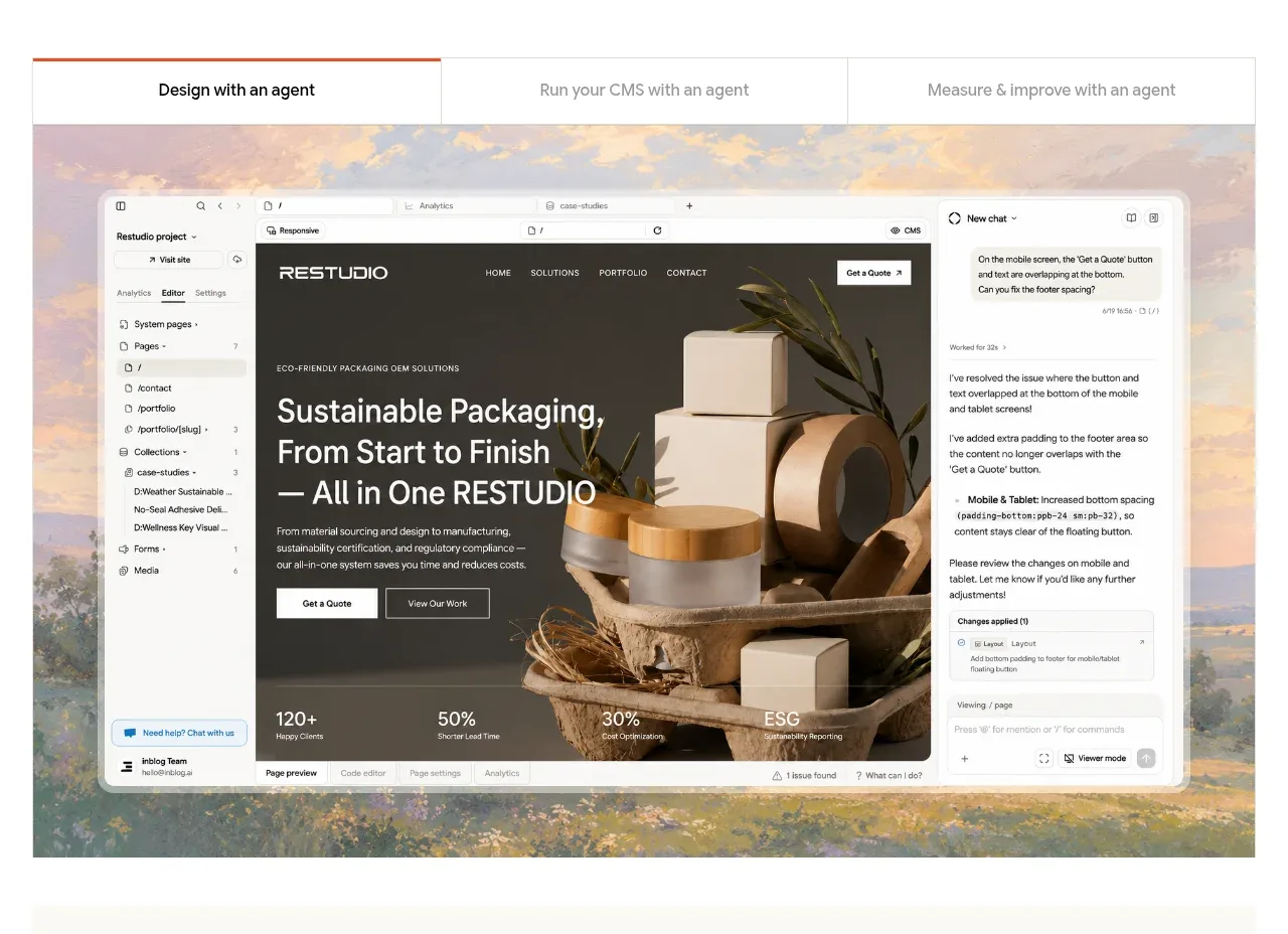
Design analysis
A three-option tab strip frames a large product preview, letting visitors understand the workflow through a tangible interface rather than abstract claims.
Prompt preview
## Reference images

Study these alongside the description below: hierarchy, rhythm, spacing, colour. Build for the product you are asked about, using this design language.

- Component: https://kage-design-assets.t3.tigrisfiles.io/components/neopress/126c1916-850c-4473-b9b4-49923d5d31e2-1789365753-2.webp
- Full page it was cut from: https://kage-design-assets.t3.tigrisfiles.io/screenshots/neopress/126c1916-850c-4473-b9b4-49923d5d31e2-1789365678746-full.webp
- Component on Kage: https://kage.design/component/neopress-feature-grid

## Before you start
Ask what product workflow the user's audience most needs to understand and what brand system should shape the UI. Then build an original interactive preview around that workflow.

### Design language
- Create a full-width preview module with a simple segmented tab row above a large rounded screenshot-like product canvas.
- Make the active tab obvious with a dark label or warm accent rule, while inactive tabs remain quiet and evenly distributed.
- Use a soft neutral frame (`#f5f3ee`), white interface panels (`#ffffff`), hairline borders (`#dfddd7`), and restrained warm accent colors (`#d87858`, `#e9b09b`).
- Use small UI typography inside the preview, but keep the surrounding tab labels legible at 11–13px. Give the preview a 2–6px radius and subtle shadow only if needed.
- Tabs should be keyboard navigable, expose selected state, and swap the preview content without shifting the overall layout; provide a mobile overflow or stacked alternative.

### Never
- Never reuse logos, product names, copy, illustrations, or imagery from the reference.
- Never use a fake static tab bar, inaccessible controls, or an interface so detailed that the feature's value is obscured.
More components
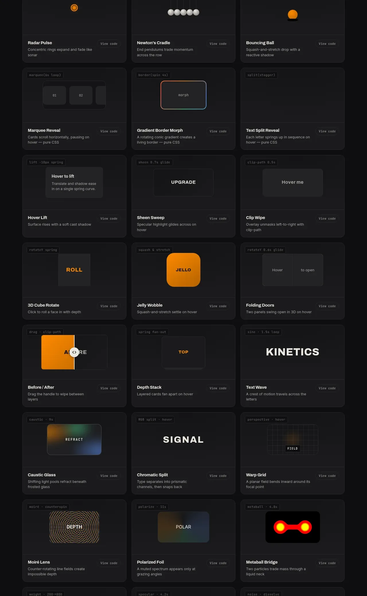
 Surface and motion pattern library
kinetics.colorion.co · Feature grid
Surface and motion pattern library
kinetics.colorion.co · Feature grid
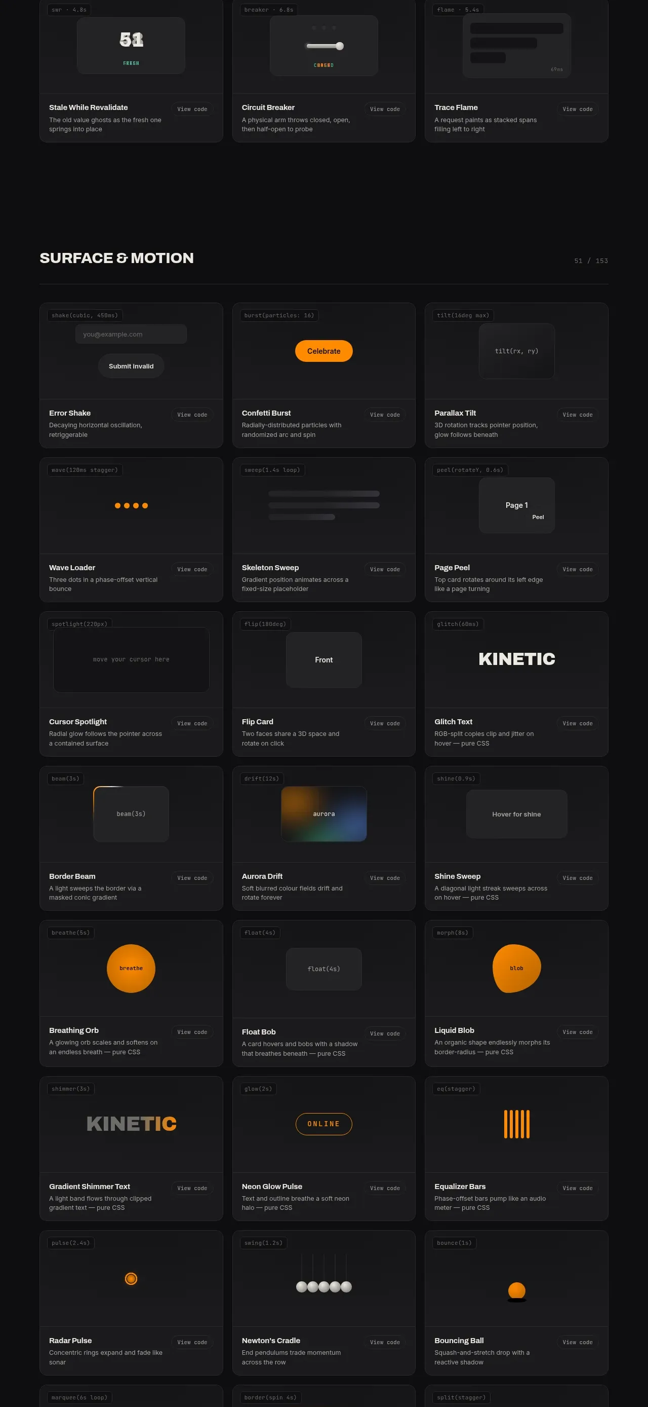 Feedback and state pattern library
kinetics.colorion.co · Feature grid
Feedback and state pattern library
kinetics.colorion.co · Feature grid
 Interaction and input pattern library
kinetics.colorion.co · Feature grid
Interaction and input pattern library
kinetics.colorion.co · Feature grid
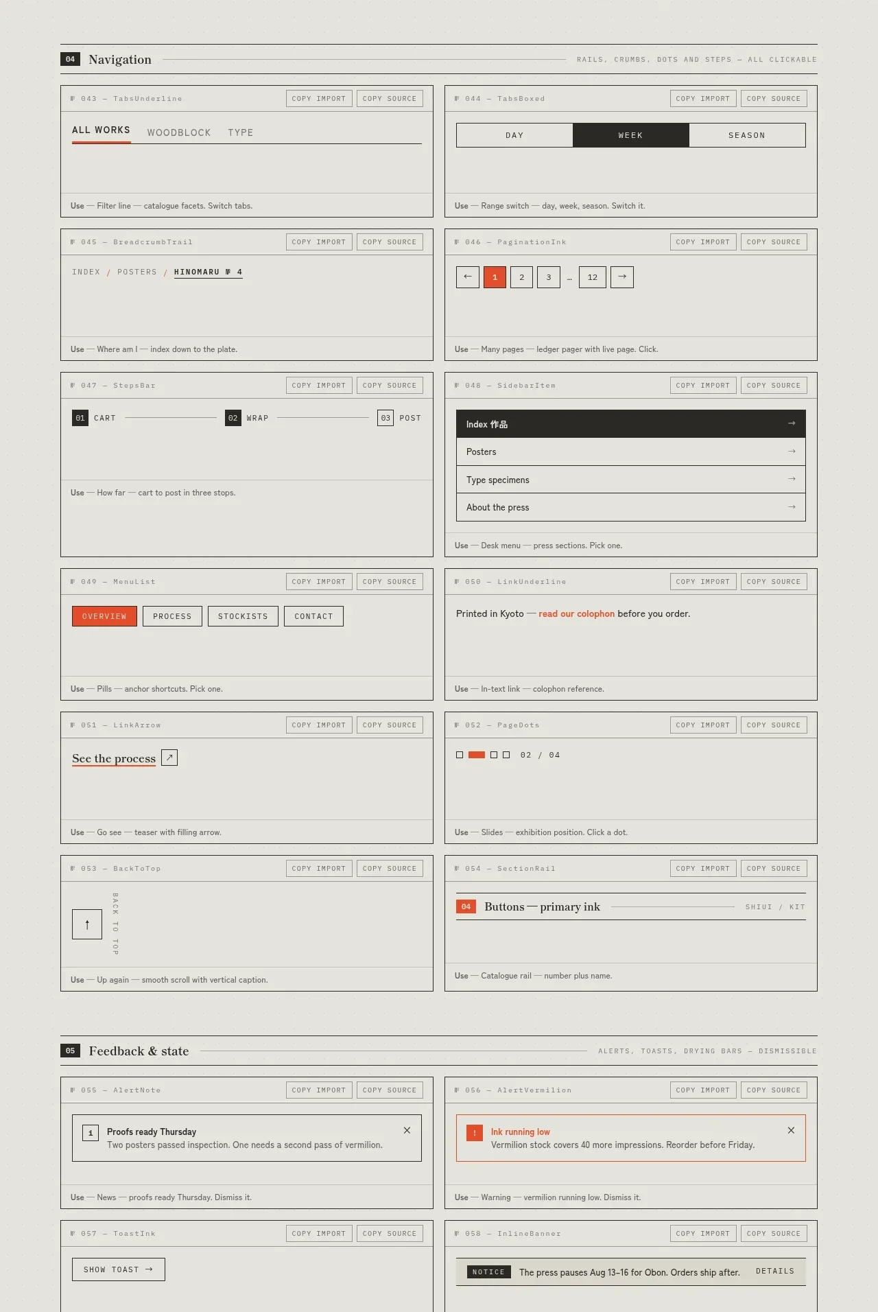
 Navigation patterns inventory
SHIUI · Feature grid
Navigation patterns inventory
SHIUI · Feature grid
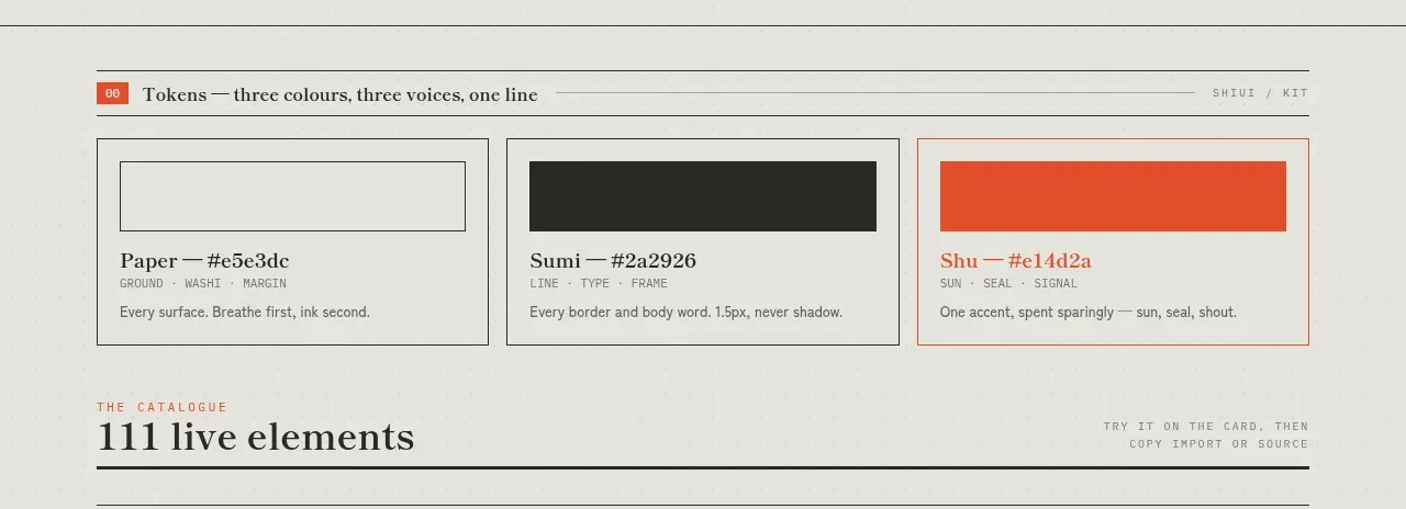 Colour and element catalogue
SHIUI · Feature grid
Colour and element catalogue
SHIUI · Feature grid
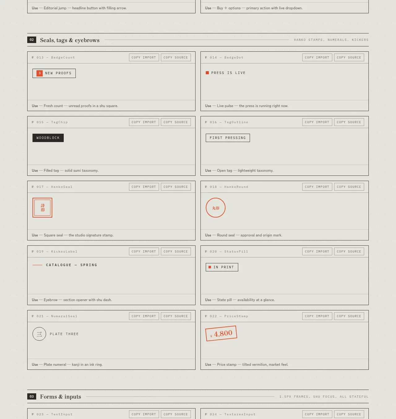 Seals, tags and eyebrows inventory
SHIUI · Feature grid
Seals, tags and eyebrows inventory
SHIUI · Feature grid