 kage
kage
neopress.ai
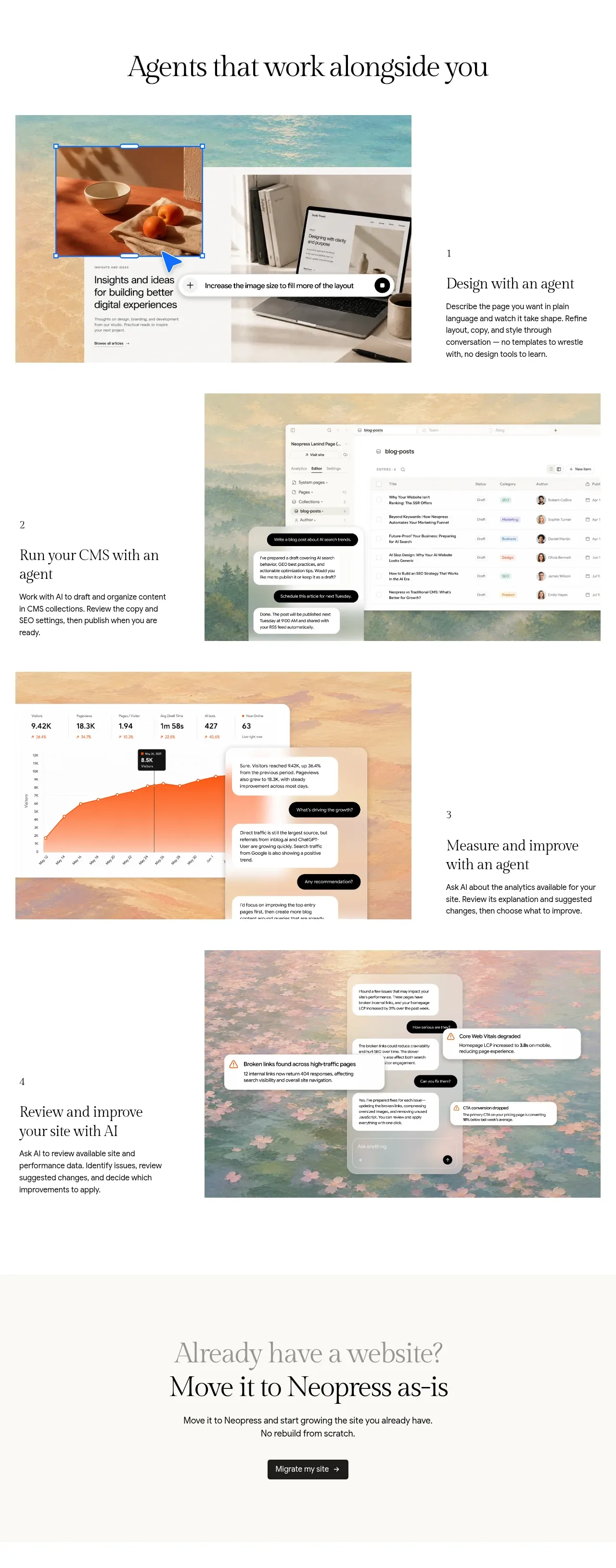
Design analysis
Four alternating feature rows show distinct product capabilities through large visual panels paired with concise numbered explanations, creating a guided narrative down the page.
Prompt preview
## Reference images

Study these alongside the description below: hierarchy, rhythm, spacing, colour. Build for the product you are asked about, using this design language.

- Component: https://kage-design-assets.t3.tigrisfiles.io/components/neopress/126c1916-850c-4473-b9b4-49923d5d31e2-1789365755-7.webp
- Full page it was cut from: https://kage-design-assets.t3.tigrisfiles.io/screenshots/neopress/126c1916-850c-4473-b9b4-49923d5d31e2-1789365678746-full.webp
- Component on Kage: https://kage.design/component/neopress-feature-grid-2

## Before you start
Ask which four workflows are most important for the user's product and what evidence or interface views can demonstrate each one. Then build an original alternating feature narrative.

### Design language
- Arrange four rows in a repeating two-column composition: a large visual/demo panel beside a compact numbered text block, then reverse the order on the next row.
- Use large, consistent media frames with clipped corners and enough surrounding whitespace; keep the explanatory text vertically centered and limited to a short heading plus two or three sentences.
- Style numbers as small utility labels, headings in a refined serif/display face around 24–30px, and descriptions in 13–15px sans-serif with comfortable line-height.
- Use pale cream backgrounds (`#f8f6f0`), white demo surfaces, dark text (`#181817`), muted copy (`#6d6a63`), hairline borders (`#e1ded6`), and occasional dusty coral/ochre accents.
- On mobile, stack each row with the visual first or preserve narrative order; animate only with subtle reveal transitions. Ensure demos have descriptive alternatives.

### Never
- Never reuse logos, product names, copy, illustrations, or imagery from the reference.
- Never make every row identical, use unreadable UI screenshots, or hide the feature benefit behind decorative media.
More components
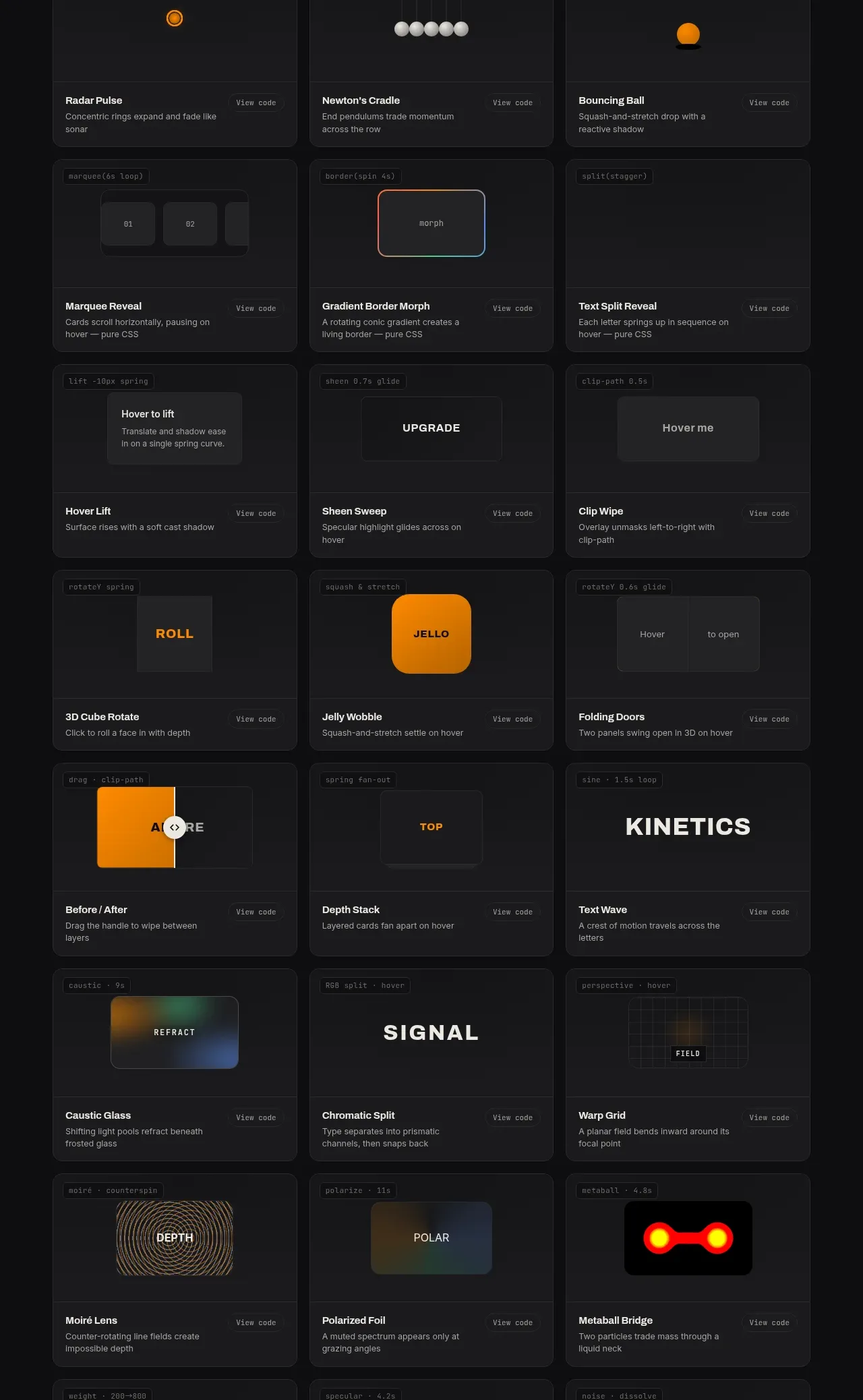
 Surface and motion pattern library
kinetics.colorion.co · Feature grid
Surface and motion pattern library
kinetics.colorion.co · Feature grid
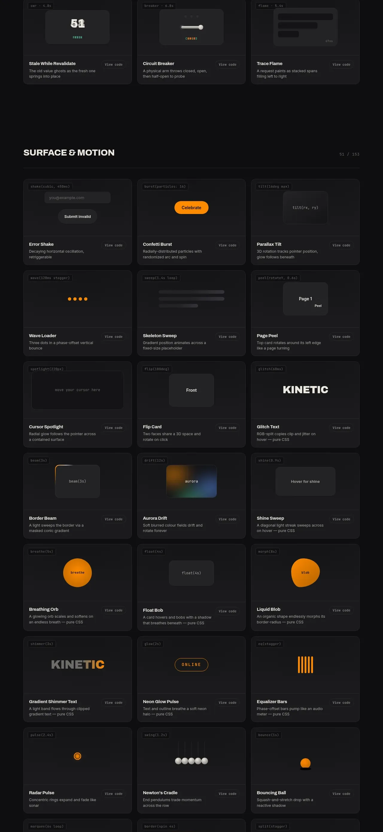 Feedback and state pattern library
kinetics.colorion.co · Feature grid
Feedback and state pattern library
kinetics.colorion.co · Feature grid
 Interaction and input pattern library
kinetics.colorion.co · Feature grid
Interaction and input pattern library
kinetics.colorion.co · Feature grid
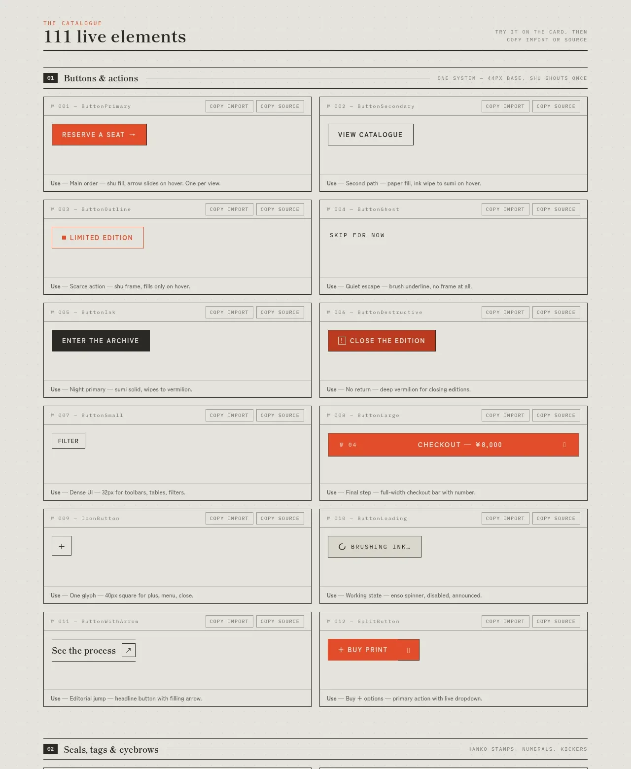
 Buttons and actions inventory
SHIUI · Feature grid
Buttons and actions inventory
SHIUI · Feature grid
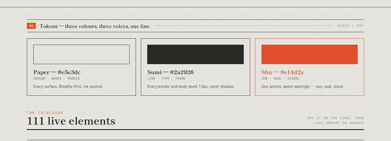 Colour and element catalogue
SHIUI · Feature grid
Colour and element catalogue
SHIUI · Feature grid
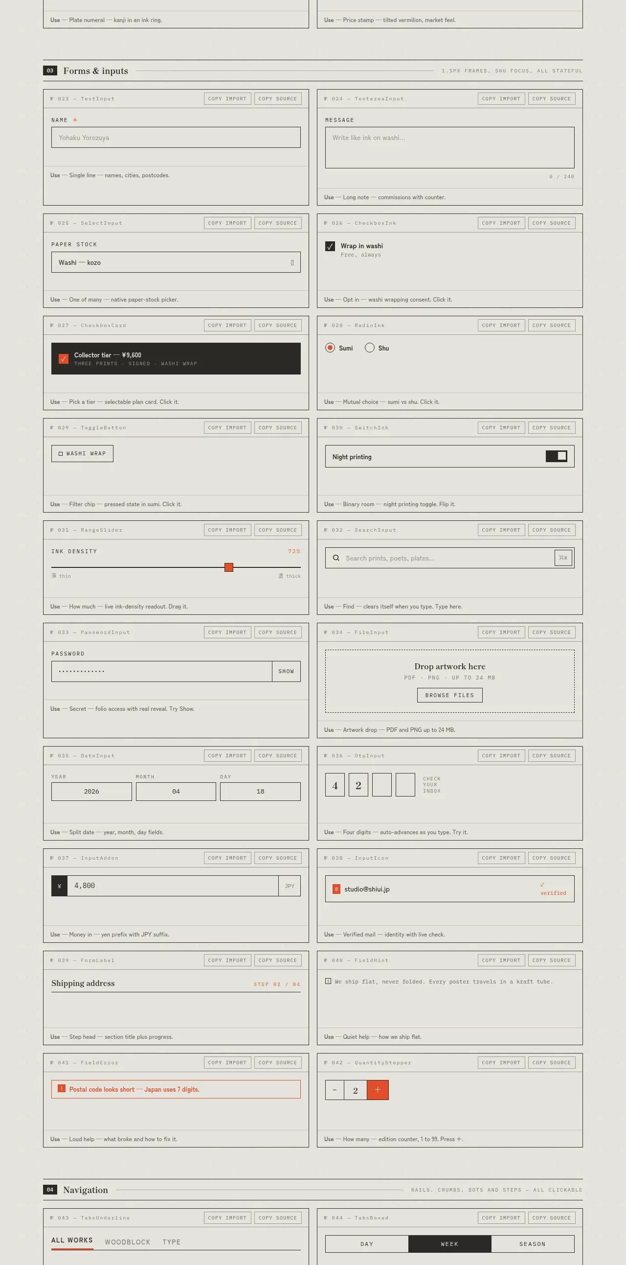 Forms and inputs inventory
SHIUI · Feature grid
Forms and inputs inventory
SHIUI · Feature grid