 kage
kage
neopress.ai
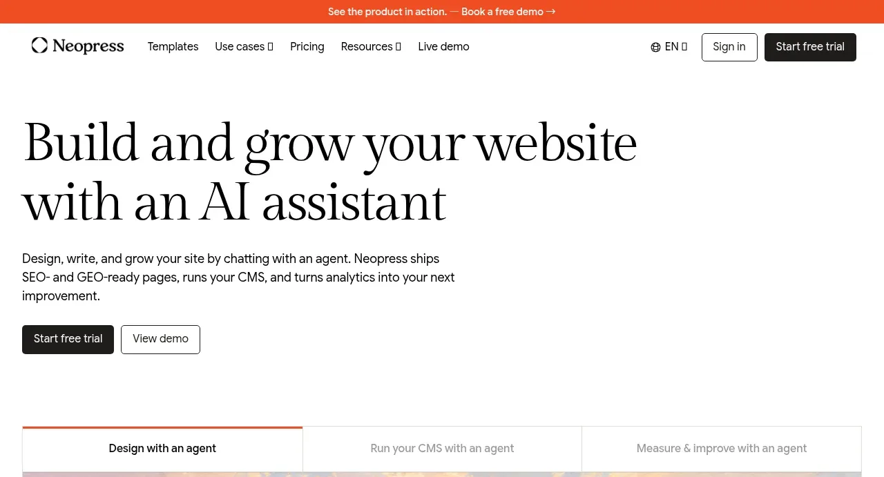
Design analysis
A large editorial headline explains the product promise, followed by a concise supporting paragraph and paired calls to action with substantial breathing room.
Prompt preview
## Reference images

Study these alongside the description below: hierarchy, rhythm, spacing, colour. Build for the product you are asked about, using this design language.

- Component: https://kage-design-assets.t3.tigrisfiles.io/components/neopress/126c1916-850c-4473-b9b4-49923d5d31e2-1789365752-1.webp
- Full page it was cut from: https://kage-design-assets.t3.tigrisfiles.io/screenshots/neopress/126c1916-850c-4473-b9b4-49923d5d31e2-1789365678746-full.webp
- Component on Kage: https://kage.design/component/neopress-hero

## Before you start
Ask what the user's product does, its audience, and its brand personality. Use those answers to write original content and build a hero that communicates the product's main outcome.

### Design language
- Use a left-aligned, narrow text column inside a wide page container; leave ample whitespace around the content.
- Set the headline in a large high-contrast serif or distinctive display face, with compact line-height and two or three intentional lines. Set supporting copy in a small readable sans-serif.
- Place a dark filled primary CTA beside a light outlined secondary CTA beneath the copy; make both easy to scan and tap.
- Use an off-white background (`#fbfaf7`), near-black typography (`#151515`), muted gray body copy (`#686762`), and a restrained coral accent (`#e7674d`) for emphasis or rules.
- Use a desktop headline around 34–40px and scale it down fluidly on mobile; keep section padding generous, roughly 32–56px vertically.
- Add hover, focus, and pressed states to both actions without introducing decorative effects that compete with the headline.

### Never
- Never reuse logos, product names, copy, illustrations, or imagery from the reference.
- Never bury the CTA, use vague filler copy, or let the hero become a generic centered splash screen.
More components
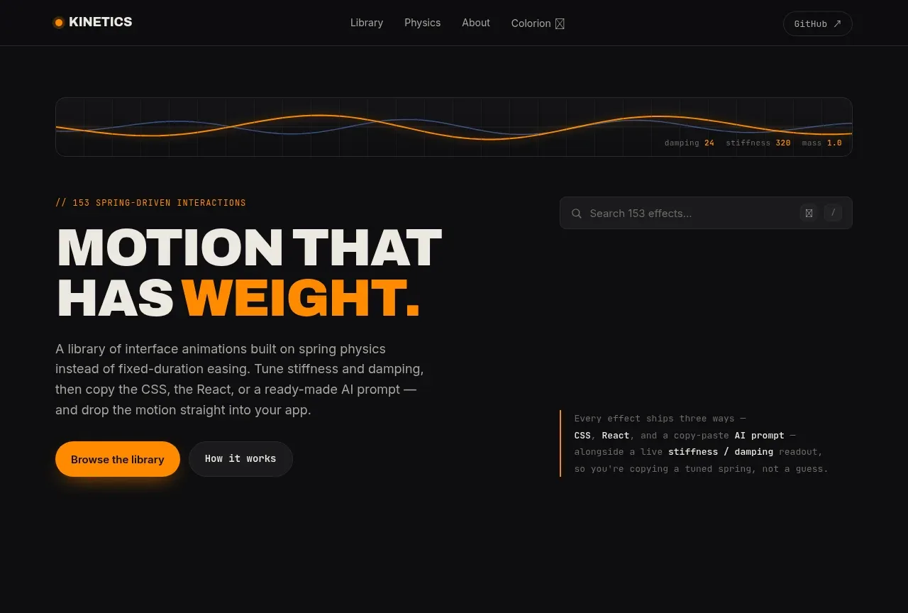
 Motion-focused hero introduction
kinetics.colorion.co · Hero
Motion-focused hero introduction
kinetics.colorion.co · Hero
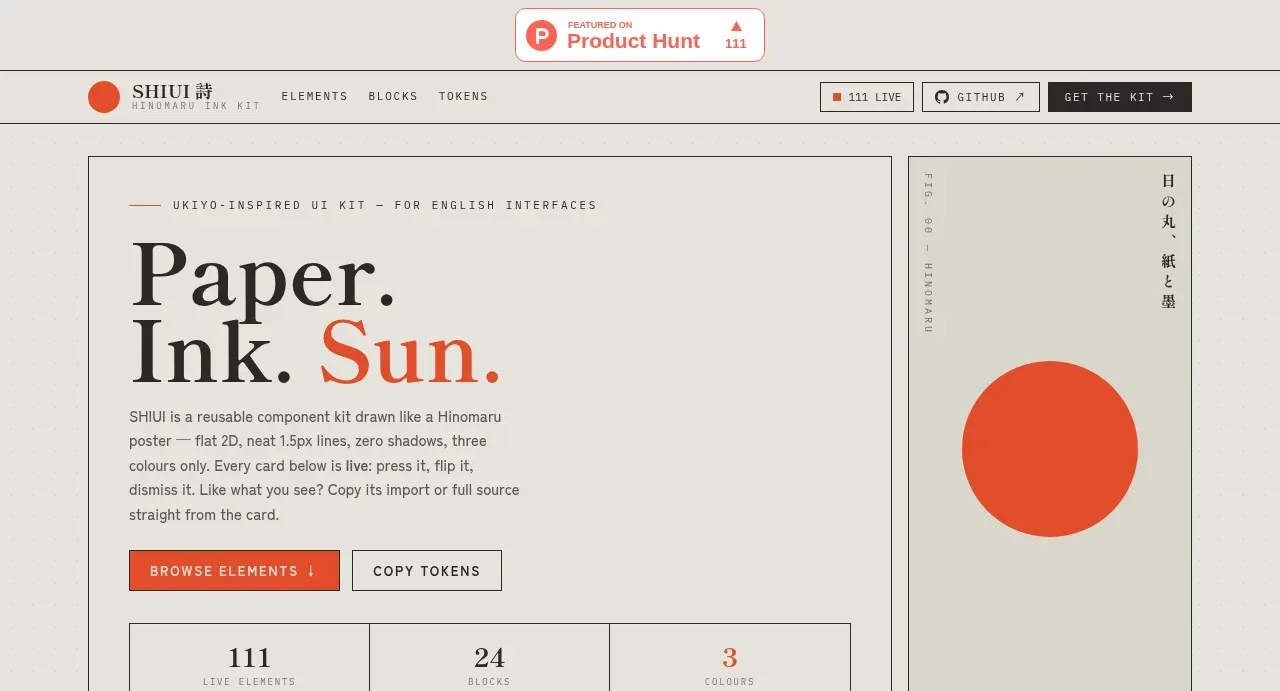
 Editorial introduction hero
SHIUI · Hero
Editorial introduction hero
SHIUI · Hero
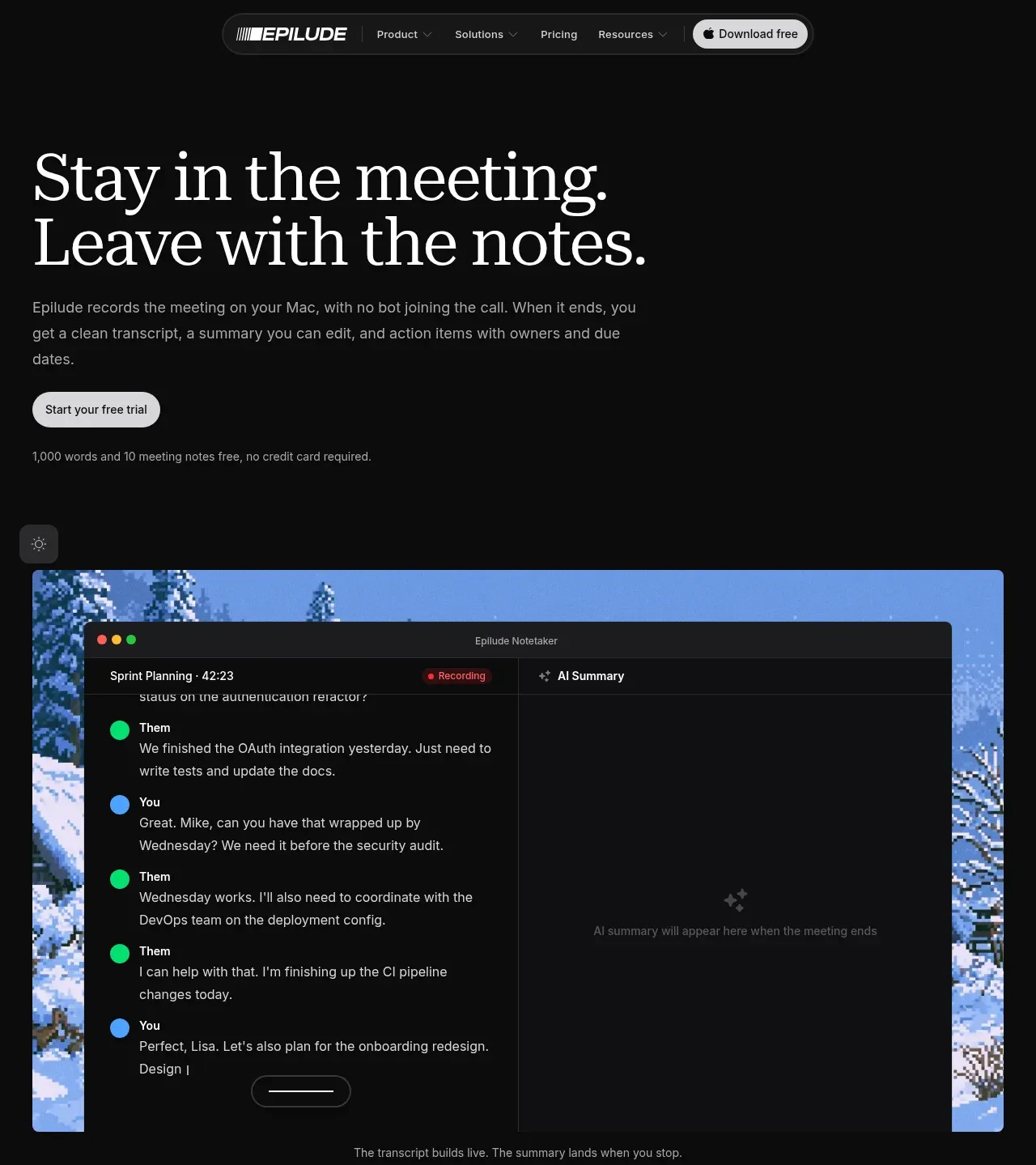
 Meeting notes hero
Epilude Notetaker · Hero
Meeting notes hero
Epilude Notetaker · Hero
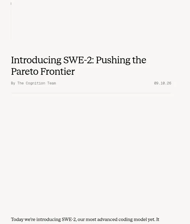
 Article introduction and opening chart
Cognition's SWE-2 · Hero
Article introduction and opening chart
Cognition's SWE-2 · Hero
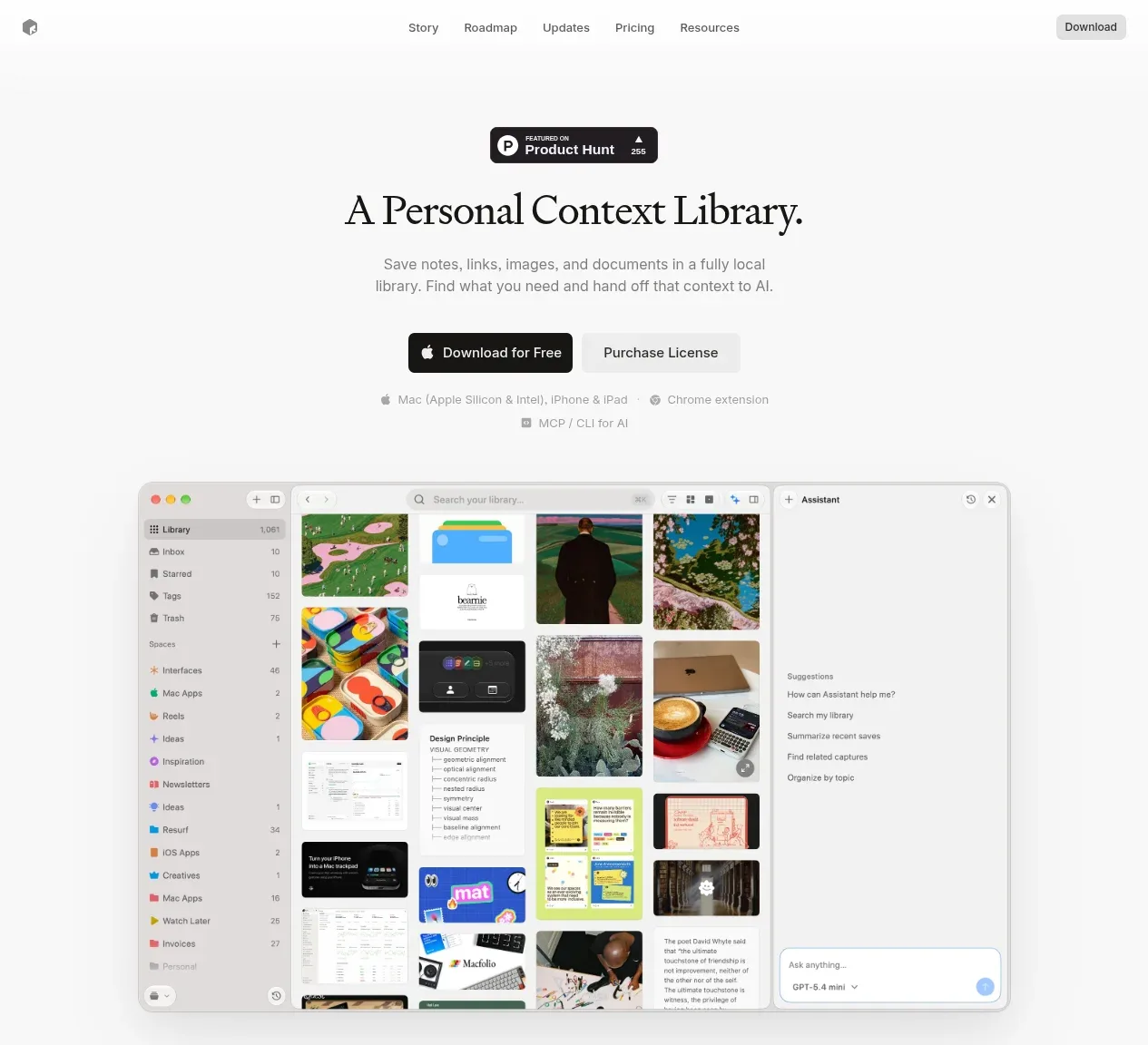
 Product introduction with interface preview
Resurf · Hero
Product introduction with interface preview
Resurf · Hero
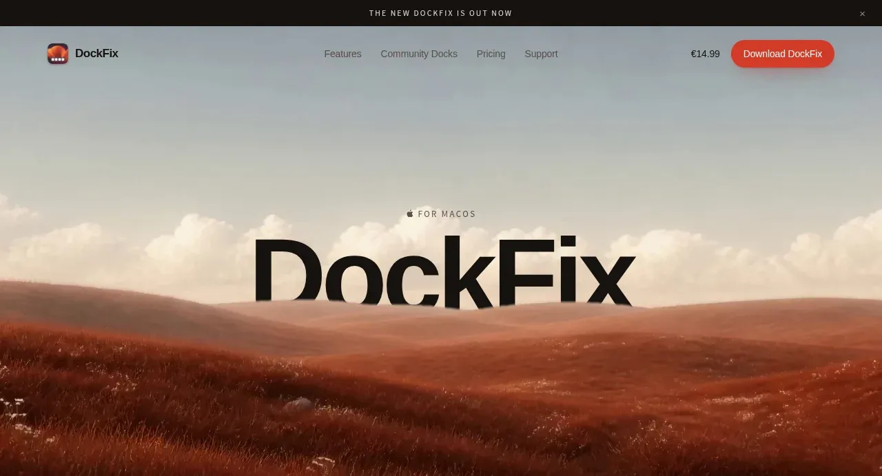
 Editorial product hero
DockFix 5.0 · Hero
Editorial product hero
DockFix 5.0 · Hero