 kage
kage
neopress.ai
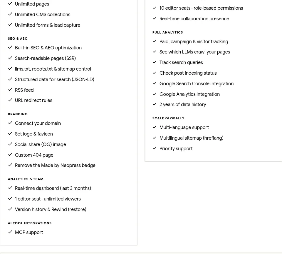
Design analysis
A centered pricing heading introduces two transparent plan cards with monthly prices, primary actions, and long feature checklists for direct comparison.
Prompt preview
## Reference images

Study these alongside the description below: hierarchy, rhythm, spacing, colour. Build for the product you are asked about, using this design language.

- Component: https://kage-design-assets.t3.tigrisfiles.io/components/neopress/126c1916-850c-4473-b9b4-49923d5d31e2-1789365758-11.webp
- Full page it was cut from: https://kage-design-assets.t3.tigrisfiles.io/screenshots/neopress/126c1916-850c-4473-b9b4-49923d5d31e2-1789365678746-full.webp
- Component on Kage: https://kage.design/component/neopress-pricing-table

## Before you start
Ask about the user's pricing model, billing rules, limits, and which plan should be recommended. Then build an original transparent pricing comparison for that product.

### Design language
- Use a centered serif heading and concise subtitle above two equal-width pricing cards; add a third tier only if the user's business genuinely needs it.
- Each card needs a plan name, plain-language summary, prominent price, billing qualifier, full-width CTA, and grouped feature checklist with clear category labels.
- Use white cards on an off-white background (`#fbfaf7`), near-black text (`#181817`), muted gray copy (`#6f6d67`), 1px borders (`#dedbd3`), and a dark filled button (`#20201f`). Use a subtle coral accent (`#d87658`) only for recommendation or emphasis.
- Keep prices visually dominant but not oversized; use 24–32px numerals, 12–14px body text, and compact 11px category labels. Align card internals so comparison is effortless.
- Make billing toggles, plan CTAs, and feature disclosures accessible; support stacked cards and horizontal comparison on mobile.

### Never
- Never reuse logos, product names, copy, illustrations, or imagery from the reference.
- Never hide fees, invent feature limits, use manipulative countdowns, or make the cheapest plan intentionally unusable.
More components
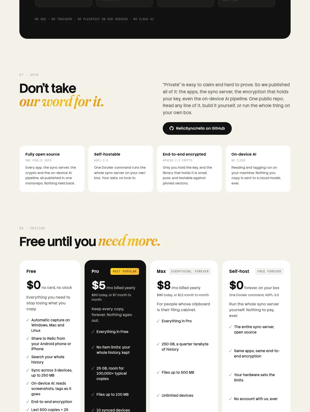
 Tiered pricing
Relic · Pricing table
Tiered pricing
Relic · Pricing table
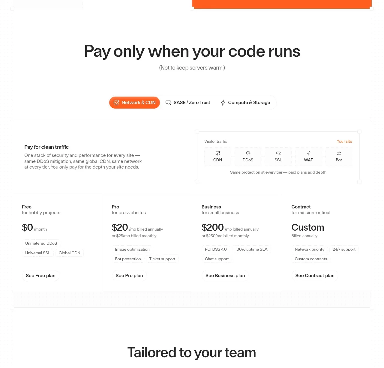
 Usage-based pricing plans
cloudflare.com · Pricing table
Usage-based pricing plans
cloudflare.com · Pricing table

 Platform download cards
Moji · Pricing table
Platform download cards
Moji · Pricing table

 Four-tier monthly pricing
termsquad.com · Pricing table
Four-tier monthly pricing
termsquad.com · Pricing table

 Two-tier pricing table
tryobra.com · Pricing table
Two-tier pricing table
tryobra.com · Pricing table

 Trial and subscription pricing
copilot.money · Pricing table
Trial and subscription pricing
copilot.money · Pricing table