 kage
kage
notchpop.com

Design analysis
Four larger editorial cards explain the highest-value workflows using colorful visual tops and concise text, with a deliberately asymmetric two-column layout.
Prompt preview
## Reference images

Study these alongside the description below: hierarchy, rhythm, spacing, colour. Build for the product you are asked about, using this design language.

- Component: https://kage-design-assets.t3.tigrisfiles.io/components/notchpop/1c698f48-5c0e-4cfb-974b-c3c3cf38c197-1790316295-4.webp
- Full page it was cut from: https://kage-design-assets.t3.tigrisfiles.io/screenshots/notchpop/1c698f48-5c0e-4cfb-974b-c3c3cf38c197-1790316211358-full.webp
- Component on Kage: https://kage.design/component/notchpop-feature-grid-2

## Before you start
Ask what the user's product and brand are, then apply the principles below to that product rather than copying the reference.

Build an editorial feature-card section with a centered heading and a two-column grid. Use one wide card beside one narrower card, then repeat the arrangement on the next row. Each card has a blue gradient visual panel at the top, a white content area below, a 1px #e7ebef border, a 14–18px radius, and a very soft shadow. Use dark 16–18px card titles, 13–14px explanatory text, and 24px internal padding. Let the visual area contain a product-specific mockup supplied by the implementation, but keep it abstract enough to support many products. Make cards equal-height within each row and stack them on mobile.

Never: use logos, product names, copy, illustrations, or imagery from the reference.
More components

 Spend visibility and daily-cost breakdown
Subscrr · Feature grid
Spend visibility and daily-cost breakdown
Subscrr · Feature grid
 Reminders and simple setup flow
Subscrr · Feature grid
Reminders and simple setup flow
Subscrr · Feature grid

 Interactive product demonstration
NotchPop · Feature grid
Interactive product demonstration
NotchPop · Feature grid
 Quiet information cards
NotchPop · Feature grid
Quiet information cards
NotchPop · Feature grid
 Security and permissions cards
NotchPop · Feature grid
Security and permissions cards
NotchPop · Feature grid
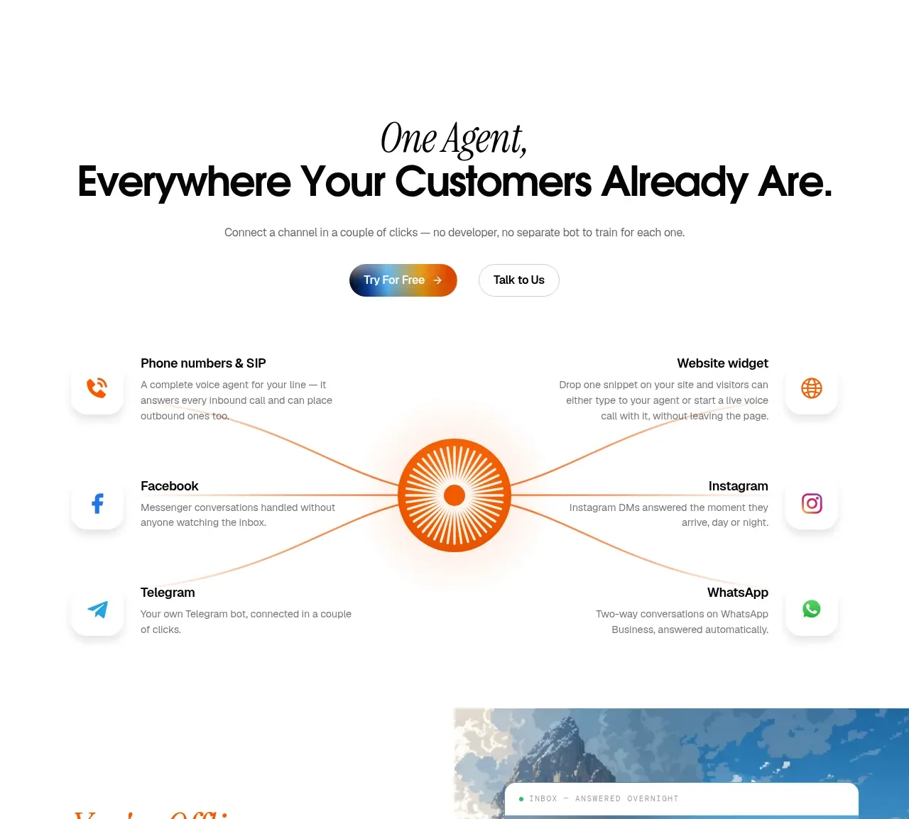
 Omnichannel connection map
IntellAgents.io · Feature grid
Omnichannel connection map
IntellAgents.io · Feature grid