 kage
kage
notchpop.com

Design analysis
A six-card grid communicates secondary capabilities in a quieter format, using narrow visual headers and substantial readable descriptions.
Prompt preview
## Reference images

Study these alongside the description below: hierarchy, rhythm, spacing, colour. Build for the product you are asked about, using this design language.

- Component: https://kage-design-assets.t3.tigrisfiles.io/components/notchpop/1c698f48-5c0e-4cfb-974b-c3c3cf38c197-1790316296-5.webp
- Full page it was cut from: https://kage-design-assets.t3.tigrisfiles.io/screenshots/notchpop/1c698f48-5c0e-4cfb-974b-c3c3cf38c197-1790316211358-full.webp
- Component on Kage: https://kage.design/component/notchpop-feature-grid-3

## Before you start
Ask what the user's product and brand are, then apply the principles below to that product rather than copying the reference.

Design a calm six-item capability grid in three columns, with two rows. Each card is a white rounded rectangle with a subtle #e6eaee border and minimal shadow. Reserve a 70–90px top visual strip for a tiny status or product indicator, using a cool blue gradient (#6ca5f5 to #d9e8fb), then place a bold 15–16px title and 13–14px body copy below. Keep cards around 180–200px tall, align text consistently, and use 16px gaps. Use restrained navy text and gray descriptions. Add a subtle hover border color and keyboard focus ring.

Never: use logos, product names, copy, illustrations, or imagery from the reference.
More components

 Spend visibility and daily-cost breakdown
Subscrr · Feature grid
Spend visibility and daily-cost breakdown
Subscrr · Feature grid
 Reminders and simple setup flow
Subscrr · Feature grid
Reminders and simple setup flow
Subscrr · Feature grid

 Interactive product demonstration
NotchPop · Feature grid
Interactive product demonstration
NotchPop · Feature grid
 Focused feature cards
NotchPop · Feature grid
Focused feature cards
NotchPop · Feature grid
 Security and permissions cards
NotchPop · Feature grid
Security and permissions cards
NotchPop · Feature grid
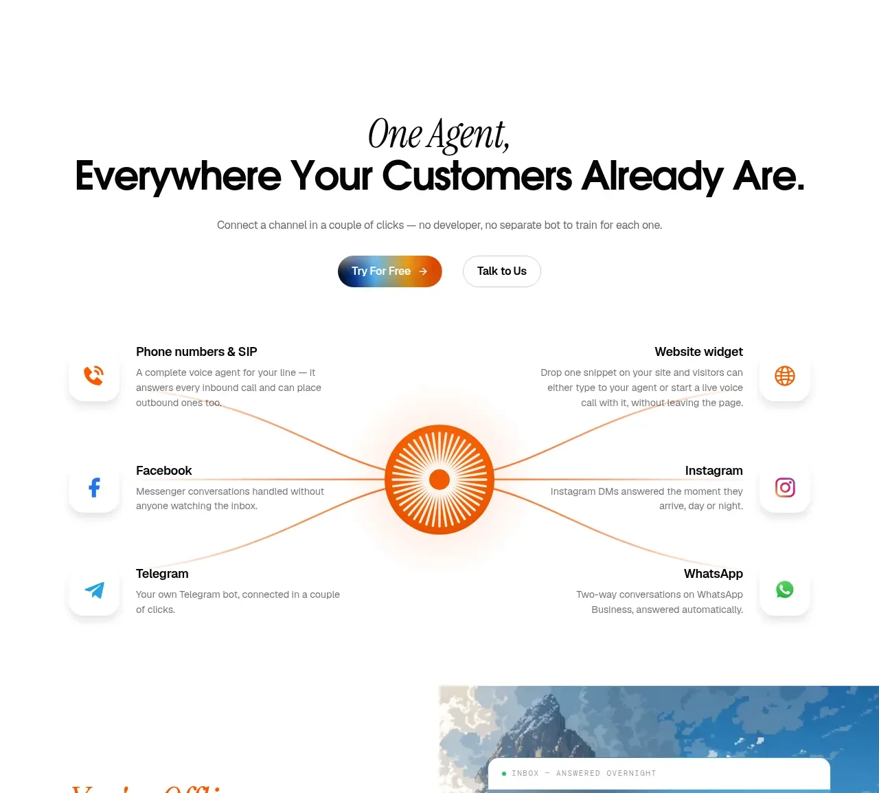
 Omnichannel connection map
IntellAgents.io · Feature grid
Omnichannel connection map
IntellAgents.io · Feature grid