kage
kage
notchpop.com
Design analysis
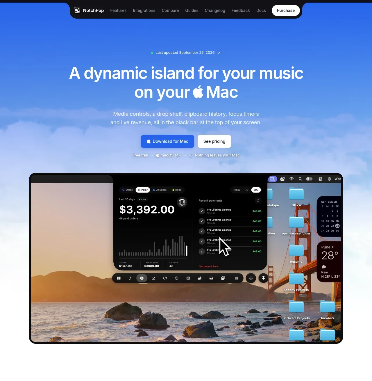
The hero combines a vivid blue atmospheric background, centered headline and supporting copy, two CTAs, a small trust line, and a large product screenshot that demonstrates the app in context.
Prompt preview
## Reference images

Study these alongside the description below: hierarchy, rhythm, spacing, colour. Build for the product you are asked about, using this design language.

- Component: https://kage-design-assets.t3.tigrisfiles.io/components/notchpop/1c698f48-5c0e-4cfb-974b-c3c3cf38c197-1790316294-1.webp
- Full page it was cut from: https://kage-design-assets.t3.tigrisfiles.io/screenshots/notchpop/1c698f48-5c0e-4cfb-974b-c3c3cf38c197-1790316211358-full.webp
- Component on Kage: https://kage.design/component/notchpop-hero

## Before you start
Ask what the user's product and brand are, then apply the principles below to that product rather than copying the reference.

Create a centered SaaS/product hero with a vivid blue-to-sky gradient background (#2878e8 to #b9d9f4) and a subtle atmospheric texture made with gradients only. Place a tiny update/status eyebrow above a large two-line headline, followed by concise supporting copy. Use a dark primary pill CTA and a white secondary pill CTA, then a quiet metadata line below. Finish the hero with one large rounded Mac desktop/product preview that overlaps the lower area; it should have a dark frame, 12–16px radius, and a soft shadow. Keep the content column narrow, headline near-black or white depending on contrast, and use generous vertical spacing so the screenshot feels like the proof point rather than decoration. Buttons should have hover lift and clear focus states.

Never: use logos, product names, copy, illustrations, or imagery from the reference.