 kage
kage
notchpop.com
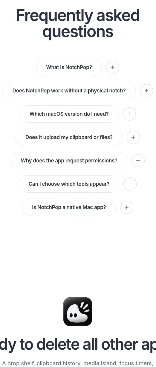
Design analysis
A single centered pricing card makes the no-subscription proposition unmistakable, with a prominent price, device selector, benefits, and two stacked actions.
Prompt preview
## Reference images

Study these alongside the description below: hierarchy, rhythm, spacing, colour. Build for the product you are asked about, using this design language.

- Component: https://kage-design-assets.t3.tigrisfiles.io/components/notchpop/1c698f48-5c0e-4cfb-974b-c3c3cf38c197-1790316298-9.webp
- Full page it was cut from: https://kage-design-assets.t3.tigrisfiles.io/screenshots/notchpop/1c698f48-5c0e-4cfb-974b-c3c3cf38c197-1790316211358-full.webp
- Component on Kage: https://kage.design/component/notchpop-pricing-table

## Before you start
Ask what the user's product and brand are, then apply the principles below to that product rather than copying the reference.

Build a centered single-offer pricing section with a concise heading above a narrow card. The card should use a white background, 1px #e6e9ed border, 16px radius, and a soft shadow. Include a small uppercase billing label, an oversized dark price, a subtle billing qualifier, a segmented device/license selector, a short checklist of included benefits, and two full-width pill buttons: dark primary purchase and white outlined trial/secondary action. Use 24–32px internal padding, 12–16px spacing, and a clear focus/selected state for the selector. Keep the pricing hierarchy obvious and avoid competing plans.

Never: use logos, product names, copy, illustrations, or imagery from the reference.
More components
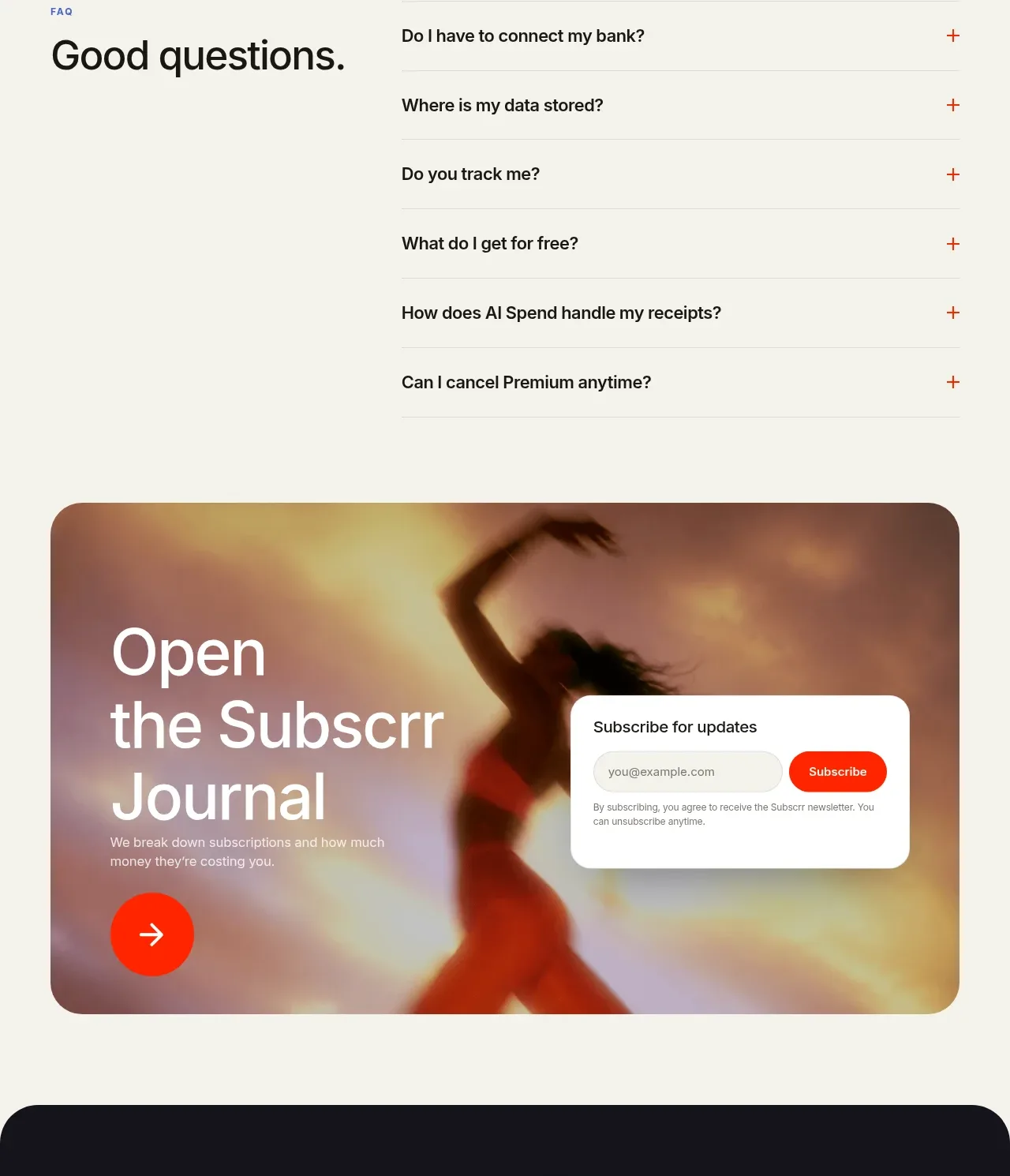
 Free and premium pricing comparison
Subscrr · Pricing table
Free and premium pricing comparison
Subscrr · Pricing table
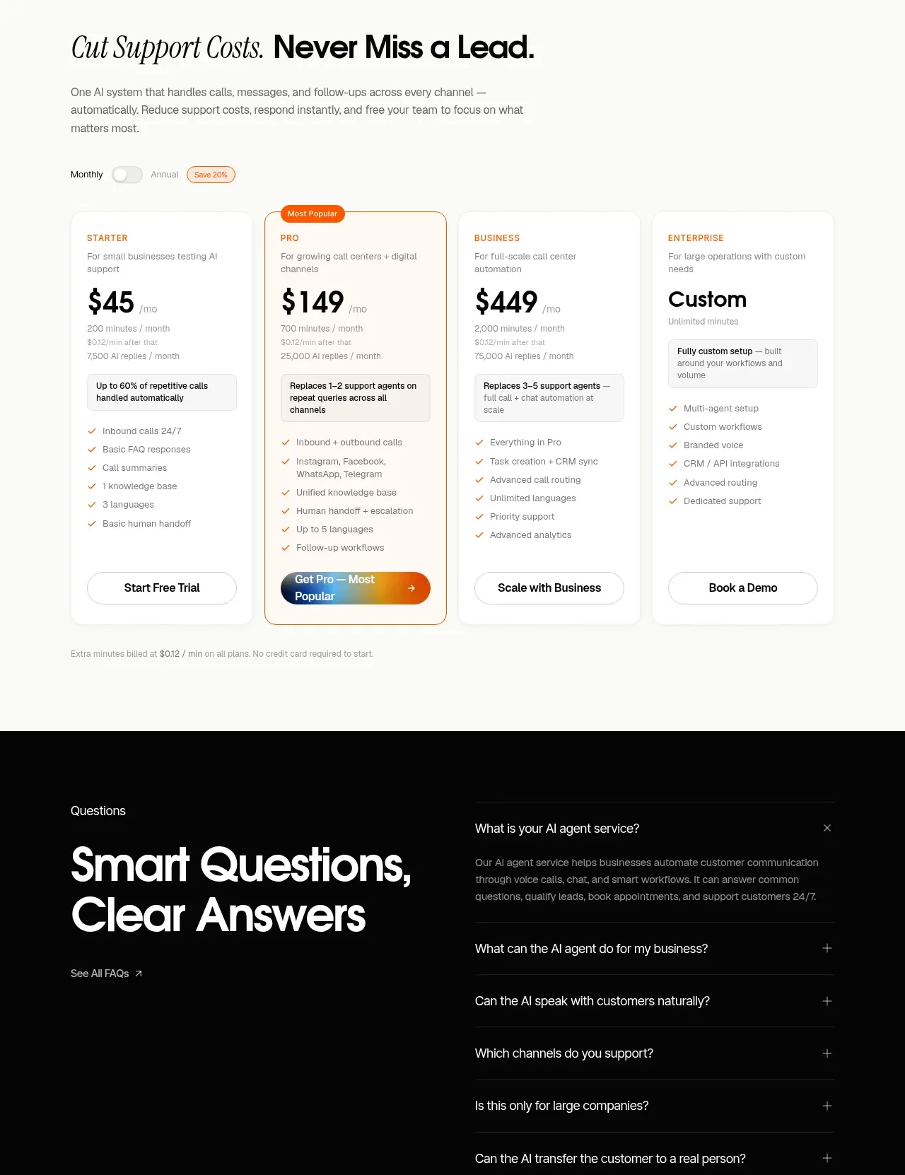
 Support plan pricing
IntellAgents.io · Pricing table
Support plan pricing
IntellAgents.io · Pricing table
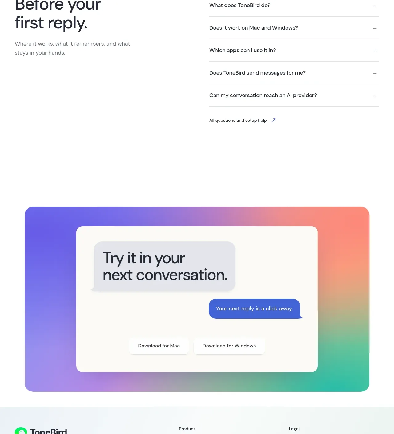
 Four-tier pricing table
ToneBird · Pricing table
Four-tier pricing table
ToneBird · Pricing table
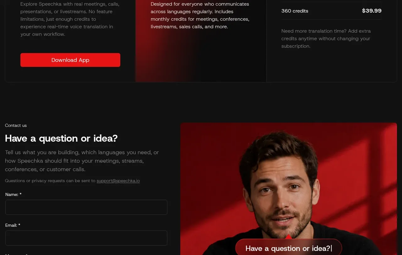
 Trial and subscription plans
Speechka · Pricing table
Trial and subscription plans
Speechka · Pricing table
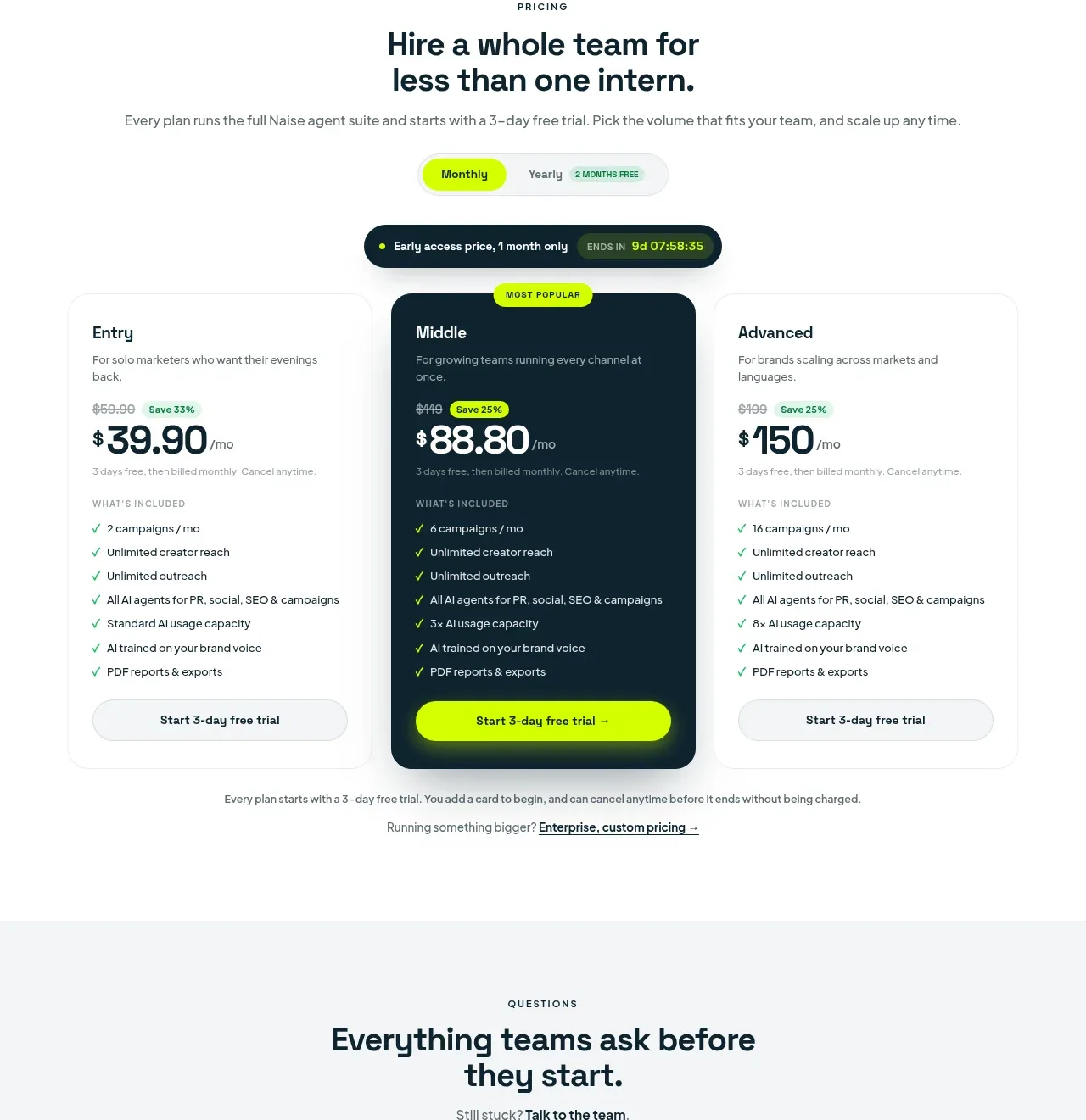
 Three-tier pricing plans
Naise AI · Pricing table
Three-tier pricing plans
Naise AI · Pricing table
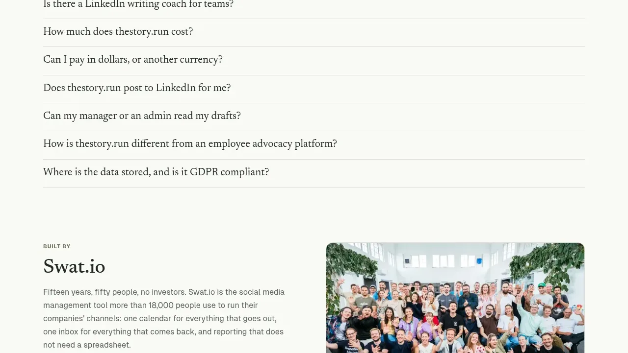
 Simple usage-based pricing
thestory.run · Pricing table
Simple usage-based pricing
thestory.run · Pricing table