 kage
kage
runnova.ai
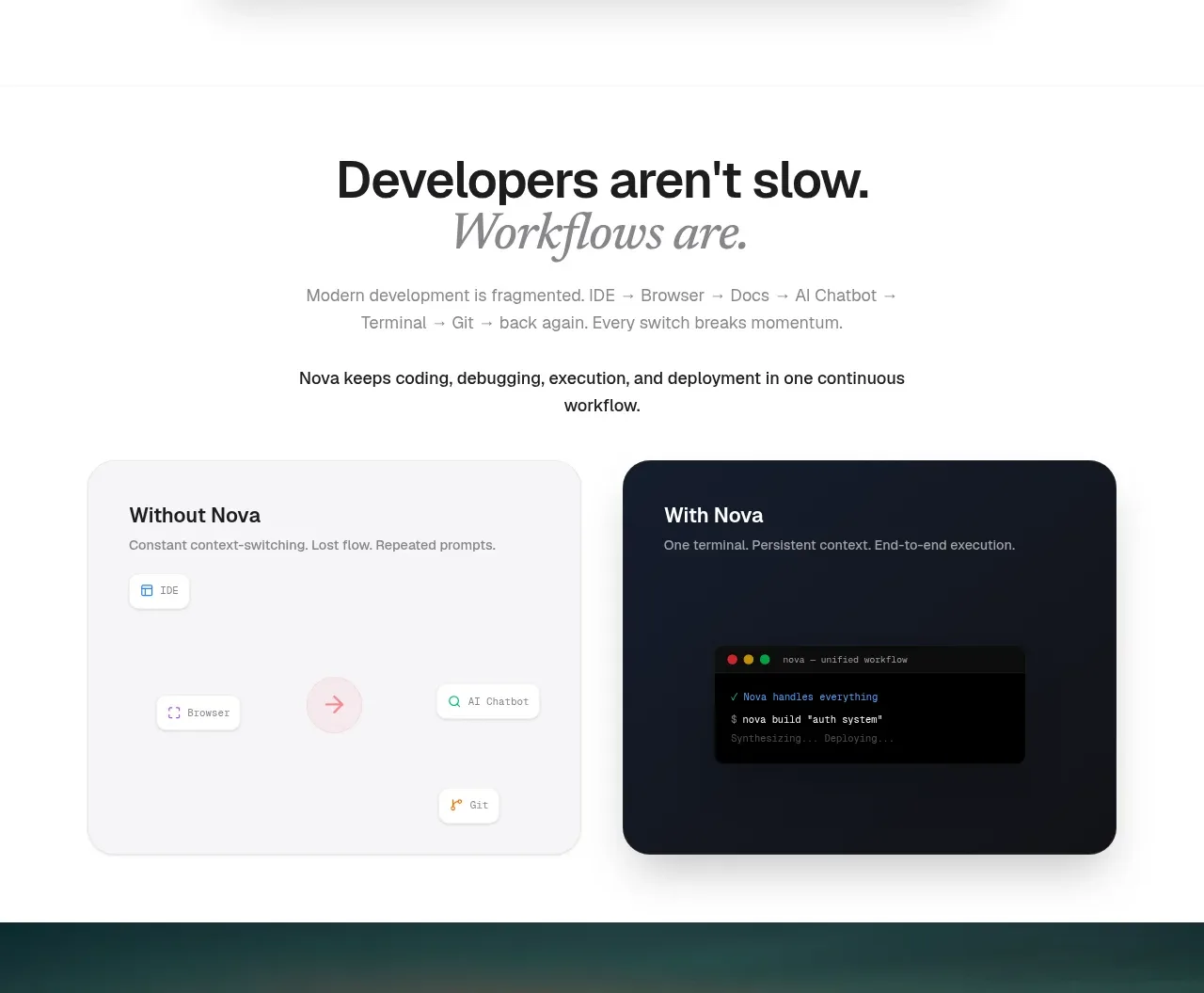
Design analysis
This section explains the problem and solution through a centered editorial heading followed by two large contrasting comparison cards.
Prompt preview
## Reference images

Study these alongside the description below: hierarchy, rhythm, spacing, colour. Build for the product you are asked about, using this design language.

- Component: https://kage-design-assets.t3.tigrisfiles.io/components/nova-cli-v1-0/f9d737a9-3081-4768-944e-79473fdb1d08-1791525757-3.webp
- Full page it was cut from: https://kage-design-assets.t3.tigrisfiles.io/screenshots/nova-cli-v1-0/f9d737a9-3081-4768-944e-79473fdb1d08-1791525679651-full.webp
- Component on Kage: https://kage.design/component/nova-cli-v1-0-feature-grid

## Before you start
Ask what inefficient workflow the user's product replaces and what the improved workflow looks like. Use the principles below with original content.

Build a comparison section on a warm white background. Center a bold two-line heading with an italic editorial emphasis, followed by a short explanatory paragraph and one concise proof statement. Below, place two equal-width cards in a two-column grid with a 28–32px gap. The “before” card should use a soft off-white surface #f5f5f6 and dark text; the “after” card should use deep navy-charcoal #111822 with white text. Use 24px rounded corners, 32px padding, small labels, and simple workflow tokens or code-like UI elements rather than decorative illustrations. Keep the visual contrast obvious and the hierarchy scannable. Stack the cards at mobile widths.

Never use logos, product names, copy, illustrations, or imagery from the reference.
More components

 Privacy and optional intelligence
Mailwell · Feature grid
Privacy and optional intelligence
Mailwell · Feature grid
 Reliable, recoverable actions
Mailwell · Feature grid
Reliable, recoverable actions
Mailwell · Feature grid
 Unified account setup
Mailwell · Feature grid
Unified account setup
Mailwell · Feature grid
 Fast local workflow and calm reading
Mailwell · Feature grid
Fast local workflow and calm reading
Mailwell · Feature grid

 Cloud layer workflows
ProcBoss · Feature grid
Cloud layer workflows
ProcBoss · Feature grid
 Operational blind spots
ProcBoss · Feature grid
Operational blind spots
ProcBoss · Feature grid