kage
kage
runnova.ai

Design analysis
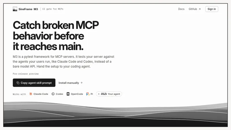
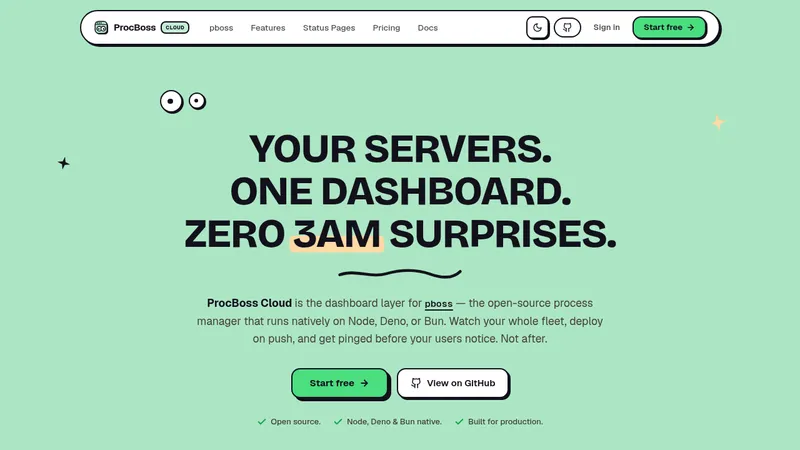
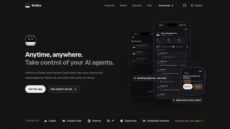
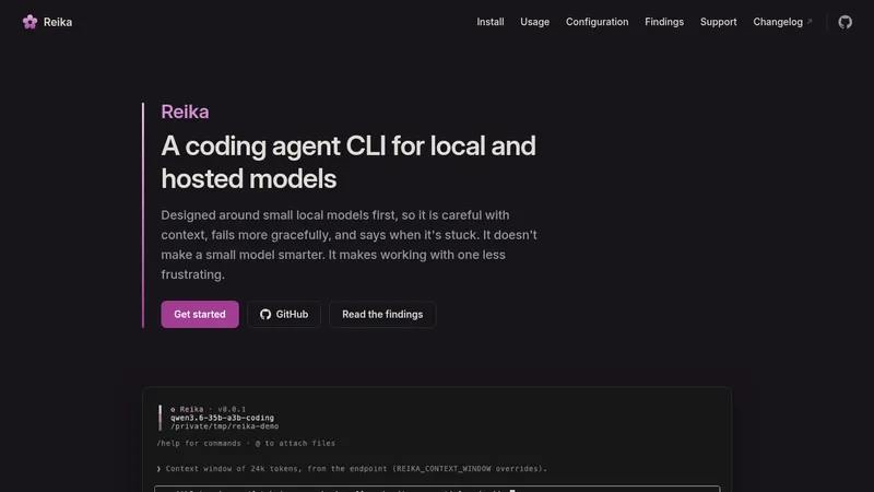
A long-form developer-tool landing page alternates between cinematic full-bleed field imagery and restrained white editorial sections. Bold sans-serif headlines are paired with italic serif sublines, while rounded black or lightly tinted panels, terminal/browser demos, comparison cards, a capability table, testimonials, metrics, FAQ rows, and a repeat-image footer progressively move from product explanation to proof and conversion.
Prompt preview
## Reference images

Study these alongside the description below: hierarchy, rhythm, spacing, colour. Build for the product you are asked about, using this design language.

- Full page: https://kage-design-assets.t3.tigrisfiles.io/screenshots/nova-cli-v1-0/f9d737a9-3081-4768-944e-79473fdb1d08-1791525679651-full.webp
- Above the fold: https://kage-design-assets.t3.tigrisfiles.io/screenshots/nova-cli-v1-0/f9d737a9-3081-4768-944e-79473fdb1d08-1791525675142.webp
- Design on Kage: https://kage.design/designs/nova-cli-v1-0-landing-page

## Before you start
Ask the user what they are building, who it is for, and what brand assets they already have—especially the product name, colours, typefaces, logo, and any existing imagery. Wait for their answers before designing. Apply the system below to their product, not to the reference product.

## Page structure
1. **Cinematic hero:** Use a large rounded-corner, full-bleed visual with a dark-to-warm horizon treatment, a compact pill-like navigation overlaid at the top, a centered two-line headline, a small explanatory paragraph at bottom-left, and a contrasting CTA at bottom-right.
2. **Product introduction and interactive demo:** Follow with a generous white section containing a centered headline and italic serif subline, short supporting copy, a row of compact command-like tabs, and a large browser/terminal demonstration panel beneath.
3. **Workflow problem statement:** Add a white editorial section with a centered headline, serif emphasis line, explanatory paragraph, and a short bold conclusion that frames the product as a unified workflow.
4. **Before/after comparison:** Place two large rounded cards side by side: a pale “without” state showing scattered tools and a dark “with” state showing one terminal workflow. Keep the diagram simple and centered inside each card.
5. **Feature overview over imagery:** Transition to a full-width repeat of the hero’s landscape treatment. Overlay a left-aligned heading and three equal dark translucent cards in a horizontal row, numbered with oversized low-contrast numerals and followed by concise feature descriptions.
6. **Intentional visual pause:** Include a very large black interval after the feature band if the product needs a dramatic scroll break; use it as negative space rather than filling it with extra UI.
7. **Capability comparison:** Return to white with a centered heading and coloured italic serif subline, then present a narrow, airy three-column comparison table. Use bold capability names, muted “typical tools” values, and a differentiated product column.
8. **Testimonials:** Add a lightly tinted section with a centered heading and subtitle, followed by a three-column grid of small rounded testimonial cards. Mix subtle pastel washes, small topic chips, star ratings, names, and a pair of controls beneath the grid for pausing and viewing more reviews.
9. **Metrics and installation CTA:** Place a wide near-black rounded panel containing three headline metrics across the top, a centered heading and serif subline, a terminal install command with a copy button, and small community/resource links below.
10. **FAQ:** Use a white section with a small eyebrow, centered heading with italic serif emphasis, and a single narrow accordion stack. Show one expanded answer and several collapsed rows with circular chevrons.
11. **Image-based footer:** Finish with a full-width crop of the hero landscape, using a decorative zigzag transition at the top. Overlay a compact logo/brand area and description on the left, multiple small navigation columns on the right, and a small legal line near the bottom.

## Design language
- Build hierarchy through a strong sans-serif headline paired with an italic serif accent line; use very large, tightly set display text and smaller muted sans-serif body copy.
- Keep the main reading sections spacious and centered, then increase density in demos, comparison cards, testimonial grids, FAQ rows, and footer navigation.
- Alternate rhythm deliberately: cinematic image, quiet white explanation, diagrammatic proof, image-backed feature band, editorial comparison, social proof, conversion panel, then utility content.
- Treat imagery as a recurring brand device: use a dusk landscape or an equivalent product-specific visual with deep teal/near-black shadows, burnt orange horizon highlights, and warm green foreground tones. Approximate supporting colours: #07151A, #F08A2B, #355A3A, #FFFFFF, #F6F6F4, and #111113.
- Use near-black text on white surfaces, white text on dark panels, and a restrained blue accent for occasional editorial emphasis. Avoid a broad rainbow palette; pastel yellow, blue, and pink should only appear as very subtle testimonial-card washes.
- Pair large geometric sans-serif headings with an elegant italic serif for secondary phrases. Use compact monospace or terminal-style text inside command tabs, demos, chips, and install controls.
- Use generous whitespace and a centered max-width grid for editorial sections. Use three-column grids for features and testimonials, two-column grids for comparisons, and narrow single-column widths for tables and FAQs.
- Prefer 18–28px rounded corners on major panels and cards, pill shapes for navigation, chips, buttons, and controls, and thin #E7E7E7 borders on light UI. Use soft, broad shadows only beneath major elevated panels; keep inner UI nearly flat.
- Make primary CTAs high-contrast pills, usually white on imagery or black on white. Make secondary controls quiet and compact, with clear terminal affordances for install and copy actions.
- If motion is added, use restrained scroll reveals, gentle image parallax, tab switching for the demo, testimonial pause/play, FAQ expansion, and a copy-to-clipboard confirmation. Motion should preserve the editorial calm rather than feel like a dashboard.
- Ensure the design collapses gracefully: stack comparison and feature cards on narrow screens, turn navigation into a compact menu, keep the hero CTA readable, and make the table horizontally scrollable or convert each row into a labelled card.

## Never
- Do not copy the reference product’s logos, wordmarks, product names, tagline, exact copy, illustrations, photography, imagery, icon set, testimonial text, metrics, or terminal commands.
- Do not present the result as NOVA or imply any affiliation with the reference.
- Create original product-specific content and brand assets supplied by the user, while preserving only the reusable layout principles and interaction patterns.
Components from this page
All components
 Floating site navigation
NOVA CLI v1.0 · Navigation
Floating site navigation
NOVA CLI v1.0 · Navigation
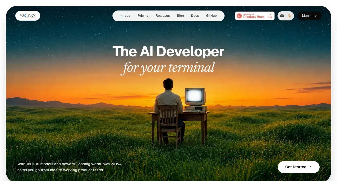 Cinematic developer hero
NOVA CLI v1.0 · Hero
Cinematic developer hero
NOVA CLI v1.0 · Hero
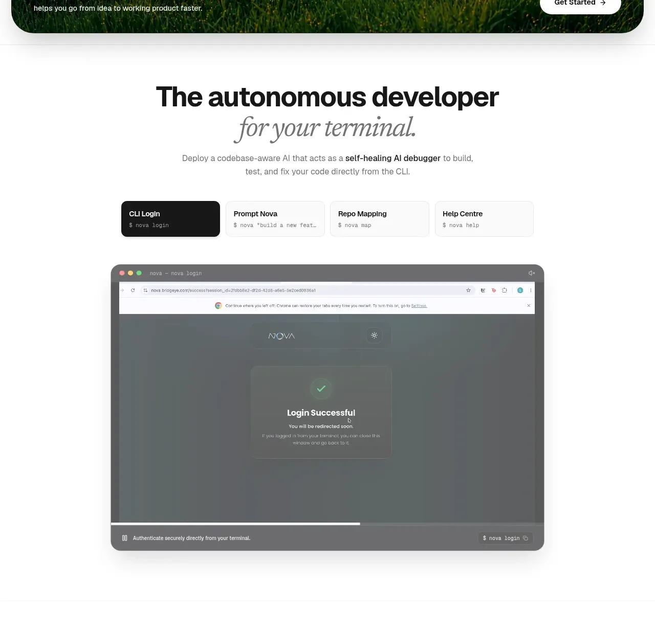 Autonomous developer demo
NOVA CLI v1.0 · Hero
Autonomous developer demo
NOVA CLI v1.0 · Hero
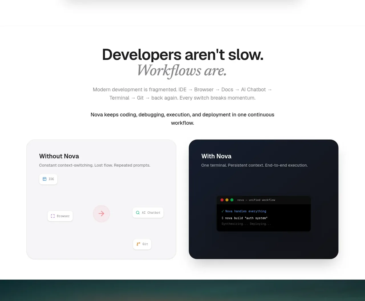 Workflow comparison
NOVA CLI v1.0 · Feature grid
Workflow comparison
NOVA CLI v1.0 · Feature grid
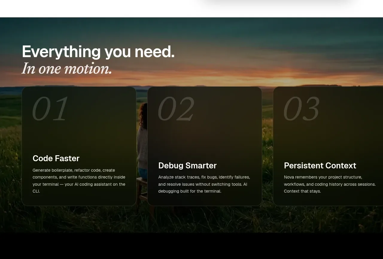 Three capability cards
NOVA CLI v1.0 · Feature grid
Three capability cards
NOVA CLI v1.0 · Feature grid
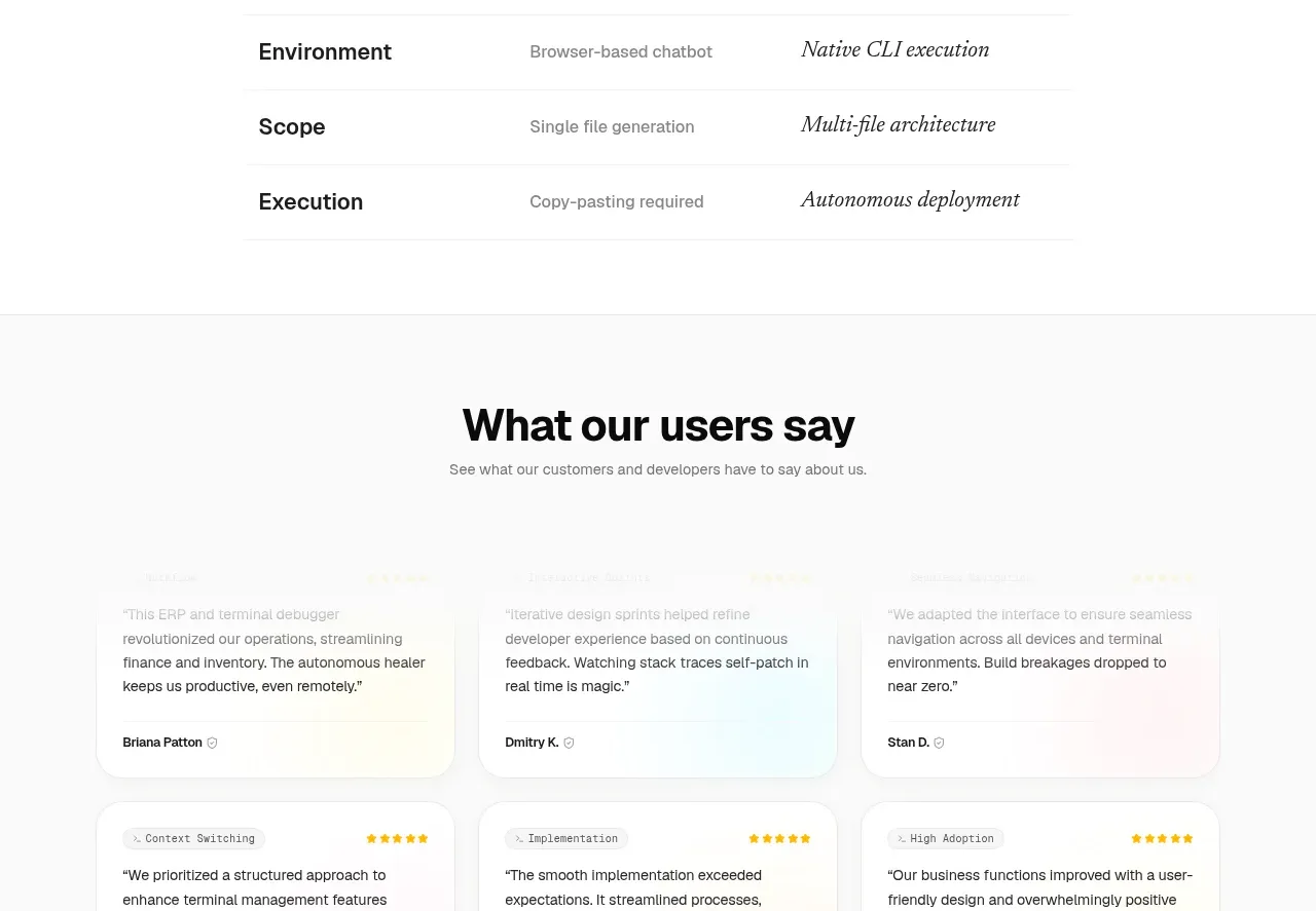 Capability differentiation table
NOVA CLI v1.0 · Table
Capability differentiation table
NOVA CLI v1.0 · Table
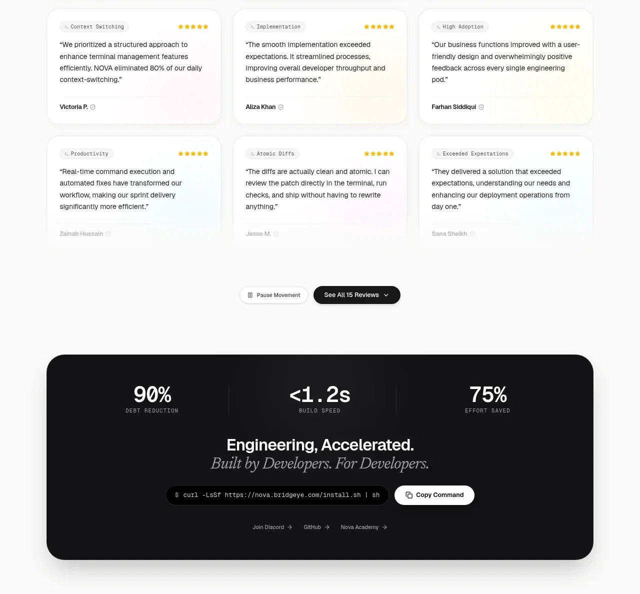 Customer testimonial grid
NOVA CLI v1.0 · Testimonials
Customer testimonial grid
NOVA CLI v1.0 · Testimonials
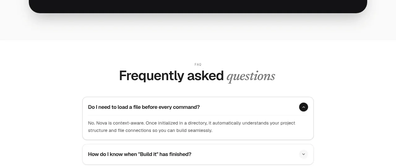 Install command CTA
NOVA CLI v1.0 · Call to action
Install command CTA
NOVA CLI v1.0 · Call to action
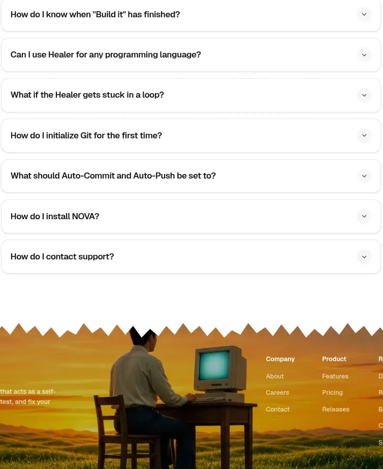 Frequently asked questions
NOVA CLI v1.0 · FAQ
Frequently asked questions
NOVA CLI v1.0 · FAQ
 Image-backed site footer
NOVA CLI v1.0 · Footer
Image-backed site footer
NOVA CLI v1.0 · Footer