kage
kage
runnova.ai

Design analysis
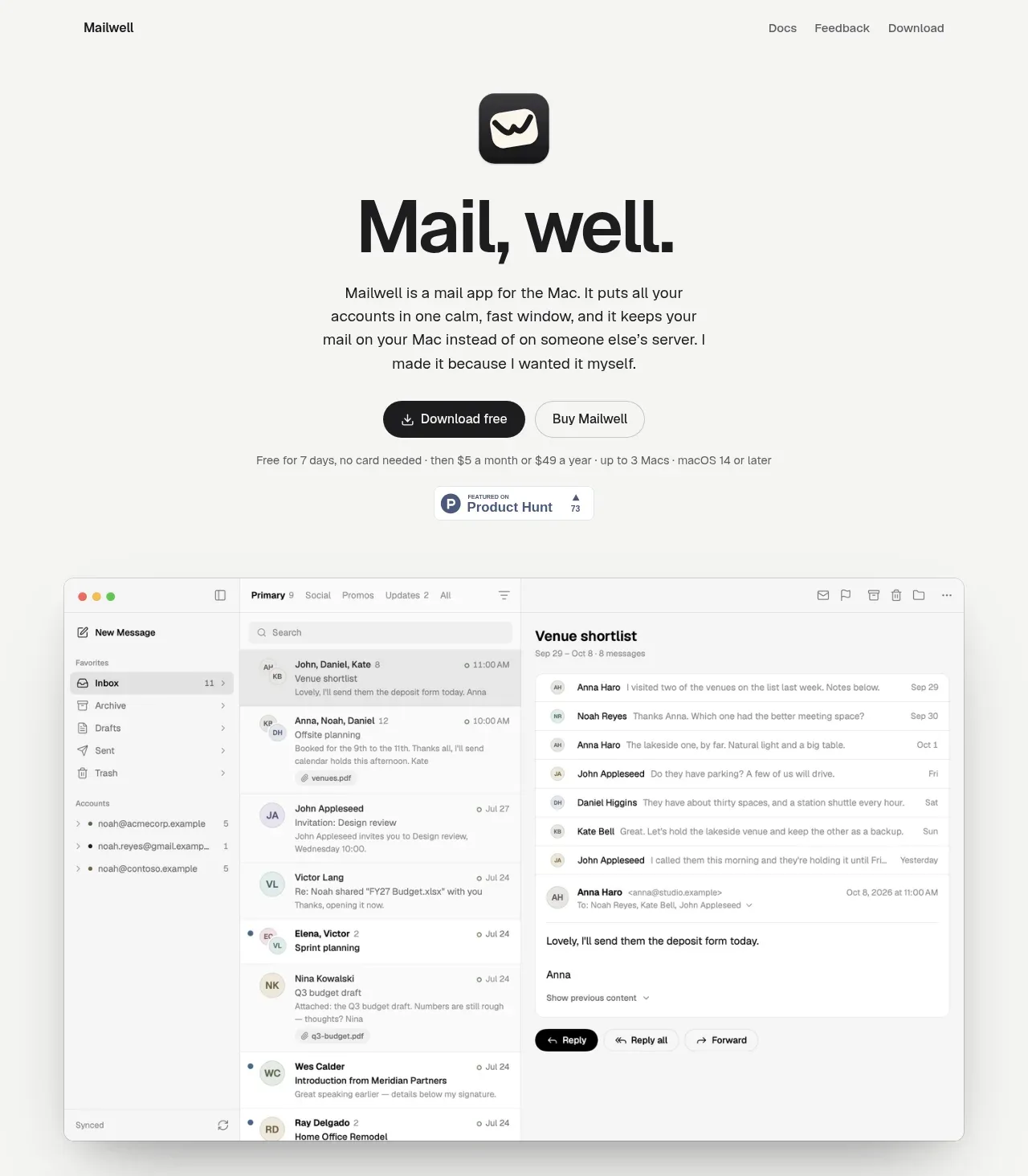
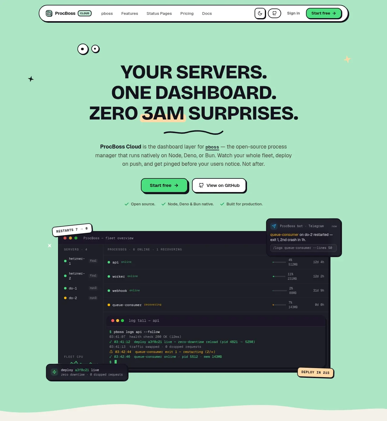
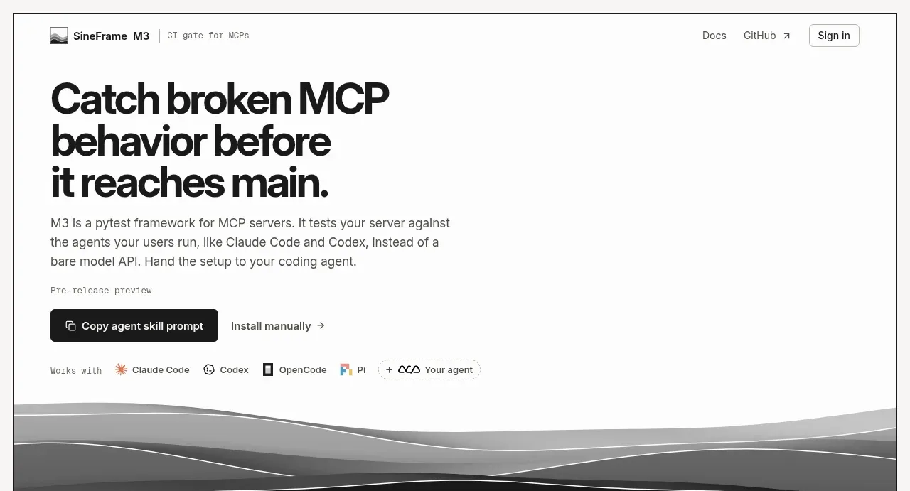
A clean white product-introduction band combines an editorial heading, explanatory copy, command tabs, and a large browser/product demonstration.
Prompt preview
## Reference images

Study these alongside the description below: hierarchy, rhythm, spacing, colour. Build for the product you are asked about, using this design language.

- Component: https://kage-design-assets.t3.tigrisfiles.io/components/nova-cli-v1-0/f9d737a9-3081-4768-944e-79473fdb1d08-1791525757-2.webp
- Full page it was cut from: https://kage-design-assets.t3.tigrisfiles.io/screenshots/nova-cli-v1-0/f9d737a9-3081-4768-944e-79473fdb1d08-1791525679651-full.webp
- Component on Kage: https://kage.design/component/nova-cli-v1-0-hero-2

## Before you start
Ask for the user's product, the key workflow it demonstrates, and the brand typography and colours. Apply the following structure to that content.

Create a white product-demo section with a centered heading, an italic secondary line, and a short paragraph constrained to roughly 520px. Below it, add a compact tab strip for switching between example commands or workflows. The active tab should be near-black #171717 with white text; inactive tabs should be white with a #e8e8e8 border and soft shadow. Under the tabs, show a large centered product preview in a rounded browser frame, using a neutral charcoal surface #5b6264 and subtle shadow. Maintain a vertical rhythm of 28–40px between heading, copy, tabs, and preview. Tabs must be keyboard accessible and update the preview without causing layout shift.

Never use logos, product names, copy, illustrations, or imagery from the reference.