 kage
kage
ariso.ai

Design analysis
A focused closing CTA repeats the core promise, adds a brief reassurance, and presents the platform actions in a compact centered block.
Prompt preview
## Reference images

Study these alongside the description below: hierarchy, rhythm, spacing, colour. Build for the product you are asked about, using this design language.

- Component: https://kage-design-assets.t3.tigrisfiles.io/components/oats/88861292-7fec-4a47-8882-69e9dc773ed4-1789452063-6.webp
- Full page it was cut from: https://kage-design-assets.t3.tigrisfiles.io/screenshots/oats/88861292-7fec-4a47-8882-69e9dc773ed4-1789452033551-full.webp
- Component on Kage: https://kage.design/component/oats-cta

## Before you start
Ask what single conversion the user's product wants at this point and which platforms or next steps should be offered. Then tailor this CTA to that goal.

Create a centered, high-whitespace CTA section on a warm off-white background. Use a bold headline with a small accent mark or coloured word, one sentence of supporting reassurance, and a single horizontal row of platform/action buttons. Make the primary action dark and filled, with secondary actions white or transparent and lightly bordered. Use #FAFAF7 background, #171716 heading, #5E5C57 body text, #F4D21F accent, #E6E4DC borders, 10px radius, and 44px buttons. Keep the content narrow and vertically balanced; stack the buttons on mobile. Avoid adding unrelated navigation or feature content.

Never: use the reference's logos, product names, copy, illustrations, or imagery.
More components
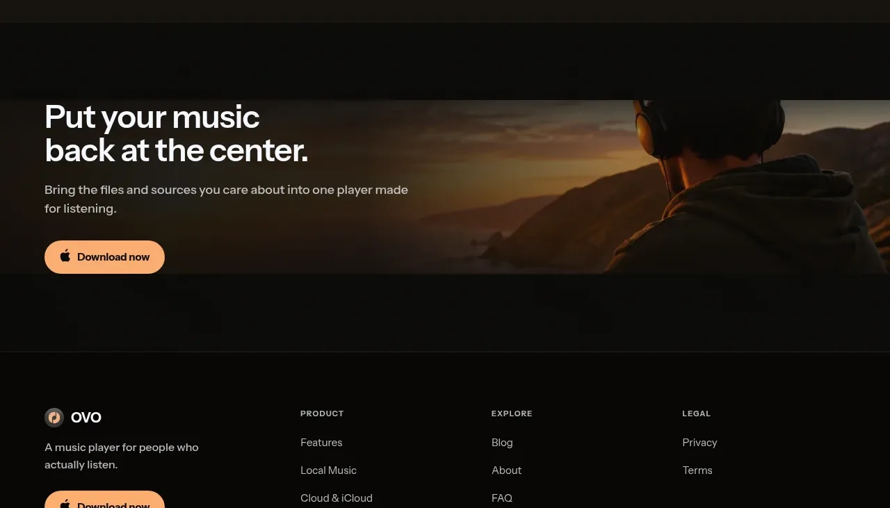
 Closing download call to action
OVO · Call to action
Closing download call to action
OVO · Call to action
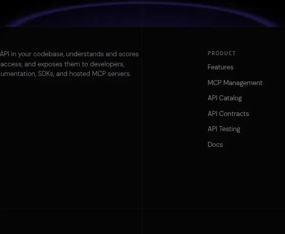
 Final conversion CTA
Elva · Call to action
Final conversion CTA
Elva · Call to action
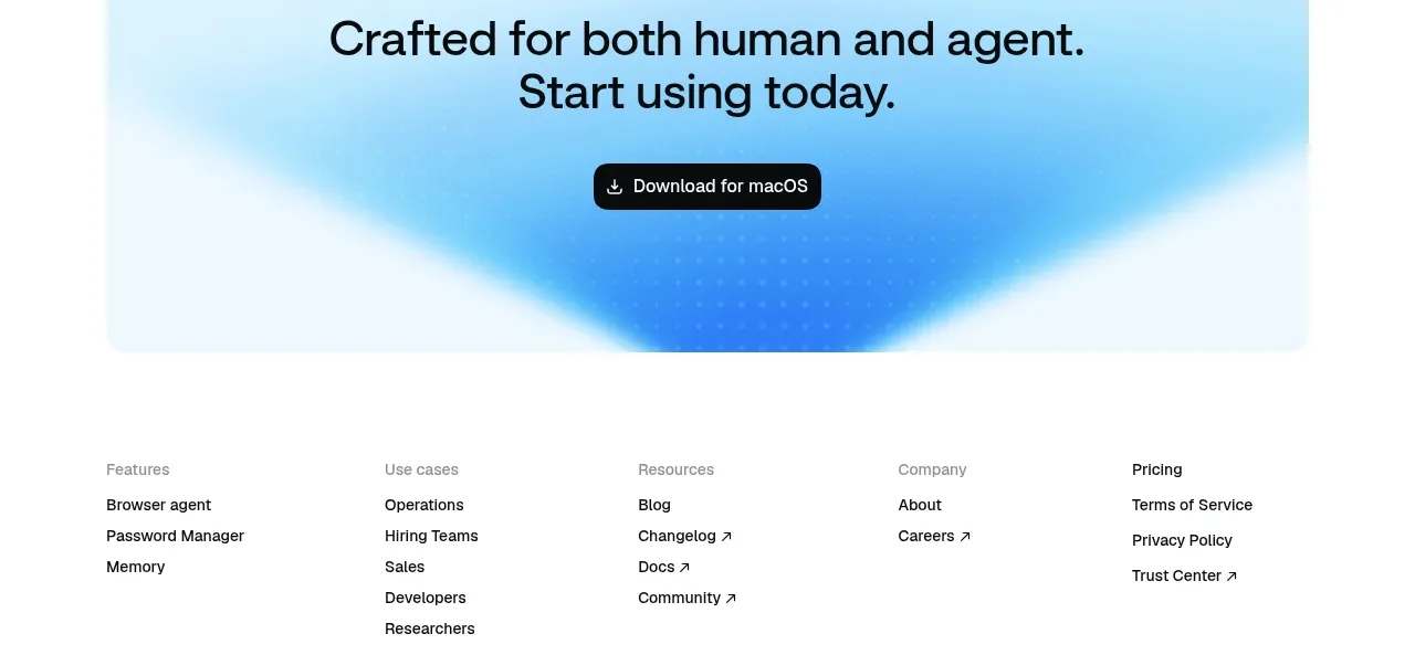
 Final download call to action
Aside · Call to action
Final download call to action
Aside · Call to action

 Website migration CTA
Neopress · Call to action
Website migration CTA
Neopress · Call to action
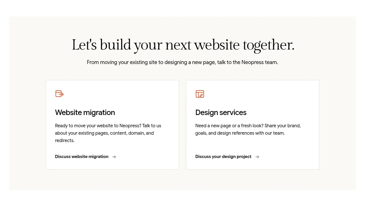 Build or migrate services CTA
Neopress · Call to action
Build or migrate services CTA
Neopress · Call to action
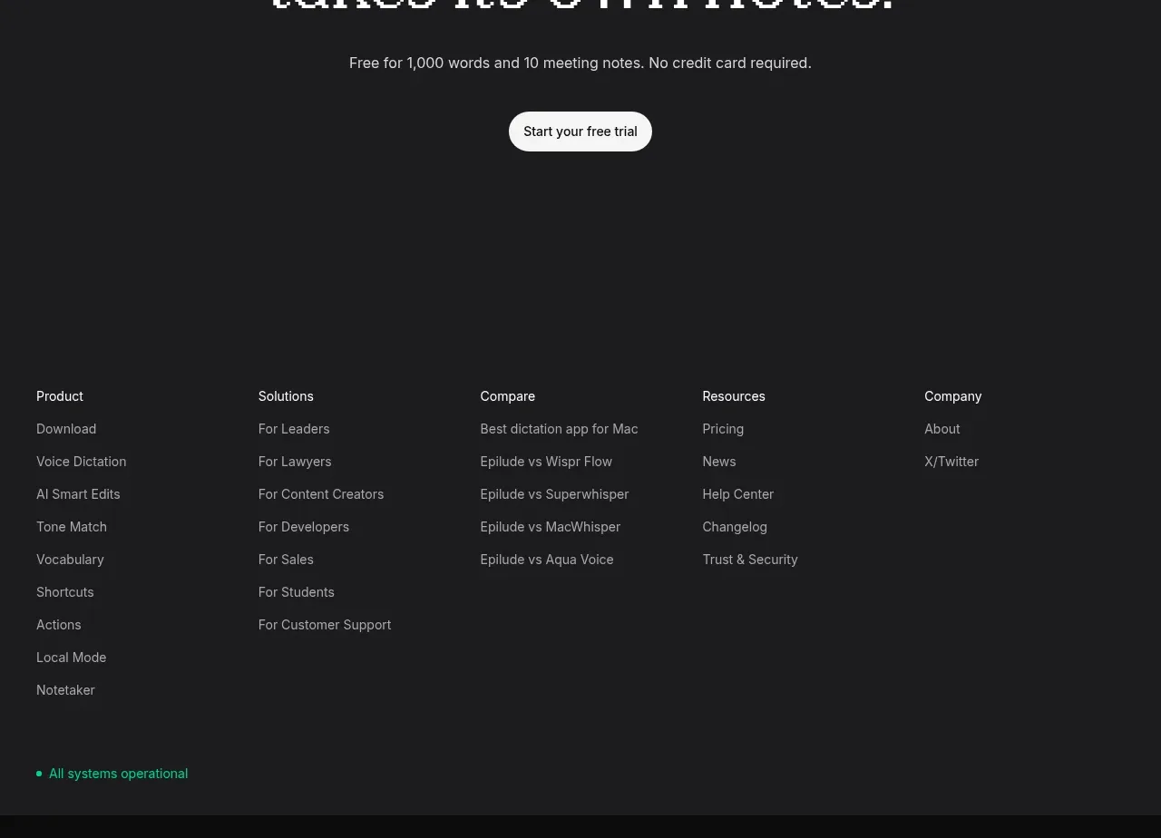
 Final trial call to action
Epilude Notetaker · Call to action
Final trial call to action
Epilude Notetaker · Call to action