 kage
kage
ariso.ai
Design analysis
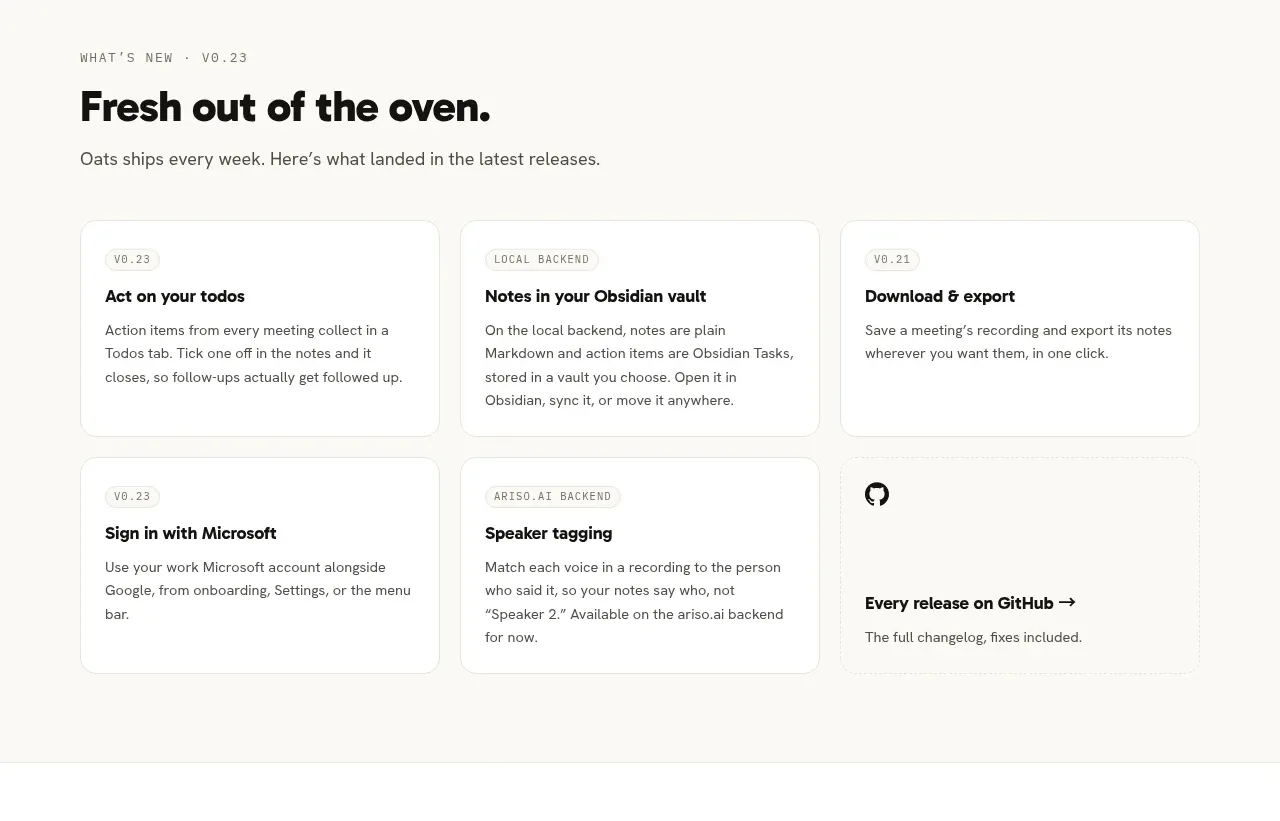
A release-focused section uses a clear heading and a six-card grid to communicate ongoing product momentum without overwhelming the reader.
Prompt preview
## Reference images

Study these alongside the description below: hierarchy, rhythm, spacing, colour. Build for the product you are asked about, using this design language.

- Component: https://kage-design-assets.t3.tigrisfiles.io/components/oats/88861292-7fec-4a47-8882-69e9dc773ed4-1789452062-2.webp
- Full page it was cut from: https://kage-design-assets.t3.tigrisfiles.io/screenshots/oats/88861292-7fec-4a47-8882-69e9dc773ed4-1789452033551-full.webp
- Component on Kage: https://kage.design/component/oats-feature-grid

## Before you start
Ask what kinds of releases, updates, or capabilities the user's product should highlight and how frequently they change. Then build an original version using these principles.

Create a light release-notes section with a small monospace or letter-spaced eyebrow, a strong heading, one sentence of context, and six equal cards in a 3-column by 2-row grid. Each card needs a tiny category/version label, a concise title, and two or three lines of explanatory text; reserve one card for a link to a broader changelog if useful. Use a centered max-width container, 16–18px grid gaps, and consistent card heights. Use #FAFAF7 or white for the section, #FFFFFF card surfaces, #E6E4DC borders, 12px radius, and restrained shadows. Headings are near-black #171716; labels use muted gray #85837B; use a small yellow accent only for emphasis. On mobile, collapse to one column while preserving readable card padding and hierarchy.

Never: use the reference's logos, product names, copy, illustrations, or imagery.







