 kage
kage
ariso.ai
Design analysis
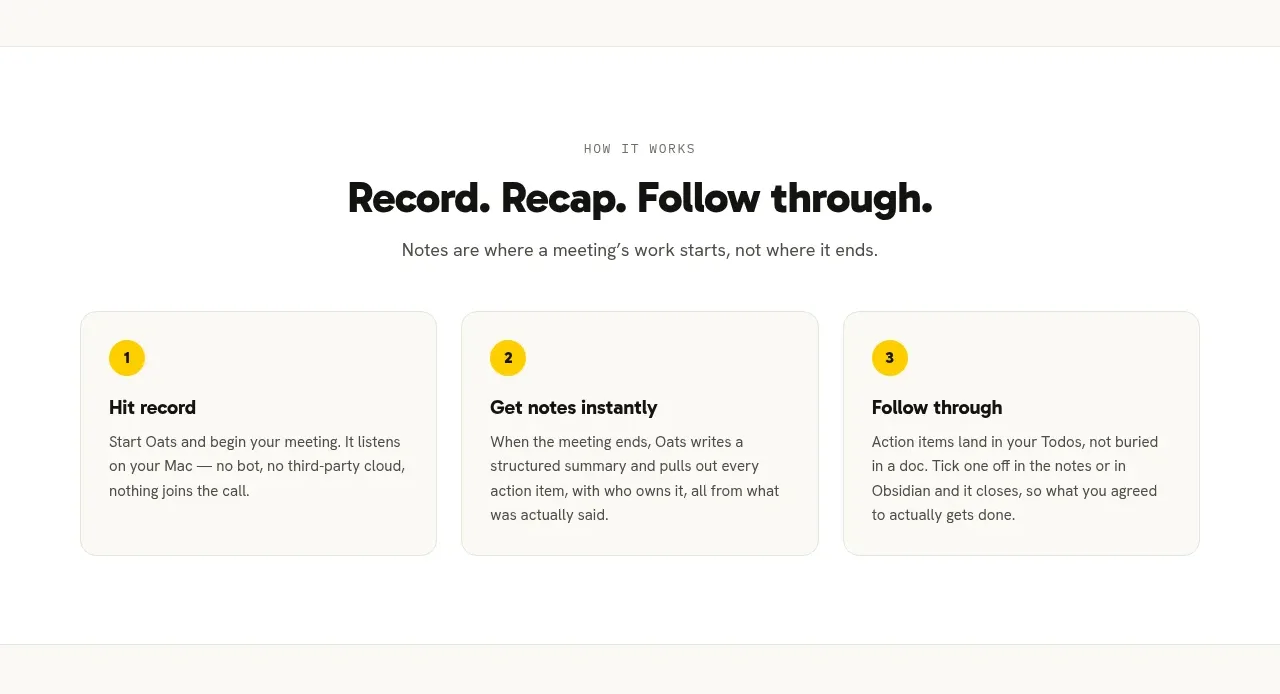
The centered “how it works” block reduces the product story to three numbered steps, making the path from input to outcome easy to scan.
Prompt preview
## Reference images

Study these alongside the description below: hierarchy, rhythm, spacing, colour. Build for the product you are asked about, using this design language.

- Component: https://kage-design-assets.t3.tigrisfiles.io/components/oats/88861292-7fec-4a47-8882-69e9dc773ed4-1789452063-3.webp
- Full page it was cut from: https://kage-design-assets.t3.tigrisfiles.io/screenshots/oats/88861292-7fec-4a47-8882-69e9dc773ed4-1789452033551-full.webp
- Component on Kage: https://kage.design/component/oats-feature-grid-2

## Before you start
Ask what the user's product's core workflow is and what three stages best explain it. Use the answers to create a tailored sequence rather than copying the reference.

Build a centered “how it works” section with a small uppercase eyebrow, a large headline, a short supporting sentence, and three horizontally aligned step cards. Each card includes a circular yellow number badge, a short action-oriented title, and a compact explanation. Keep all cards equal in height and align their internal content. Use a white background with a faint section divider, 18px column gaps, 16px card radius, #E6E4DC borders, and minimal shadow. Typography: 12px letter-spaced eyebrow in #85837B, 30–36px bold heading in #171716, 16px body copy in #5E5C57, 14–16px card titles. On smaller screens stack the cards vertically and keep the numbered badges prominent.

Never: use the reference's logos, product names, copy, illustrations, or imagery.







