 kage
kage
ariso.ai
Design analysis
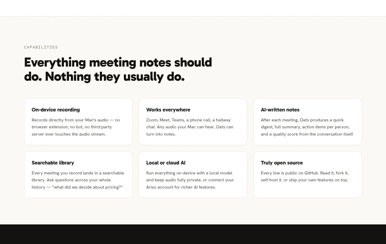
This section broadens the value proposition with six practical capability cards, organized under a direct statement of what the product does.
Prompt preview
## Reference images

Study these alongside the description below: hierarchy, rhythm, spacing, colour. Build for the product you are asked about, using this design language.

- Component: https://kage-design-assets.t3.tigrisfiles.io/components/oats/88861292-7fec-4a47-8882-69e9dc773ed4-1789452063-4.webp
- Full page it was cut from: https://kage-design-assets.t3.tigrisfiles.io/screenshots/oats/88861292-7fec-4a47-8882-69e9dc773ed4-1789452033551-full.webp
- Component on Kage: https://kage.design/component/oats-feature-grid-3

## Before you start
Ask what capabilities matter most for the user's product, which benefits are differentiating, and what audience language feels natural. Then build an original capability overview.

Create a capability section with a small uppercase eyebrow, a two-line high-impact heading, and a 3-column by 2-row grid of feature cards. Each card should have a concise benefit-led title and a short paragraph explaining the practical outcome. Keep copy scannable and avoid icons unless they add real meaning. Use a warm cream/off-white background #FAFAF7, white cards #FFFFFF, subtle #E6E4DC borders, 12px radius, and 20–24px internal padding. Set the section heading around 32–38px with tight line-height; card titles 15–17px semibold; body text 13–14px with #5E5C57. Maintain generous top and bottom whitespace and collapse to one column on mobile.

Never: use the reference's logos, product names, copy, illustrations, or imagery.







