 kage
kage
ariso.ai
Design analysis
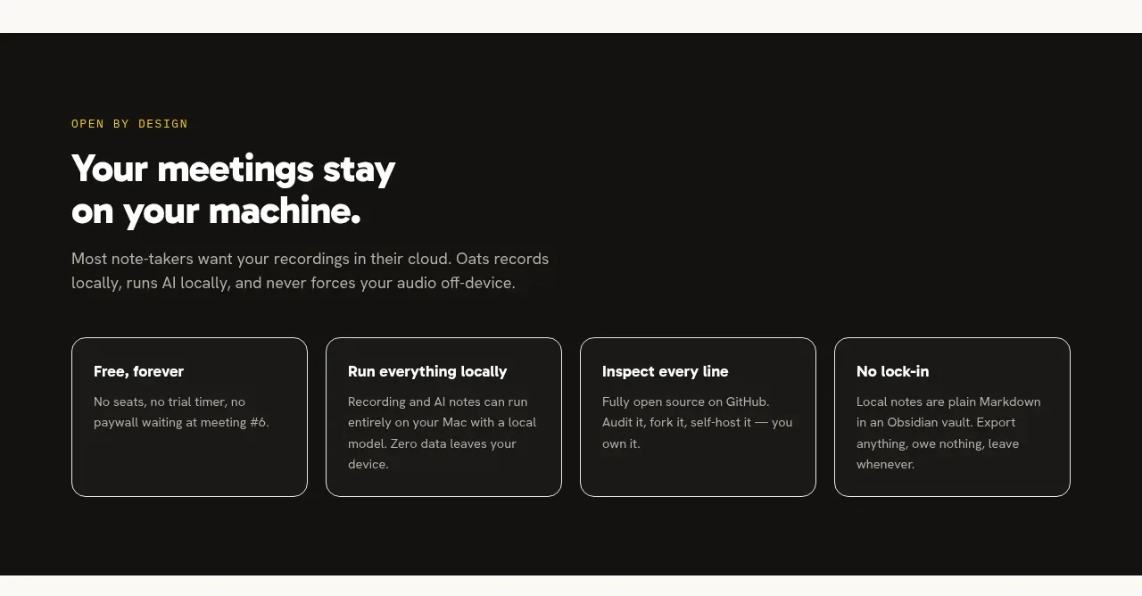
A dark contrast band communicates trust and product philosophy, with four bordered cards that make abstract principles concrete.
Prompt preview
## Reference images

Study these alongside the description below: hierarchy, rhythm, spacing, colour. Build for the product you are asked about, using this design language.

- Component: https://kage-design-assets.t3.tigrisfiles.io/components/oats/88861292-7fec-4a47-8882-69e9dc773ed4-1789452063-5.webp
- Full page it was cut from: https://kage-design-assets.t3.tigrisfiles.io/screenshots/oats/88861292-7fec-4a47-8882-69e9dc773ed4-1789452033551-full.webp
- Component on Kage: https://kage.design/component/oats-feature-grid-4

## Before you start
Ask what trust, privacy, ownership, or transparency commitments are genuinely true for the user's product. Translate those commitments into four useful principles.

Build a full-width dark principles section. Use a centered max-width container with a small yellow/olive eyebrow, a large white heading split across two lines, and a short muted introduction. Below it, place four equal cards in one row on desktop, each with a short white title and a muted explanation. Use near-black #151514 as the background, warm white #F5F4EE for headings, muted gray #AAA8A0 for body copy, accent #D7C21A for the eyebrow, and thin #77766F borders. Give cards 14px radius, 20–24px padding, and no heavy shadow. Preserve strong contrast and stack cards vertically on small screens.

Never: use the reference's logos, product names, copy, illustrations, or imagery.







