kage
kage
ariso.ai
Design analysis
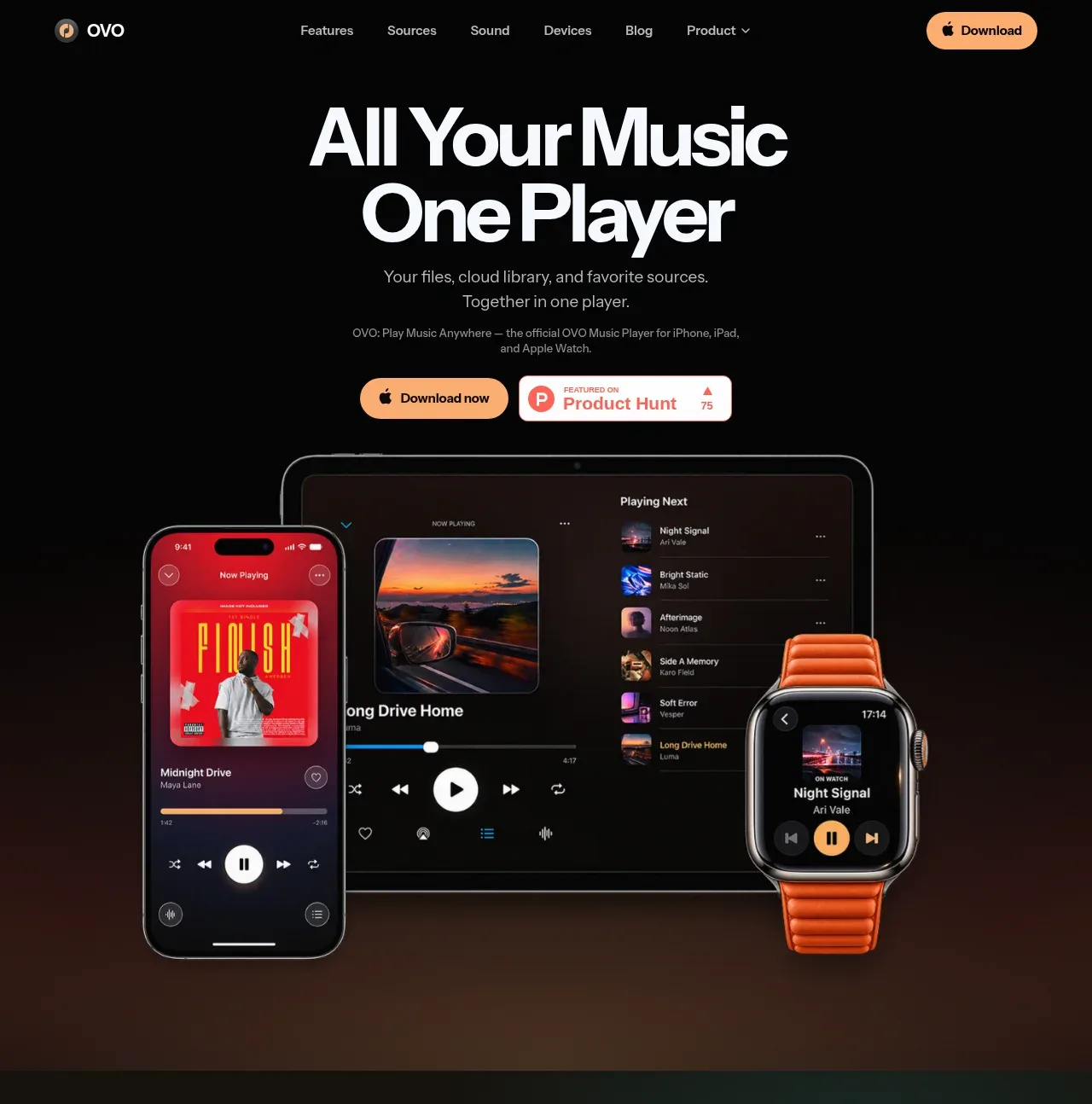
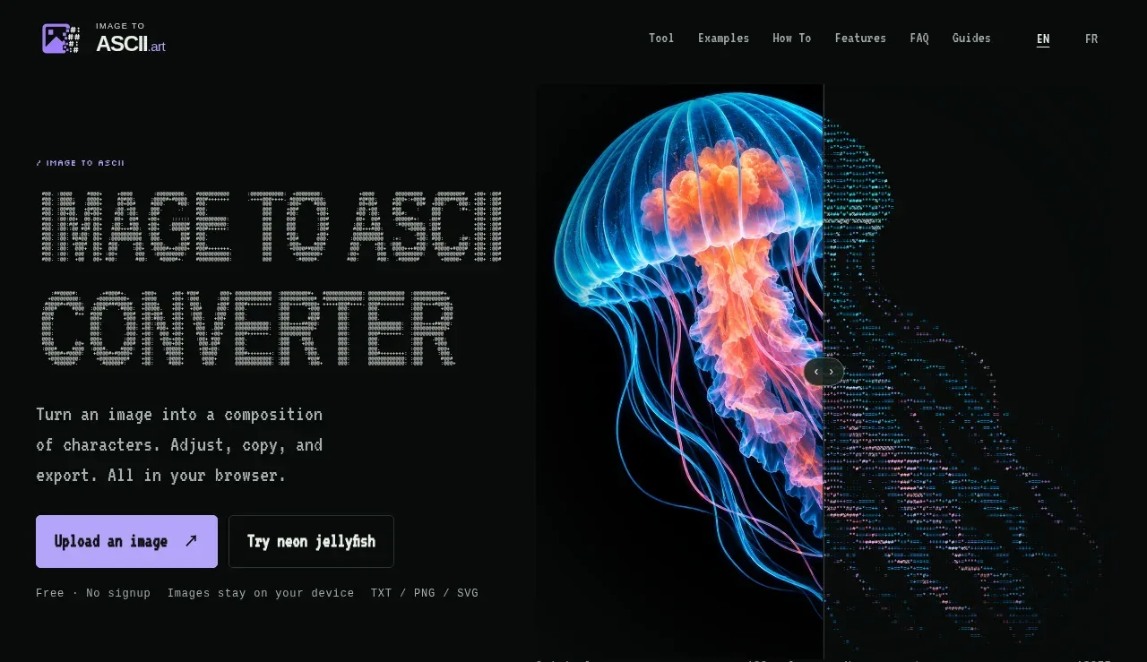
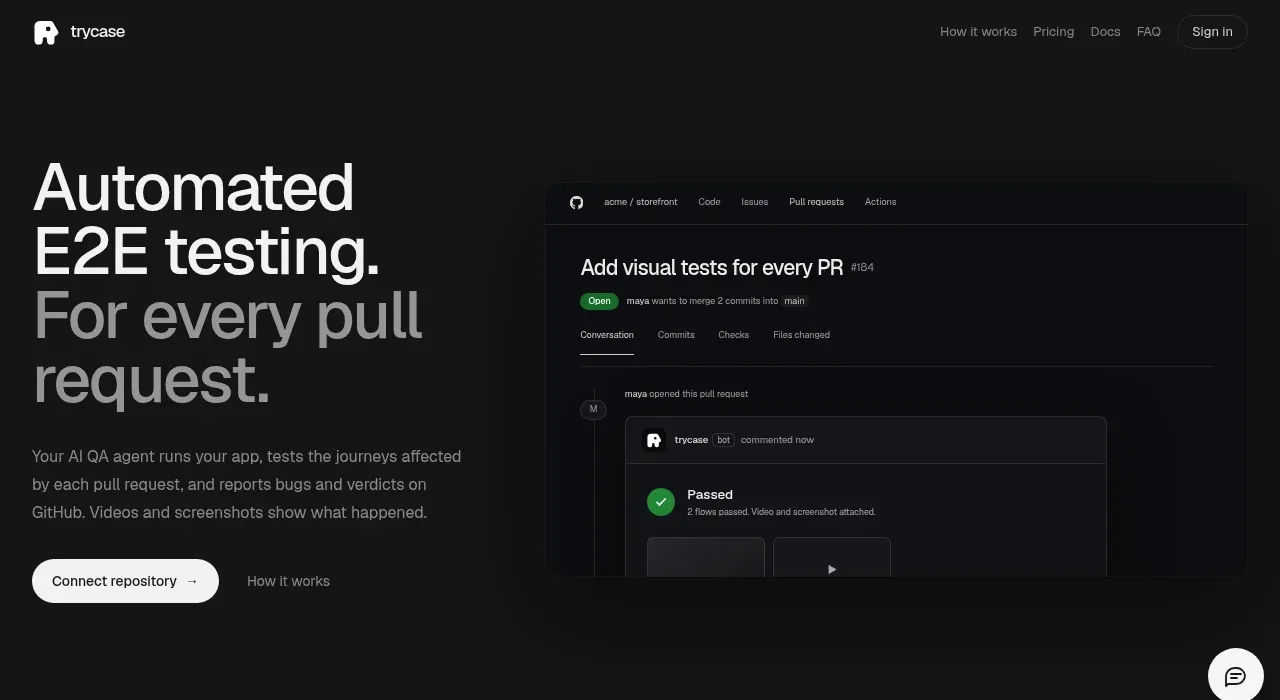
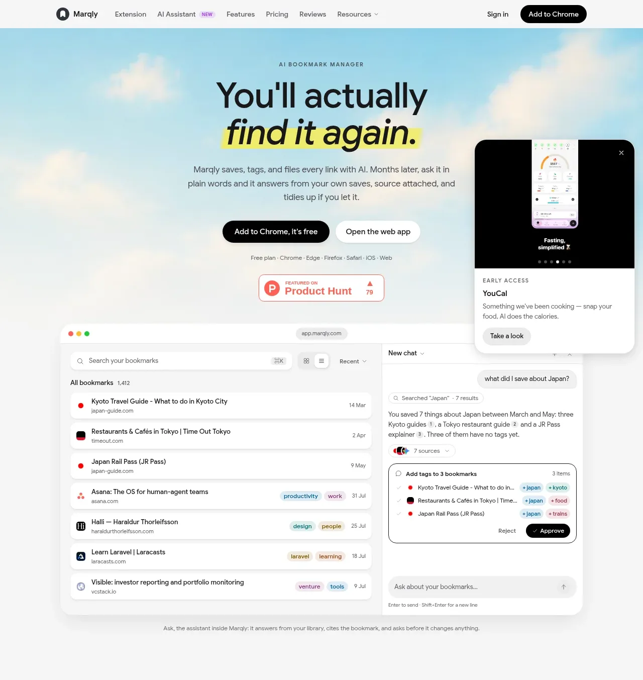
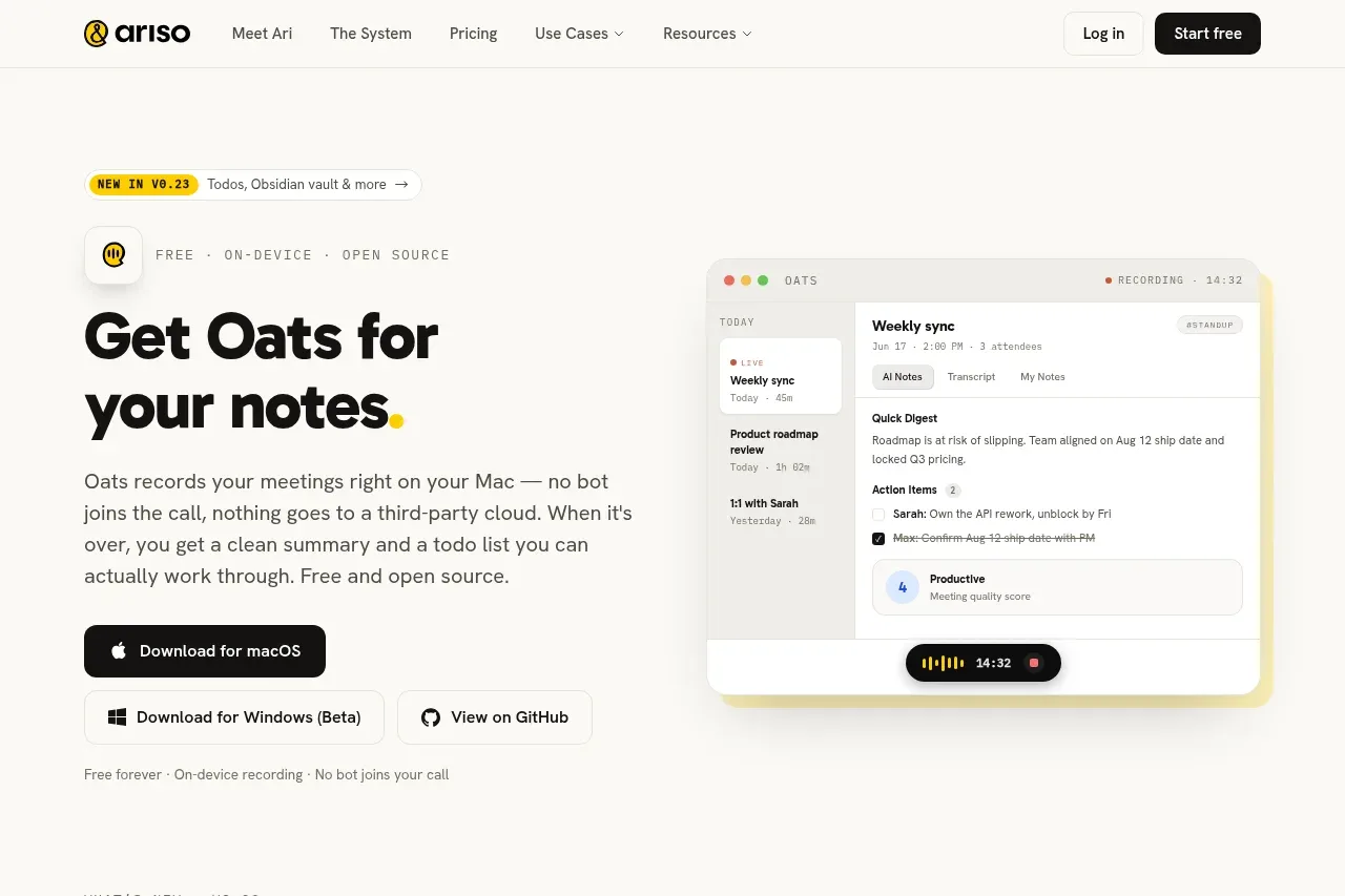
The hero pairs a bold promise and explanatory paragraph with immediate platform downloads and a large product UI visual, making the product understandable and actionable above the fold.
Prompt preview
## Reference images

Study these alongside the description below: hierarchy, rhythm, spacing, colour. Build for the product you are asked about, using this design language.

- Component: https://kage-design-assets.t3.tigrisfiles.io/components/oats/88861292-7fec-4a47-8882-69e9dc773ed4-1789452062-1.webp
- Full page it was cut from: https://kage-design-assets.t3.tigrisfiles.io/screenshots/oats/88861292-7fec-4a47-8882-69e9dc773ed4-1789452033551-full.webp
- Component on Kage: https://kage.design/component/oats-hero

## Before you start
Ask what the user's product does, who it is for, which platforms it supports, and what its brand voice should be. Apply the following structure to that product, using original content and visuals.

Create a two-column hero beneath the navigation. On the left, place a small announcement pill, an eyebrow describing the product, a large two-line headline, concise supporting copy, and a strong primary download or trial button followed by two lighter platform/action buttons. Add a small reassurance line below the buttons. On the right, show a large softly shadowed product interface mockup that visually demonstrates the core workflow; keep it partially oversized but contained within the hero. Align both columns to a shared vertical rhythm and use generous whitespace. Use a warm off-white #FAFAF7 background, near-black #171716 text, muted body text #5E5C57, yellow accent #F4D21F, white UI surfaces, #E6E4DC borders, 12–16px radii, and a very soft warm shadow. Headline should be bold, approximately 42–52px desktop / 34–40px mobile, with tight line-height. Buttons should be 44–48px tall and stack responsively.

Never: use the reference's logos, product names, copy, illustrations, or imagery.