kage
kage
omnea.co

Design analysis
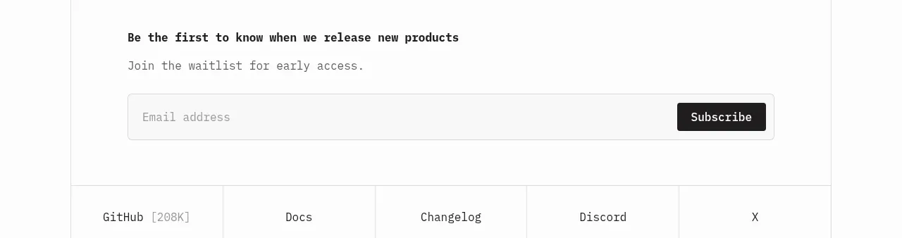
A minimal centered subscription prompt uses a clear two-line hierarchy and a compact inline email form without competing with the final CTA.
Prompt preview
## Reference images

Study these alongside the description below: hierarchy, rhythm, spacing, colour. Build for the product you are asked about, using this design language.

- Component: https://kage-design-assets.t3.tigrisfiles.io/components/omnea-co/444fd721-a6f8-467e-8179-cf278abe5ec1-1789142170-11.webp
- Full page it was cut from: https://kage-design-assets.t3.tigrisfiles.io/screenshots/omnea-co/444fd721-a6f8-467e-8179-cf278abe5ec1-1789141735165-full.webp
- Component on Kage: https://kage.design/component/omnea-form

## Before you start
Ask what the user's product is, who it serves, and what its brand personality and primary conversion goal are. Then apply the following principles to that product rather than copying the reference.

Build a centered newsletter signup band with a muted eyebrow, a short editorial heading, and one sentence of supporting text. Place an inline email input and dark submit button below, with clear labels, validation, success, and error states. Use warm white #fbfbfa, 16px input text, 10–12px muted placeholder text, a pale #f1f1ed input fill, and a black #151817 button with 4px radius. Keep the form width around 360–440px and stack it on mobile. Include a small privacy note if required by the product's compliance needs.

Never use logos, product names, copy, illustrations, or imagery from the reference.