kage
kage
useomnia.com
Design analysis
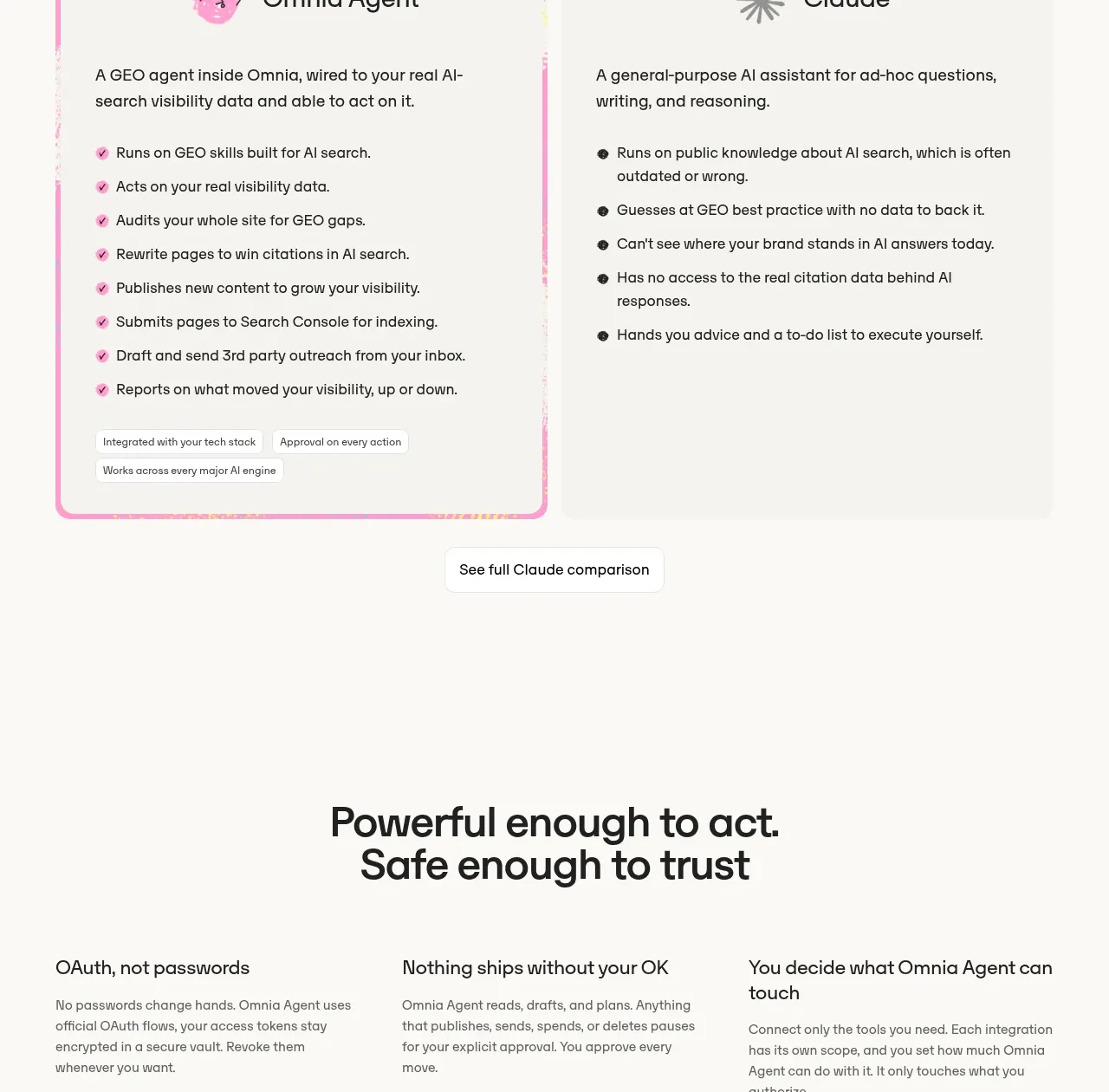
A side-by-side comparison card contrasts a specialized agent with a generic assistant using checklisted capabilities and a single follow-up action.
Prompt preview
## Reference images

Study these alongside the description below: hierarchy, rhythm, spacing, colour. Build for the product you are asked about, using this design language.

- Component: https://kage-design-assets.t3.tigrisfiles.io/components/omnia-agent/49497126-f7d8-48a0-b56b-a26990811c92-1790920879-7.webp
- Full page it was cut from: https://kage-design-assets.t3.tigrisfiles.io/screenshots/omnia-agent/49497126-f7d8-48a0-b56b-a26990811c92-1790920840559-full.webp
- Component on Kage: https://kage.design/component/omnia-agent-card

## Before you start
Ask what the user's product and brand are, then apply these principles to that product rather than reproducing the reference.

Build a two-column comparison section. Give the product-specific side a vivid pastel border or inset treatment and the general alternative a quieter neutral surface. Each side needs a simple heading, a one-sentence description, and a vertically spaced checklist of concrete capabilities or limitations. Use small check or dot indicators, 16–18px body text, and a clear visual distinction without making the comparison feel adversarial. Place one centered secondary button beneath the panels. Ensure equal column widths on desktop and stack them on mobile.

Never: use the reference logo, product name, exact copy, illustrations, imagery, or branded assets.