 kage
kage
useomnia.com
Design analysis
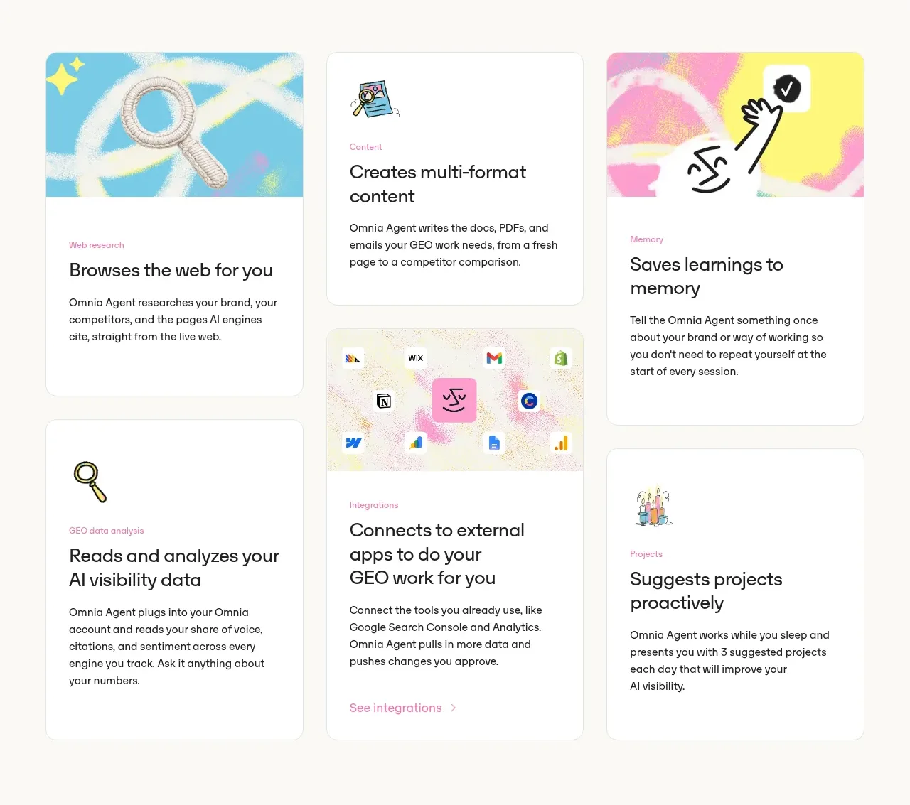
A staggered three-column card grid explains the agent through distinct jobs, mixing illustrated cards with plain text cards and varied vertical rhythm.
Prompt preview
## Reference images

Study these alongside the description below: hierarchy, rhythm, spacing, colour. Build for the product you are asked about, using this design language.

- Component: https://kage-design-assets.t3.tigrisfiles.io/components/omnia-agent/49497126-f7d8-48a0-b56b-a26990811c92-1790920877-2.webp
- Full page it was cut from: https://kage-design-assets.t3.tigrisfiles.io/screenshots/omnia-agent/49497126-f7d8-48a0-b56b-a26990811c92-1790920840559-full.webp
- Component on Kage: https://kage.design/component/omnia-agent-feature-grid

## Before you start
Ask what the user's product and brand are, then apply these principles to that product rather than reproducing the reference.

Build a three-column feature grid for an AI agent. Use large rounded white cards on a warm neutral page, with thin low-contrast borders and soft shadows. Give each card a small category label, a strong 22–28px title, and a concise explanatory paragraph. Alternate cards that have a colorful abstract media panel at the top with text-first cards and allow a subtle masonry-like stagger while retaining a clean column rhythm. Keep gutters around 20–24px and card padding around 22px. Use a restrained pastel palette with one bright accent color, and ensure the cards still communicate without imagery. Add a modest inline link only where a deeper integration or detail exists.

Never: use the reference logo, product name, exact copy, illustrations, imagery, or branded assets.
More components

 Three-step process cards
godaylight.com · Feature grid
Three-step process cards
godaylight.com · Feature grid

 Use-case selector with vertical video preview
Spira Maxima · Feature grid
Use-case selector with vertical video preview
Spira Maxima · Feature grid

 Insights and enterprise model access
FastRouter.ai · Feature grid
Insights and enterprise model access
FastRouter.ai · Feature grid
 Solutions by organizational role
FastRouter.ai · Feature grid
Solutions by organizational role
FastRouter.ai · Feature grid
 Routing reliability and model collaboration
FastRouter.ai · Feature grid
Routing reliability and model collaboration
FastRouter.ai · Feature grid
 Goal-oriented product capabilities
FastRouter.ai · Feature grid
Goal-oriented product capabilities
FastRouter.ai · Feature grid