 kage
kage
once-ui.com
Design analysis
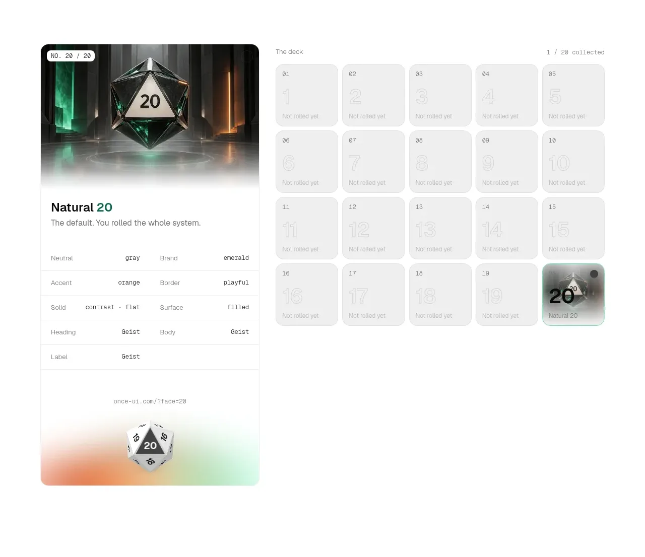
A two-column product showcase combines a featured card with metadata on the left and a numbered collection grid on the right. Muted inactive tiles and one highlighted tile clearly communicate progress and selection.
Prompt preview
## Reference images

Study these alongside the description below: hierarchy, rhythm, spacing, colour. Build for the product you are asked about, using this design language.

- Component: https://kage-design-assets.t3.tigrisfiles.io/components/once-ui-2-0/5271e217-1d5e-4be9-a528-849fafbcb323-1790488914-2.webp
- Full page it was cut from: https://kage-design-assets.t3.tigrisfiles.io/screenshots/once-ui-2-0/5271e217-1d5e-4be9-a528-849fafbcb323-1790488895695-full.webp
- Component on Kage: https://kage.design/component/once-ui-2-0-feature-grid

## Before you start
Ask what the user's product, audience, and brand are, then adapt this interaction model to it.

Build a product-explorer section with a responsive two-column layout. The left column is a large rounded feature card containing a visual, compact status badge, title, short description, and a small metadata table; the right column has a tiny section label and a 5-column grid of numbered collection tiles. Use pale gray surfaces #f4f4f4, white cards, near-black #111111, and a restrained accent such as #8bd4c8 for the selected item. Apply 18–22px corner radii, 1px #e8e8e8 borders, 16px tile gaps, and generous section padding. Inactive tiles should have low-contrast labels, while the selected tile gets a stronger border, subtle shadow, and readable preview. Make tiles keyboard-selectable, add hover elevation, and support responsive wrapping or a single-column stack.

Never: use the reference's logo, product name, exact copy, die imagery, screenshots, or distinctive assets.
More components

 Three-step process cards
godaylight.com · Feature grid
Three-step process cards
godaylight.com · Feature grid

 Use-case selector with vertical video preview
Spira Maxima · Feature grid
Use-case selector with vertical video preview
Spira Maxima · Feature grid

 Insights and enterprise model access
FastRouter.ai · Feature grid
Insights and enterprise model access
FastRouter.ai · Feature grid
 Solutions by organizational role
FastRouter.ai · Feature grid
Solutions by organizational role
FastRouter.ai · Feature grid
 Routing reliability and model collaboration
FastRouter.ai · Feature grid
Routing reliability and model collaboration
FastRouter.ai · Feature grid
 Goal-oriented product capabilities
FastRouter.ai · Feature grid
Goal-oriented product capabilities
FastRouter.ai · Feature grid