 kage
kage
once-ui.com
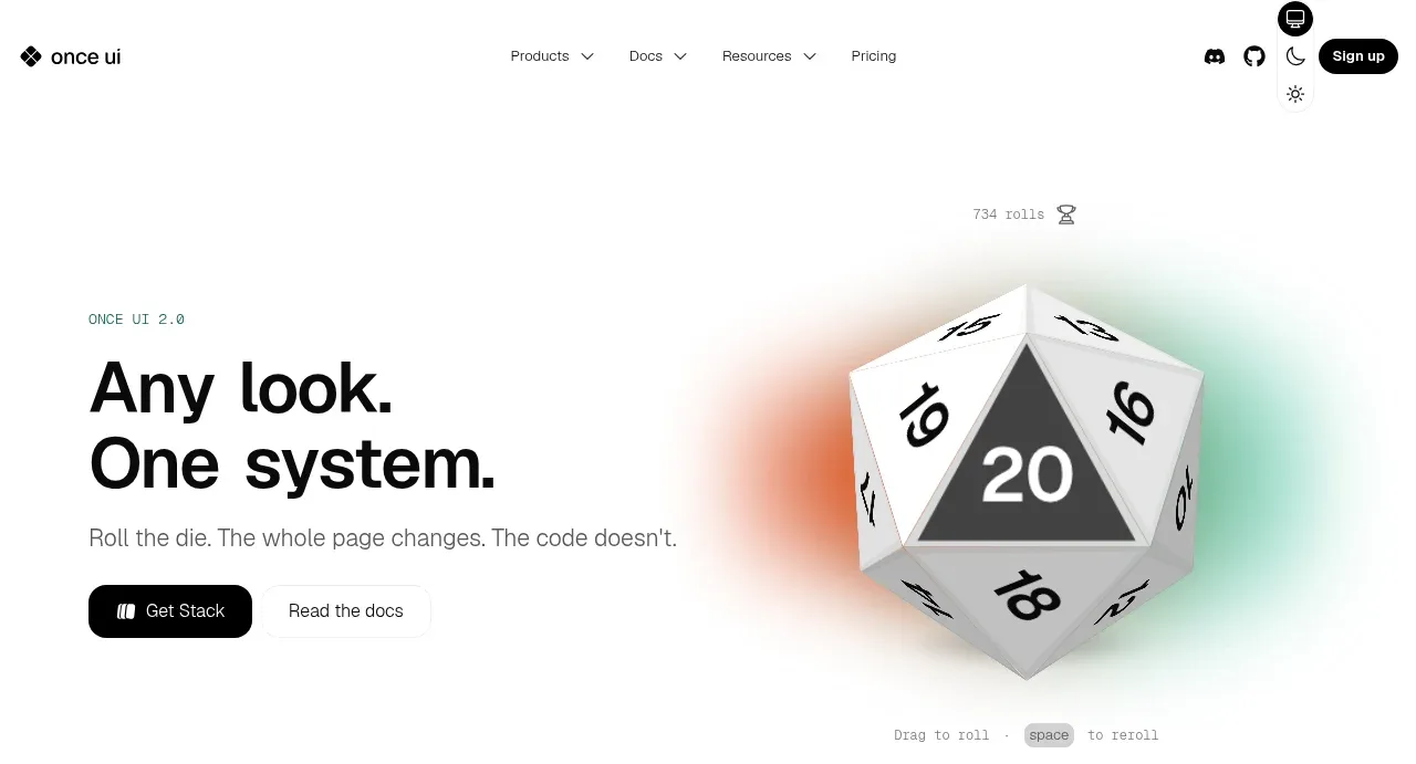
Design analysis
The hero pairs a large, direct two-line headline and supporting sentence with two actions on the left and a large die-like visual on the right. A soft multicolor glow and small interaction hint make the visual feel playable rather than decorative.
Prompt preview
## Reference images

Study these alongside the description below: hierarchy, rhythm, spacing, colour. Build for the product you are asked about, using this design language.

- Component: https://kage-design-assets.t3.tigrisfiles.io/components/once-ui-2-0/5271e217-1d5e-4be9-a528-849fafbcb323-1790488914-1.webp
- Full page it was cut from: https://kage-design-assets.t3.tigrisfiles.io/screenshots/once-ui-2-0/5271e217-1d5e-4be9-a528-849fafbcb323-1790488895695-full.webp
- Component on Kage: https://kage.design/component/once-ui-2-0-hero

## Before you start
Ask what the user's product, audience, and brand are, then apply these principles to that product.

Build a spacious split hero directly below the navigation. Place a bold two-line headline and one concise supporting sentence in a left column, followed by a dark pill primary CTA and a quiet text secondary link. Reserve the right half for an interactive product visual or abstract object, with a soft blurred radial glow behind it. Use a white background, near-black #0b0b0d text, muted #6f7075 copy, and restrained accent glows in warm orange, cyan, and pale green. Use a large 44–56px headline with tight line-height, 16px body copy, 24px gap before actions, and 64–96px vertical padding. Include a small helper label below the visual to communicate the interaction. On mobile, stack the visual below the copy and keep the CTA row usable.

Never: use the reference's logo, product name, exact copy, die illustration, imagery, or distinctive brand assets.
More components
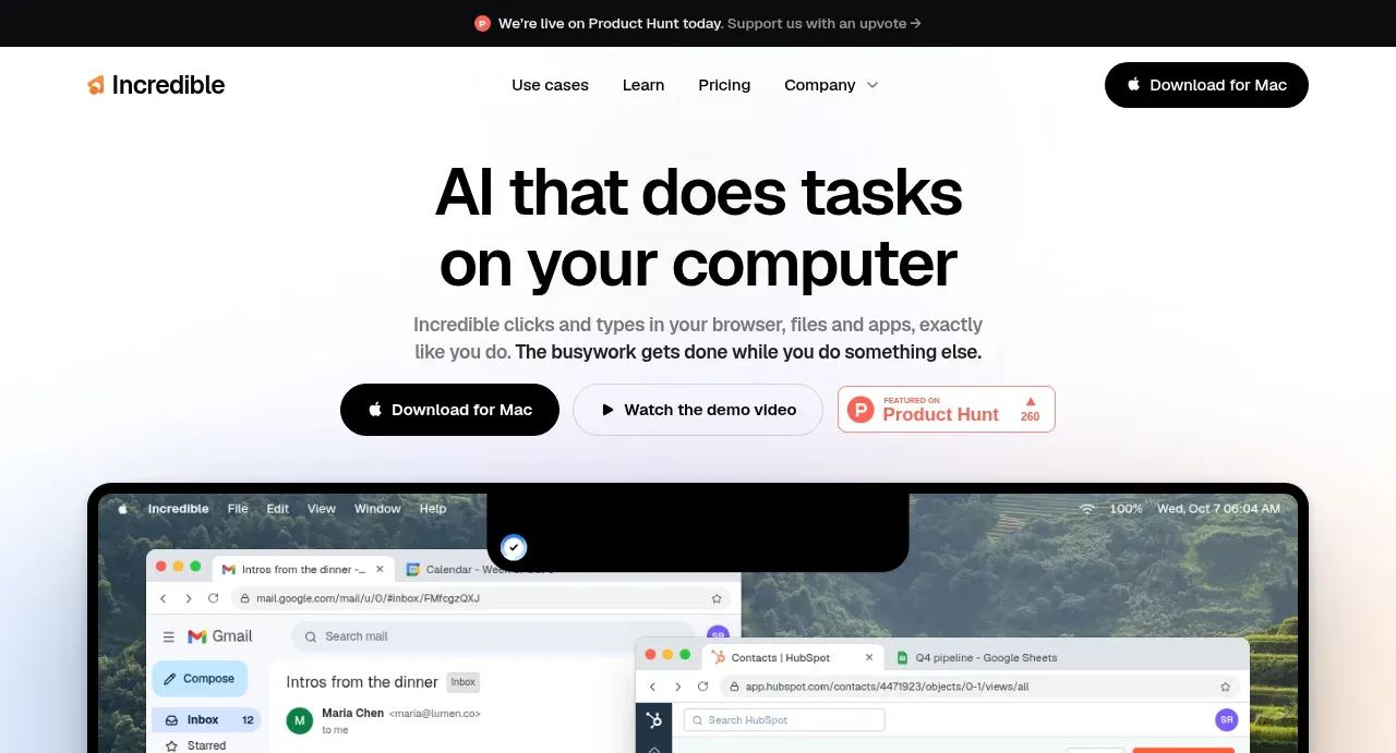
 AI workflow hero
Incredible · Hero
AI workflow hero
Incredible · Hero
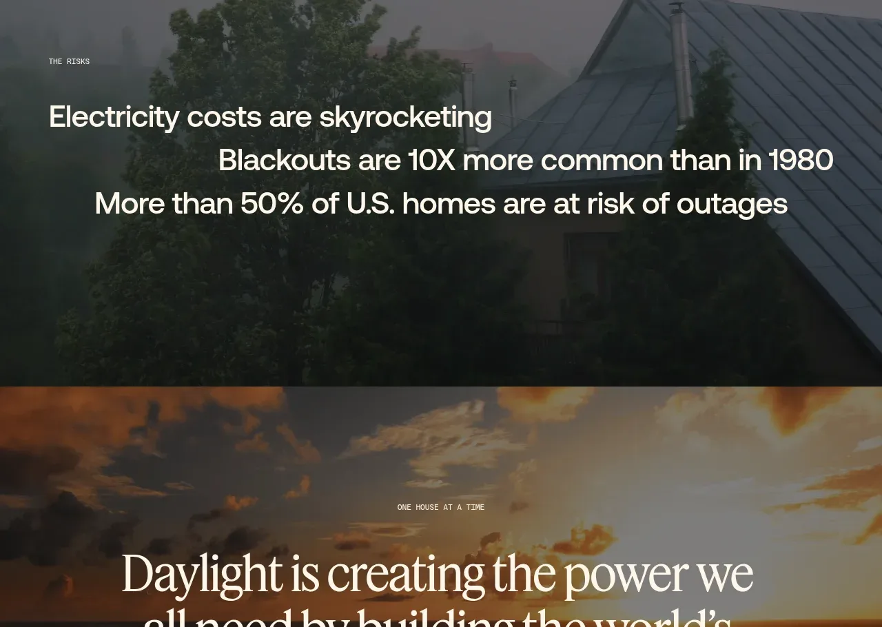
 Decentralized energy statement
godaylight.com · Hero
Decentralized energy statement
godaylight.com · Hero
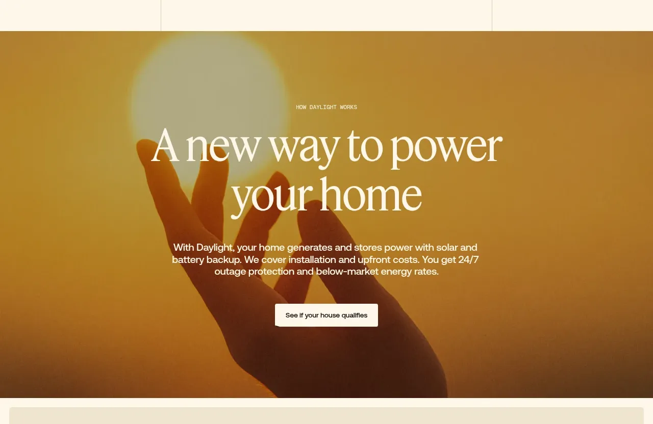 Warm mission statement panel
godaylight.com · Hero
Warm mission statement panel
godaylight.com · Hero
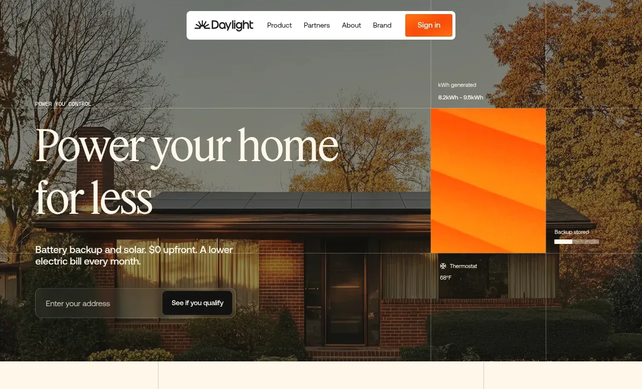 Photographic power-home hero
godaylight.com · Hero
Photographic power-home hero
godaylight.com · Hero
 Grid problem statement
godaylight.com · Hero
Grid problem statement
godaylight.com · Hero
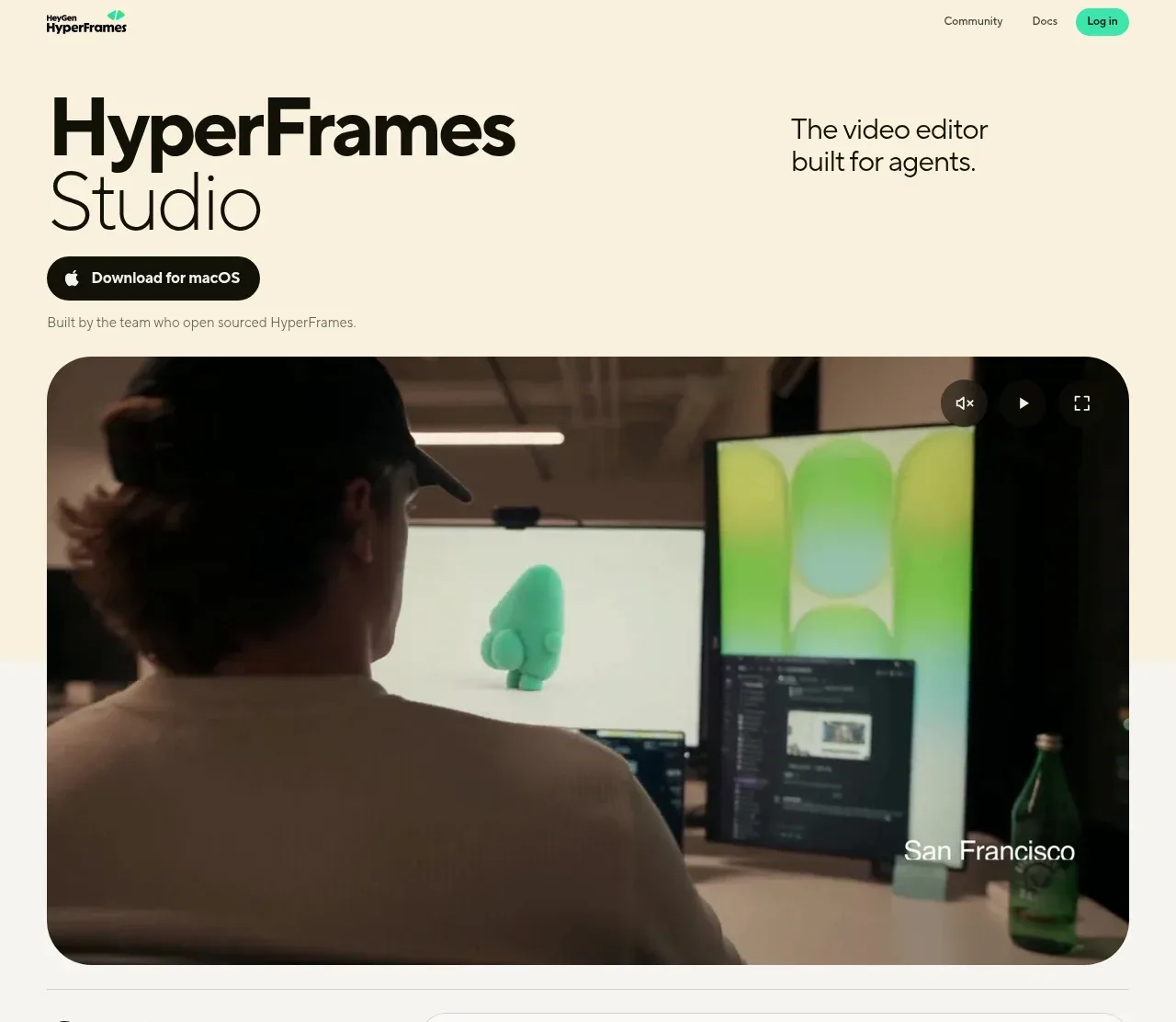
 Product hero with download action and video
HyperFrames Studio (Desktop) · Hero
Product hero with download action and video
HyperFrames Studio (Desktop) · Hero