 kage
kage
openflowkit.com
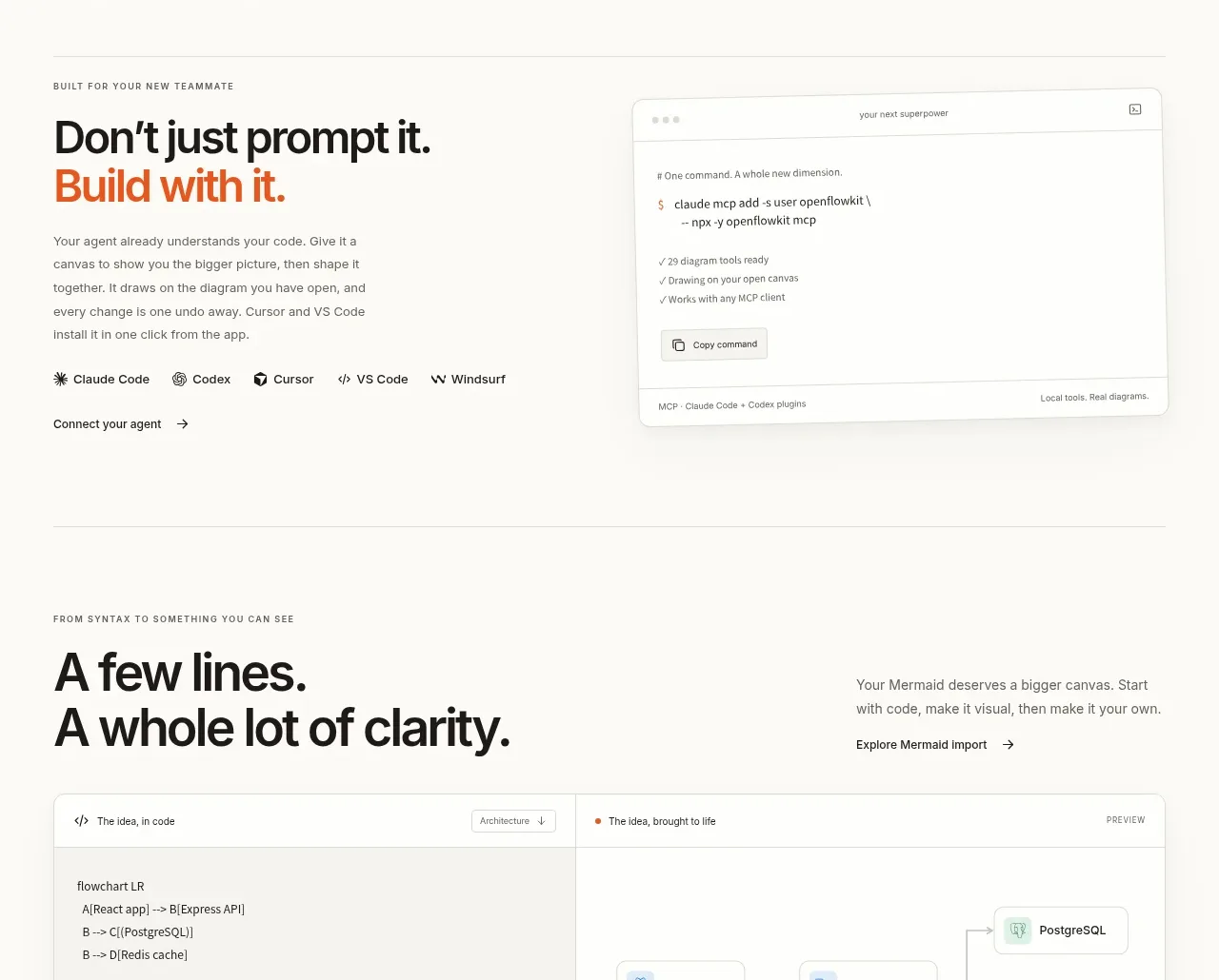
Design analysis
This section reframes the product as a tool for agent-assisted building, pairing a concise narrative with a command or integration preview.
Prompt preview
## Reference images

Study these alongside the description below: hierarchy, rhythm, spacing, colour. Build for the product you are asked about, using this design language.

- Component: https://kage-design-assets.t3.tigrisfiles.io/components/openflowkit-2/3de20331-4179-415d-a7ba-29915155b155-1791957762-7.webp
- Full page it was cut from: https://kage-design-assets.t3.tigrisfiles.io/screenshots/openflowkit-2/3de20331-4179-415d-a7ba-29915155b155-1791957697393-full.webp
- Component on Kage: https://kage.design/component/openflowkit-2-feature-grid-3

## Before you start
Ask which AI agents, developer tools, or integrations the user's audience actually uses and what action they should take from this section.

Create a horizontal developer-workflow section. Put an eyebrow, bold 36–44px heading with an accent-colored second line, short paragraph, and small row of tool names or icon chips on the left. Place a large code/command or integration preview on the right inside a white rounded panel with a faint border and soft shadow. Use monospace text at 12–14px, a compact toolbar, muted syntax colors, and one outlined copy button. Keep the surrounding background warm off-white, use charcoal typography, and reserve orange for the key phrase and primary interaction. On small screens, stack the narrative above the preview. Ensure the command block has an accessible copy action and does not overflow horizontally.

Never use the reference's logo, product name, copy, illustrations, imagery, or exact commands.
More components
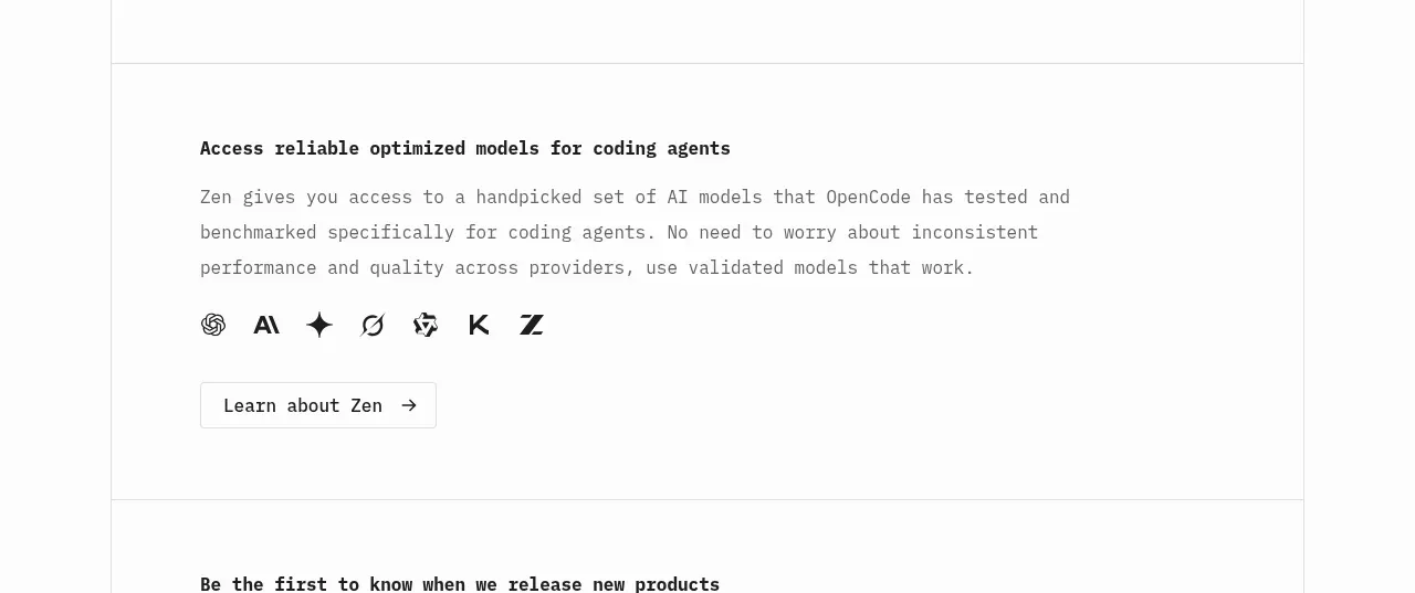
 Model access feature block
OpenCode 2.0 · Feature grid
Model access feature block
OpenCode 2.0 · Feature grid
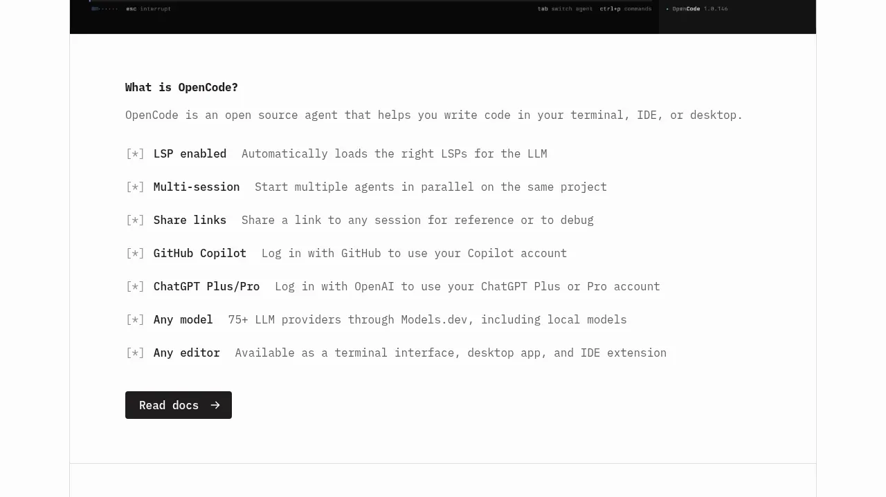 Core capabilities overview
OpenCode 2.0 · Feature grid
Core capabilities overview
OpenCode 2.0 · Feature grid
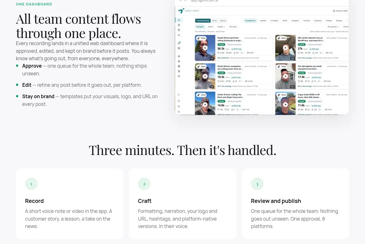
 Unified dashboard workflow
Agent Craft · Feature grid
Unified dashboard workflow
Agent Craft · Feature grid
 Three-step operating model
Agent Craft · Feature grid
Three-step operating model
Agent Craft · Feature grid
 Mobile capture workflow
Agent Craft · Feature grid
Mobile capture workflow
Agent Craft · Feature grid
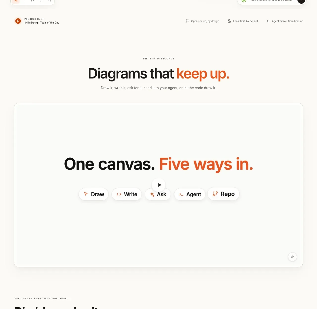
 Canvas modes showcase
OpenFlowKit 2 · Feature grid
Canvas modes showcase
OpenFlowKit 2 · Feature grid