 kage
kage
openflowkit.com
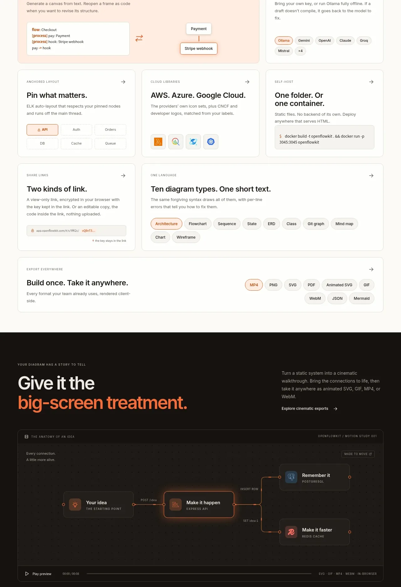
Design analysis
A dense collection of capability cards makes the platform breadth scannable while preserving a consistent card system and one larger highlighted card.
Prompt preview
## Reference images

Study these alongside the description below: hierarchy, rhythm, spacing, colour. Build for the product you are asked about, using this design language.

- Component: https://kage-design-assets.t3.tigrisfiles.io/components/openflowkit-2/3de20331-4179-415d-a7ba-29915155b155-1791957763-9.webp
- Full page it was cut from: https://kage-design-assets.t3.tigrisfiles.io/screenshots/openflowkit-2/3de20331-4179-415d-a7ba-29915155b155-1791957697393-full.webp
- Component on Kage: https://kage.design/component/openflowkit-2-feature-grid-4

## Before you start
Ask which capabilities, export formats, deployment options, and collaboration features are genuinely important for the user's product. Prioritize them into a scannable hierarchy.

Create a capabilities section with an editorial intro row: eyebrow, large two-line heading, and a short paragraph/link. Below it, build a responsive multi-card grid with one wide highlighted peach card and several smaller white cards. Every card should have a tiny uppercase category, a 20–24px title, one or two lines of muted copy, a top-right arrow, and a small illustrative UI fragment made only from abstract boxes, pills, lines, or text. Use `#ffeadc` for the hero card, `#ffffff` for standard cards, `#e3e0d8` borders, 12px radius, and restrained shadows. Keep the grid aligned to a consistent 12-column rhythm on desktop and stack cards on mobile. Include a final full-width card for export/output options.

Never use the reference's logo, product name, copy, illustrations, imagery, or exact capability names.
More components
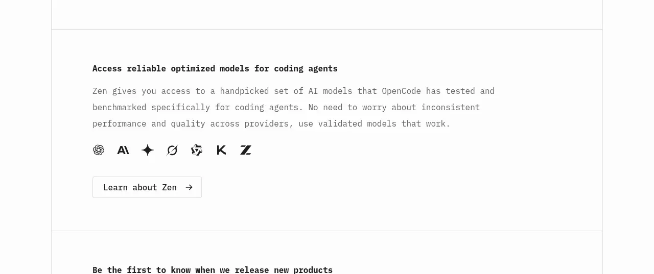
 Model access feature block
OpenCode 2.0 · Feature grid
Model access feature block
OpenCode 2.0 · Feature grid
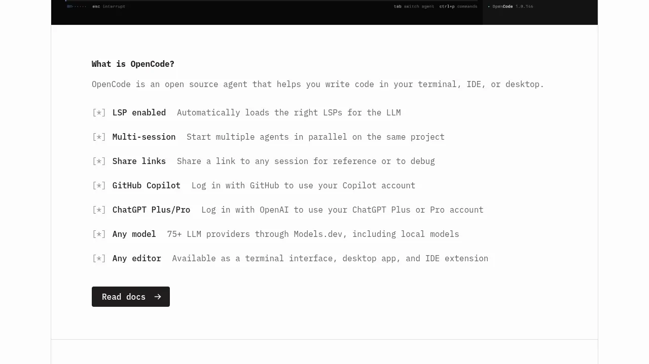 Core capabilities overview
OpenCode 2.0 · Feature grid
Core capabilities overview
OpenCode 2.0 · Feature grid
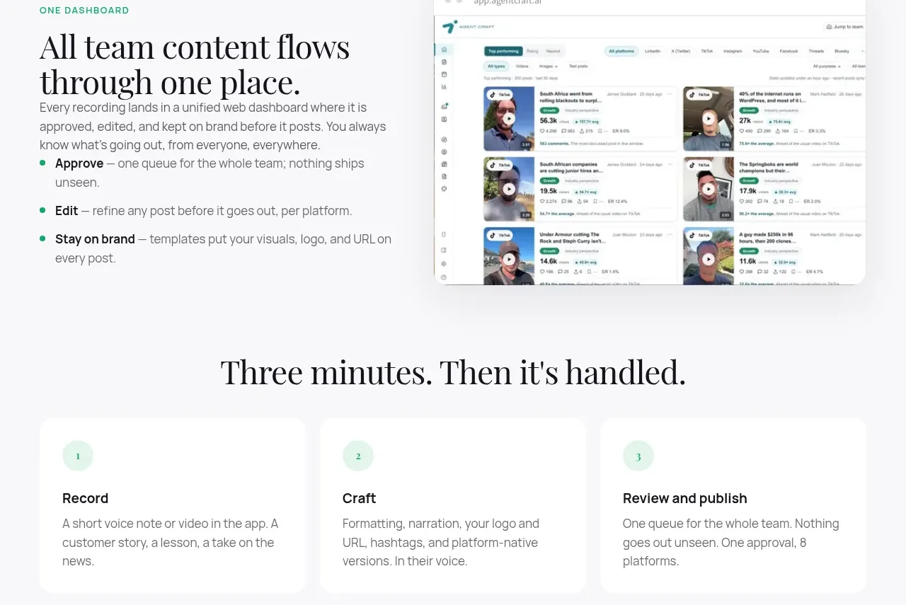
 Unified dashboard workflow
Agent Craft · Feature grid
Unified dashboard workflow
Agent Craft · Feature grid
 Three-step operating model
Agent Craft · Feature grid
Three-step operating model
Agent Craft · Feature grid
 Mobile capture workflow
Agent Craft · Feature grid
Mobile capture workflow
Agent Craft · Feature grid
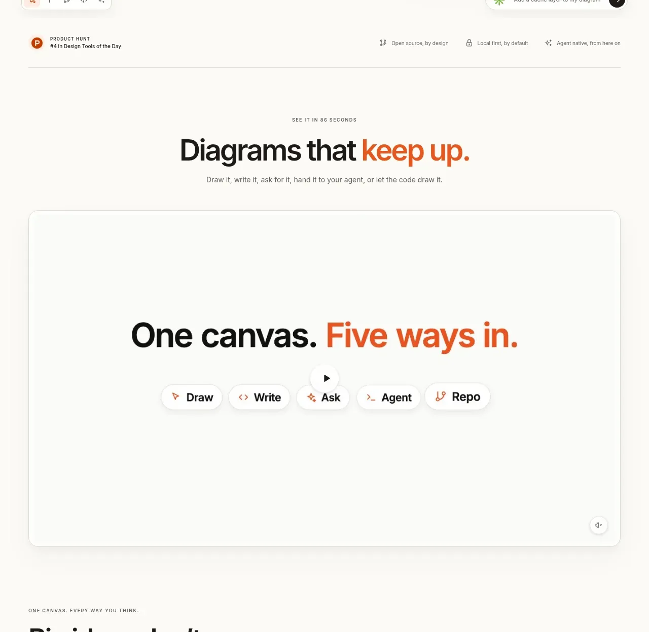
 Canvas modes showcase
OpenFlowKit 2 · Feature grid
Canvas modes showcase
OpenFlowKit 2 · Feature grid