 kage
kage
opensend.cc
Design analysis
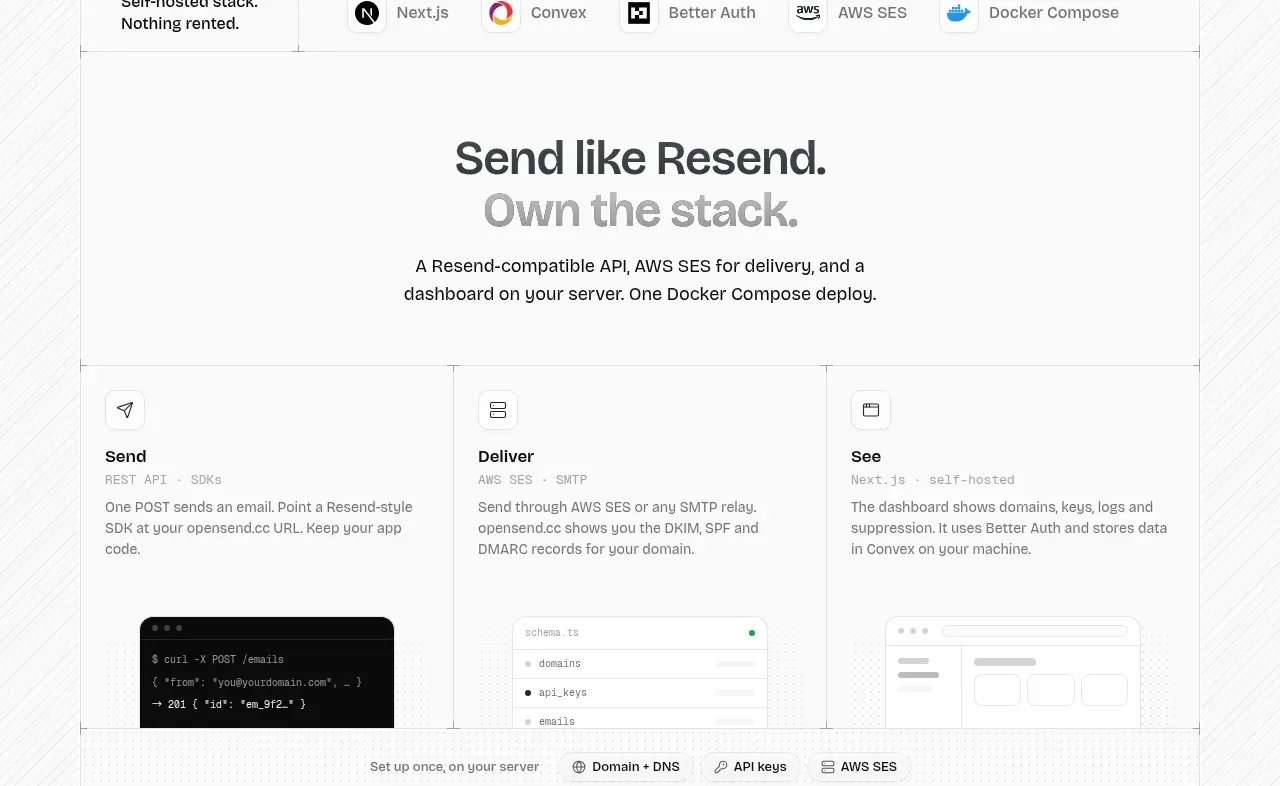
A section headline frames a three-column workflow, with each column pairing a concise explanation and a lightweight product visual.
Prompt preview
## Reference images

Study these alongside the description below: hierarchy, rhythm, spacing, colour. Build for the product you are asked about, using this design language.

- Component: https://kage-design-assets.t3.tigrisfiles.io/components/opensend-cc/cb8c9d86-a0e5-47f8-893c-550f6137189a-1791180190-3.webp
- Full page it was cut from: https://kage-design-assets.t3.tigrisfiles.io/screenshots/opensend-cc/cb8c9d86-a0e5-47f8-893c-550f6137189a-1791180114349-full.webp
- Component on Kage: https://kage.design/component/opensend-feature-grid

## Before you start
Ask what three core jobs the user's product performs and what visual proof can support each one, then apply the principles below to that product.

Build a centered feature section with a two-line headline, short supporting copy, and a three-column grid below. Each column should have a small icon, a short verb-led title, a compact category label, explanatory text, and a low-contrast visual placeholder such as a terminal, dashboard fragment, or data panel. Use 1px borders between columns (#e4e4e4), generous top and bottom padding, 16px card padding, 14px titles, 12–13px body text, and restrained grayscale with one dark visual accent. Keep column heights aligned and make the visual proof sit near the bottom of each column.

Never: use logos, product names, copy, illustrations, or imagery from the reference.
More components

 Three-step process cards
godaylight.com · Feature grid
Three-step process cards
godaylight.com · Feature grid

 Use-case selector with vertical video preview
Spira Maxima · Feature grid
Use-case selector with vertical video preview
Spira Maxima · Feature grid

 Goal-oriented product capabilities
FastRouter.ai · Feature grid
Goal-oriented product capabilities
FastRouter.ai · Feature grid
 Routing reliability and model collaboration
FastRouter.ai · Feature grid
Routing reliability and model collaboration
FastRouter.ai · Feature grid
 Insights and enterprise model access
FastRouter.ai · Feature grid
Insights and enterprise model access
FastRouter.ai · Feature grid
 Solutions by organizational role
FastRouter.ai · Feature grid
Solutions by organizational role
FastRouter.ai · Feature grid