kage
kage
opensend.cc

Design analysis
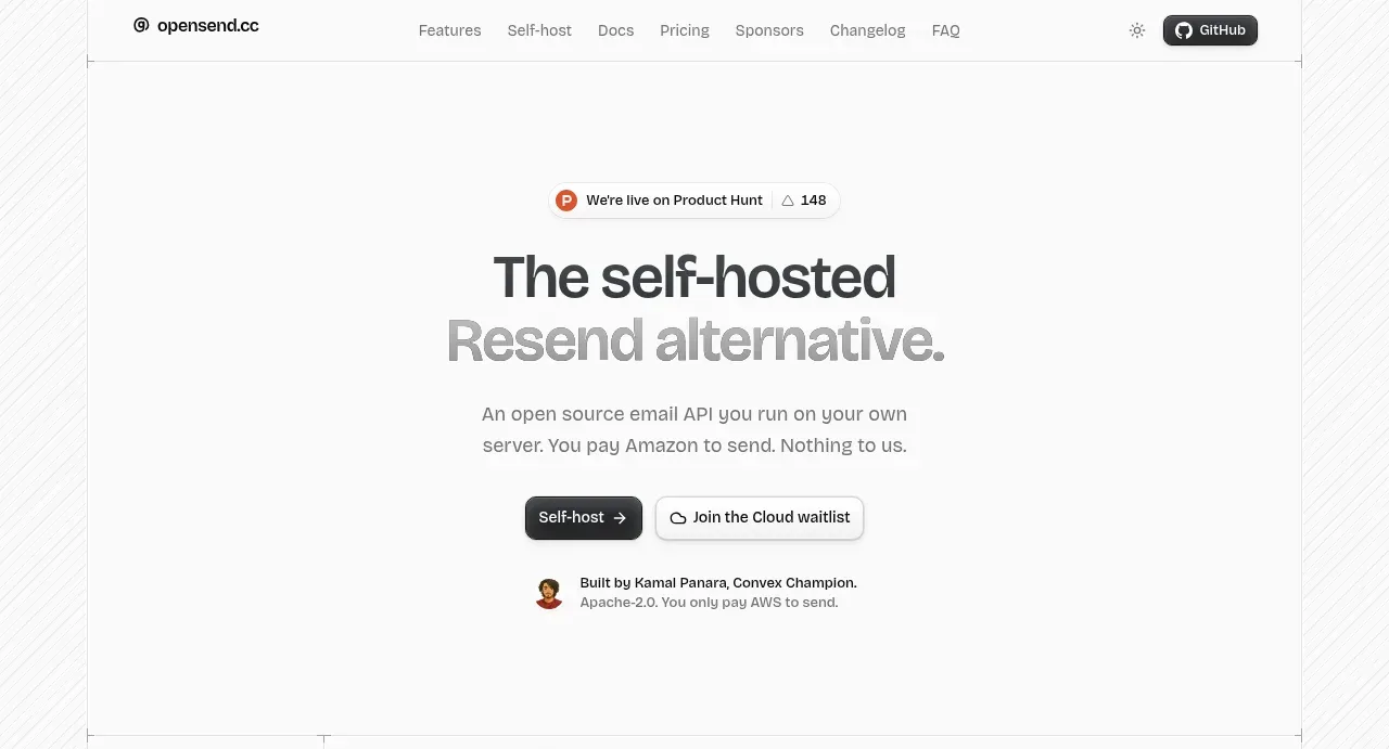
A near-monochrome landing page that carries its entire system with hairline rules, a single sans family and rationed colour. Two-tone headlines (near-black phrase, then gray) top airy centred statements, while the substance lives in dense bordered bands: a table-like 3×3 feature grid with tiny monospace tag chips, twin checklist cards, ghost-numeral steps and a sponsor matrix whose empty plus-cells are the sales pitch. Rhythm alternates deliberately — centred breather sections between dense data bands — and colour appears only as signal (a green 'Soon', an orange badge), leaving the near-black CTA buttons to do all the pointing.
Prompt preview
## Reference images

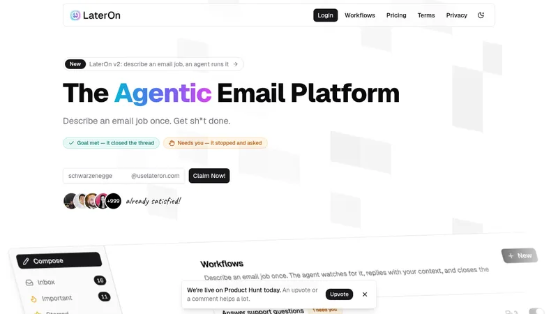
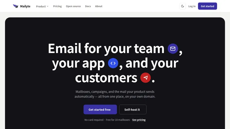
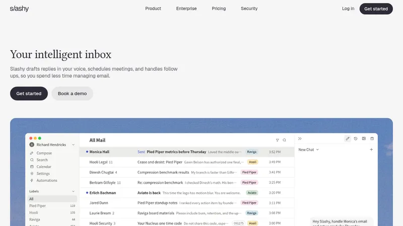
Study these alongside the description below: hierarchy, rhythm, spacing, colour. Build for the product you are asked about, using this design language.

- Full page: https://kage-design-assets.t3.tigrisfiles.io/screenshots/opensend-cc/cb8c9d86-a0e5-47f8-893c-550f6137189a-1791180114349-full.webp
- Above the fold: https://kage-design-assets.t3.tigrisfiles.io/screenshots/opensend-cc/cb8c9d86-a0e5-47f8-893c-550f6137189a-1791180105366.webp
- Design on Kage: https://kage.design/designs/opensend-landing-page

## Before you start

Ask the user what they are building (the product and the goal of this page), who it is for, and what brand assets they already have (name, colours, type). Wait for the answers before writing any code. Everything below is applied to their product, not to the reference site.

## Page structure

Build a single long landing page with these sections, top to bottom:

1. **Top bar** — hairline bottom rule; wordmark left, 6–7 plain text links centre-right, a theme toggle and a dark pill button (the signup/login action) far right.
2. **Hero** — centred and airy: a small pill badge (launch/announcement with a counter), a two-tone headline, a 1–2 sentence subcopy, one dark primary button plus one bordered secondary button, then a one-line builder/credit row with a small avatar.
3. **Trust strip** — full-width bordered band: a short left label stating the positioning, then a row of five technology logos with names the product is built on.
4. **Product explainer** — centred two-tone heading and subcopy, then three columns, each with an icon, a title, a monospace meta line, a short paragraph, and a small UI illustration (terminal snippet, data table, dashboard wireframe).
5. **Feature matrix** — a thin strip with a one-line note and three pill tabs, then a 3×3 grid of feature cells that share hairline dividers like a printed table; each cell has a title, two to three lines of copy, and a row of tiny monospace tag chips (e.g. api / smtp / dashboard).
6. **Ownership section** — centred heading and subcopy, then two side-by-side bordered cards: the left a spec list (component name + its role, right-aligned), the right a numbered 01–04 how-to list; close with a centred arrow link and a small caption.
7. **Steps** — centred heading, three columns each with a huge low-contrast ghost numeral (01/02/03), an icon, a title and short copy.
8. **Founder note** — centred two-tone heading, then avatar, short paragraph and handle links.
9. **Sponsor/backer band** — centred heading, subcopy and a dark button, then a 4×2 grid of bordered cells: one filled sponsor cell, the rest deliberate empty cells with a plus icon, a price line and a subscribe link.
10. **Pricing** — centred heading and subcopy, then two bordered cards: a $0 plan with a badge, checklist and dark CTA, and a coming-soon plan with a $$ price mark, greyed CTA and a checklist including a green availability note; centred fine print and a contact line below.
11. **FAQ** — centred heading, then a single-column accordion of ~8 rows with hairline dividers and plus icons.
12. **Final CTA** — huge two-tone headline, short subcopy, one dark button, a soft radial glow behind.
13. **Footer** — hairline top rule; brand and tagline left, three link columns, bottom bar with copyright and social icons.

## Design language

- **Palette:** off-white page background (#fafafa), white surfaces (#ffffff), near-black ink (#18181b), secondary text gray (#71717a), hairlines (#e4e4e7). One green accent (#16a34a) used exactly once for availability signals; keep every other colour out except tiny badge/logo moments. The page is ~95% neutral.
- **Texture:** a subtle diagonal hairline hatch on bands between sections, under 3% contrast — it separates zones without adding weight.
- **Type:** one sans-serif family. Headings 56–72px on desktop, medium weight, tight tracking, with the two-tone rule: the first phrase in ink, the second phrase in gray. Body 15–16px. Micro-labels, eyebrows, meta lines and tag chips in monospace at 11–12px, lowercase, gray.
- **Structure with rules, not shadows:** each major section is a full-width band framed by 1px top/bottom hairlines; grids share internal borders like a printed table; cards use 10–14px radius and at most a whisper of shadow.
- **Buttons:** primary is a near-black fill with white text, ~10px radius and a trailing →; secondary is white with a hairline border. Keep them short and blunt.
- **Rhythm:** alternate centred statement sections (two-tone heading plus a ≤2-line subcopy) with dense bordered data bands, so the page breathes between heavy moments.
- **Devices:** oversized low-contrast ghost numerals behind step columns; empty bordered cells with a plus icon as an intentional device for unfilled slots; two-column card pairs (what you get / how you get there) with right-aligned annotations.
- **Copy voice:** blunt, concrete, engineer-to-engineer. Name real technologies, state pricing honestly ($0 forever, $$), avoid marketing adjectives, keep lines short.
- **Motion:** minimal — hover darkens borders, links nudge their arrow, accordion plus rotates to ×. Nothing animated by default.
- **Footer:** quiet — small link columns, monospace copyright, hairline rules only.

## Never

- No logos, wordmarks, product names, copy, testimonials, illustrations, photography or icon sets from the reference site.
- Never present the result as that product or reuse its comparison messaging; everything must be written for the user's own product.
Components from this page
All components
 Top navigation bar
opensend.cc · Navigation
Top navigation bar
opensend.cc · Navigation
 Self-hosted product hero
opensend.cc · Hero
Self-hosted product hero
opensend.cc · Hero
 Technology stack strip
opensend.cc · Logo cloud
Technology stack strip
opensend.cc · Logo cloud
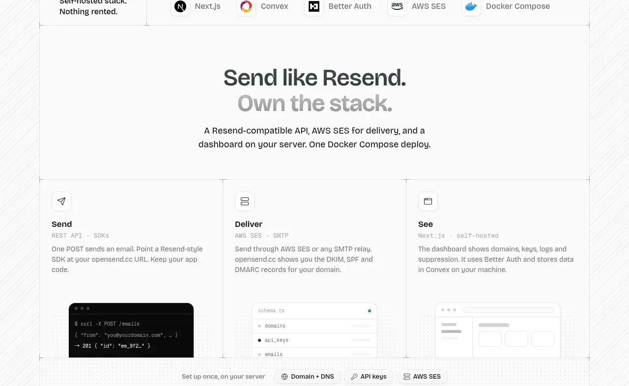 Send, deliver, see overview
opensend.cc · Feature grid
Send, deliver, see overview
opensend.cc · Feature grid
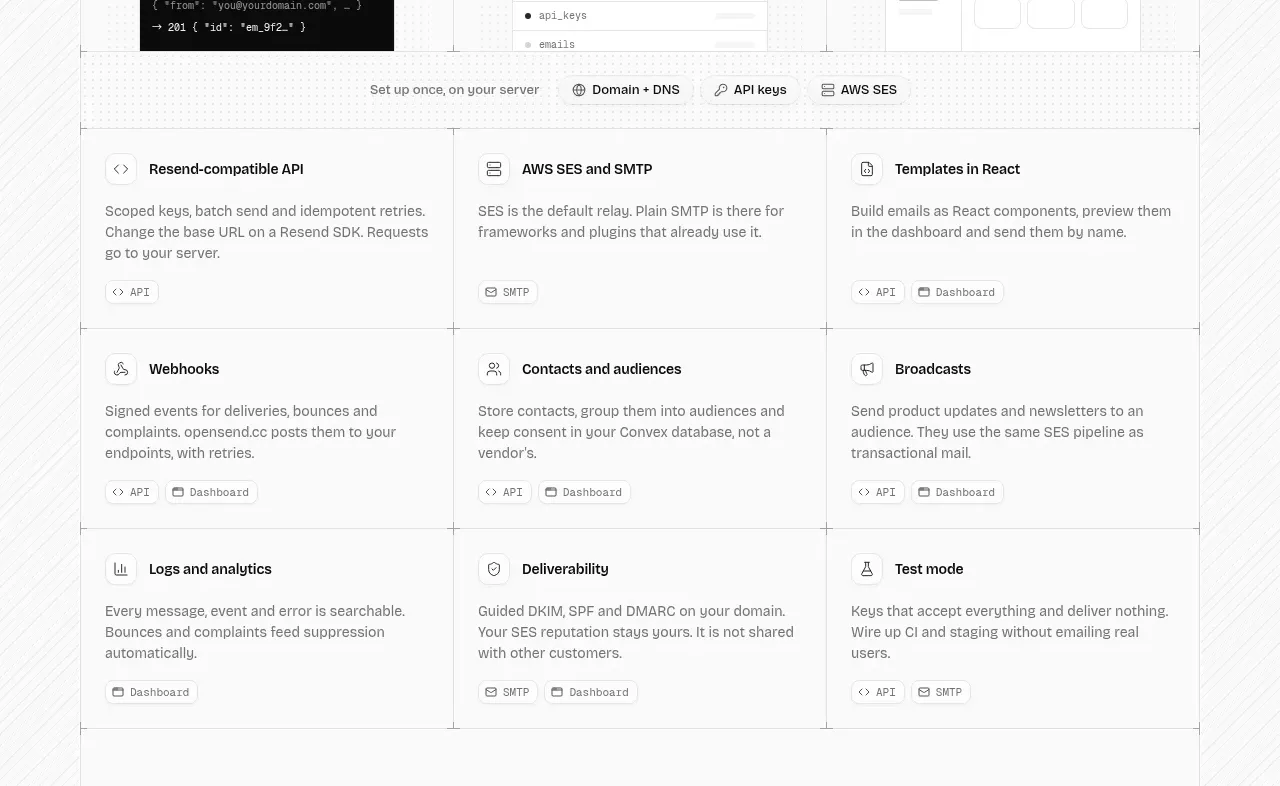 Platform capabilities grid
opensend.cc · Feature grid
Platform capabilities grid
opensend.cc · Feature grid
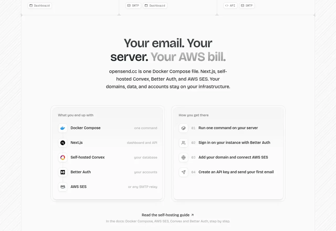 Self-hosting comparison workflow
opensend.cc · Feature grid
Self-hosting comparison workflow
opensend.cc · Feature grid
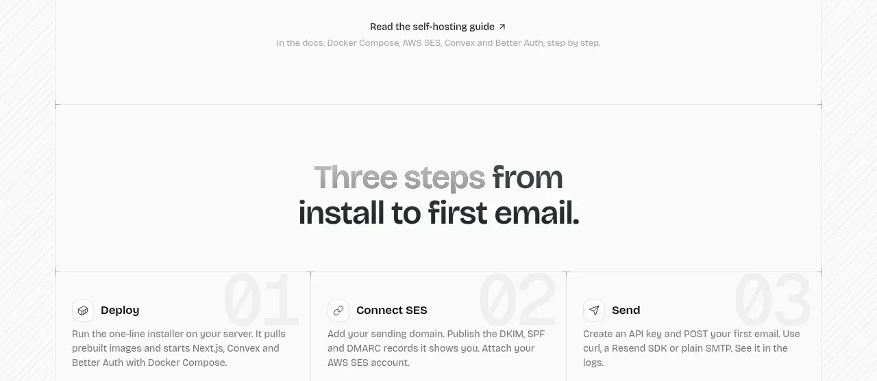 Three-step onboarding
opensend.cc · Feature grid
Three-step onboarding
opensend.cc · Feature grid
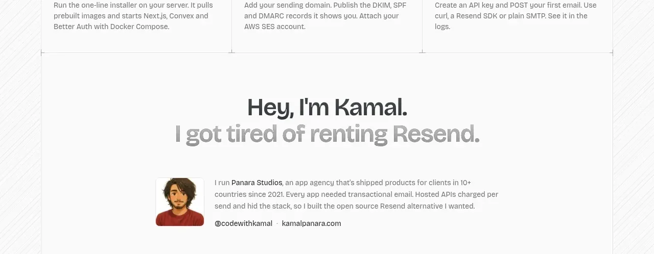 Founder story
opensend.cc · Testimonials
Founder story
opensend.cc · Testimonials
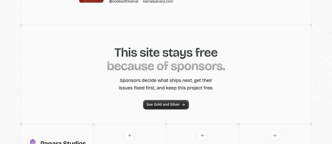 Sponsor call to action
opensend.cc · Call to action
Sponsor call to action
opensend.cc · Call to action
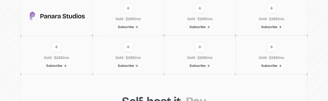 Sponsor tiers grid
opensend.cc · Table
Sponsor tiers grid
opensend.cc · Table
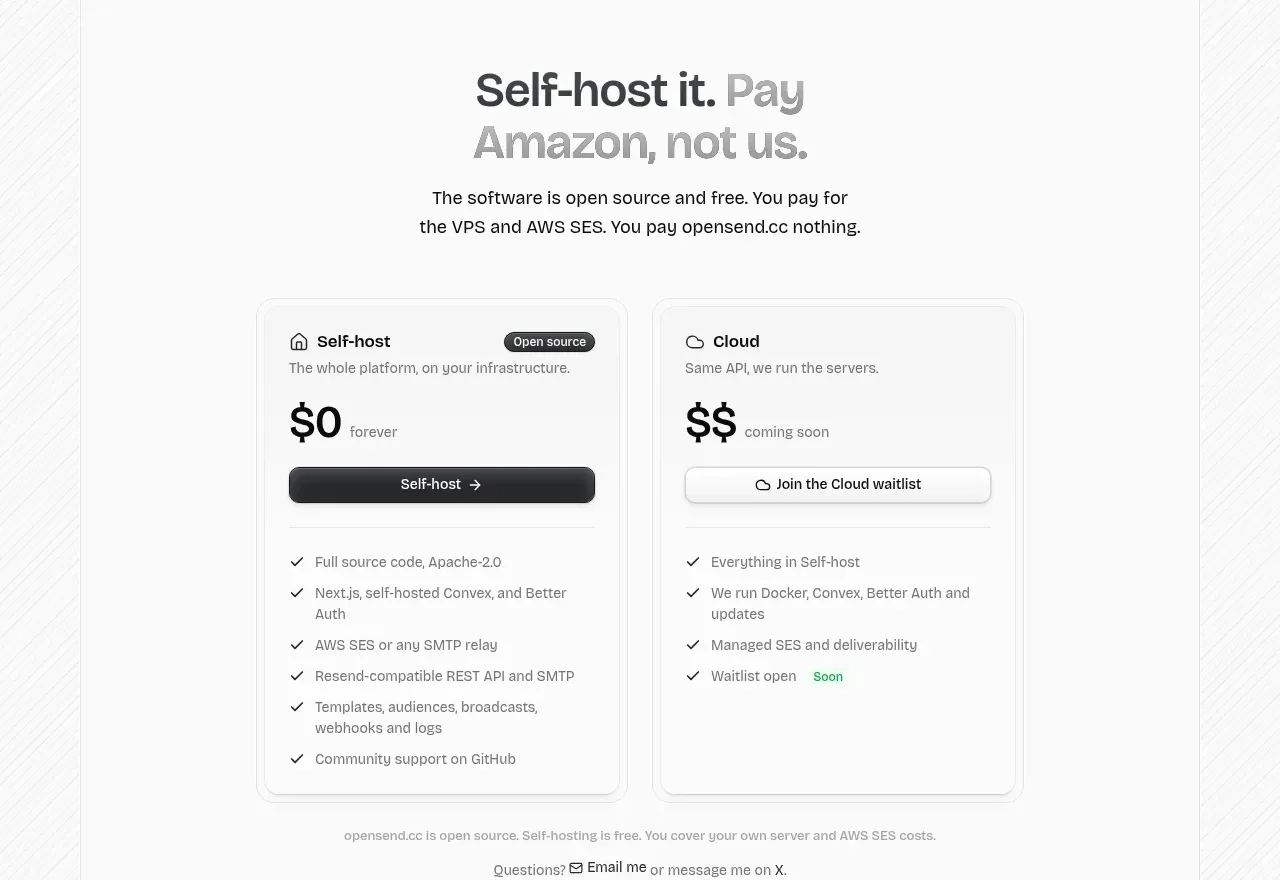 Self-host versus cloud pricing
opensend.cc · Pricing table
Self-host versus cloud pricing
opensend.cc · Pricing table
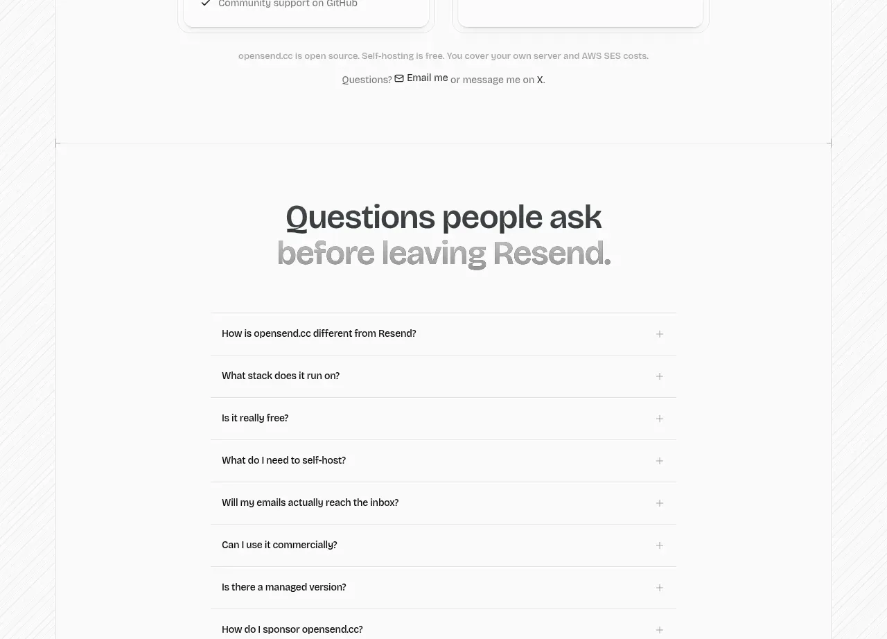 Frequently asked questions
opensend.cc · FAQ
Frequently asked questions
opensend.cc · FAQ