 kage
kage
opensend.cc
Design analysis
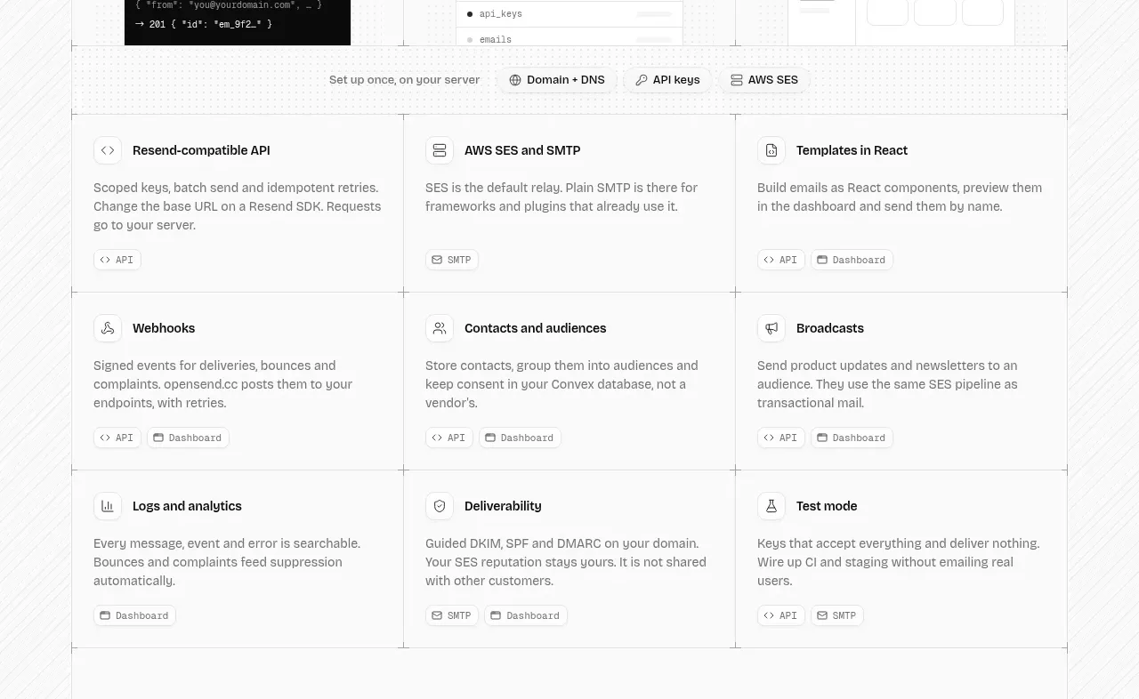
A dense three-column matrix presents nine capabilities with consistent icon-title-description anatomy and small category tags.
Prompt preview
## Reference images

Study these alongside the description below: hierarchy, rhythm, spacing, colour. Build for the product you are asked about, using this design language.

- Component: https://kage-design-assets.t3.tigrisfiles.io/components/opensend-cc/cb8c9d86-a0e5-47f8-893c-550f6137189a-1791180190-4.webp
- Full page it was cut from: https://kage-design-assets.t3.tigrisfiles.io/screenshots/opensend-cc/cb8c9d86-a0e5-47f8-893c-550f6137189a-1791180114349-full.webp
- Component on Kage: https://kage.design/component/opensend-feature-grid-2

## Before you start
Ask what capabilities the user's product should make scannable and how they should be grouped, then apply the principles below to that product.

Build a nine-item capability grid in three columns and three rows. Each cell should contain a compact icon, bold capability title, two-to-three-line description, and optional tiny tags for surfaces such as API or dashboard. Use a fine 1px grid system, no heavy card shadows, 16–18px internal padding, 14px titles, 12–13px muted descriptions, and a nearly white background (#fbfbfb). Keep row heights consistent and use subtle hover highlighting rather than dramatic animation. Make the grid collapse to one column on narrow screens.

Never: use logos, product names, copy, illustrations, or imagery from the reference.
More components

 Three-step process cards
godaylight.com · Feature grid
Three-step process cards
godaylight.com · Feature grid

 Use-case selector with vertical video preview
Spira Maxima · Feature grid
Use-case selector with vertical video preview
Spira Maxima · Feature grid

 Goal-oriented product capabilities
FastRouter.ai · Feature grid
Goal-oriented product capabilities
FastRouter.ai · Feature grid
 Routing reliability and model collaboration
FastRouter.ai · Feature grid
Routing reliability and model collaboration
FastRouter.ai · Feature grid
 Insights and enterprise model access
FastRouter.ai · Feature grid
Insights and enterprise model access
FastRouter.ai · Feature grid
 Solutions by organizational role
FastRouter.ai · Feature grid
Solutions by organizational role
FastRouter.ai · Feature grid