 kage
kage
opensend.cc
Design analysis
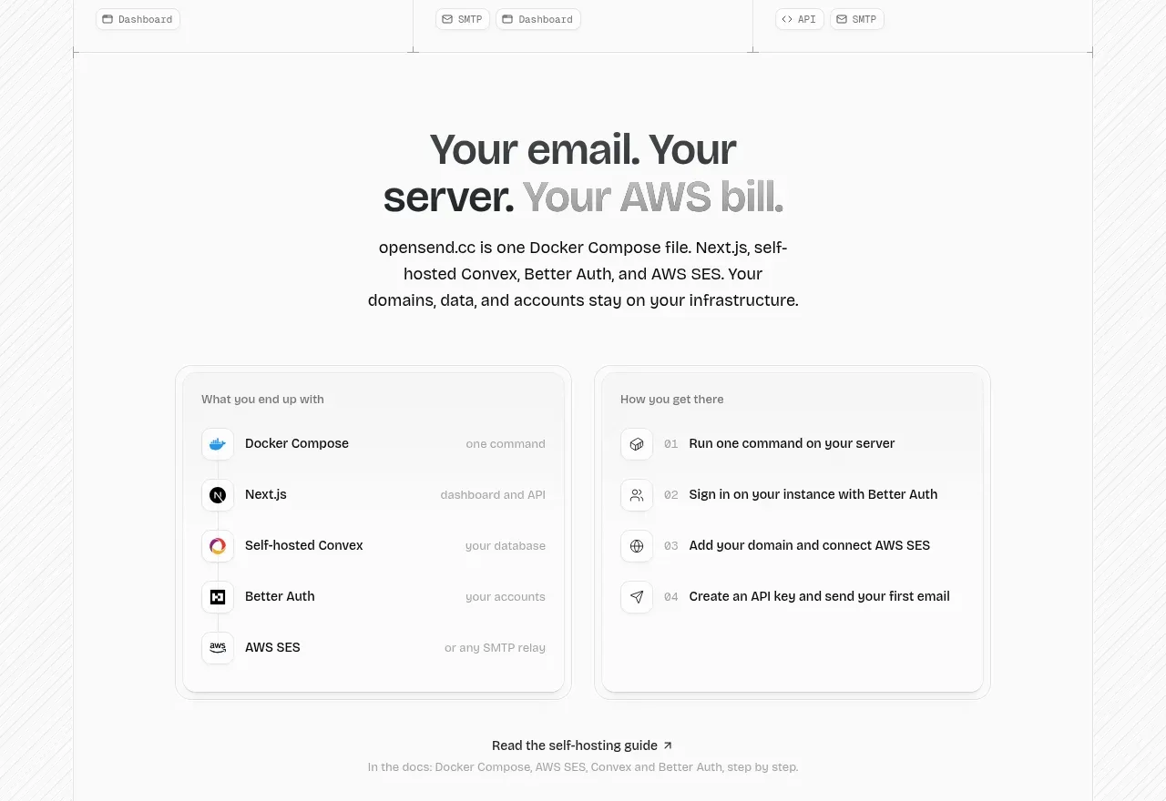
A centered proposition is followed by two large panels contrasting the resulting stack with a short, numbered setup path and a documentation link.
Prompt preview
## Reference images

Study these alongside the description below: hierarchy, rhythm, spacing, colour. Build for the product you are asked about, using this design language.

- Component: https://kage-design-assets.t3.tigrisfiles.io/components/opensend-cc/cb8c9d86-a0e5-47f8-893c-550f6137189a-1791180190-5.webp
- Full page it was cut from: https://kage-design-assets.t3.tigrisfiles.io/screenshots/opensend-cc/cb8c9d86-a0e5-47f8-893c-550f6137189a-1791180114349-full.webp
- Component on Kage: https://kage.design/component/opensend-feature-grid-3

## Before you start
Ask what the user's product replaces, what the resulting architecture includes, and what setup steps users must follow, then apply the principles below to that product.

Build a section with a centered headline and explanatory paragraph, followed by two equal-width bordered panels. The left panel lists the resulting components with a small label and right-aligned benefit notes; the right panel presents four numbered setup steps with compact icons. Use 1px light borders, 12px corner radius, soft layered shadows, 16–20px panel padding, 14px panel titles, and 12–13px detail text. Place a centered documentation text link beneath the panels. Maintain a calm grayscale palette with one subtle accent for status or numbering.

Never: use logos, product names, copy, illustrations, or imagery from the reference.
More components

 Three-step process cards
godaylight.com · Feature grid
Three-step process cards
godaylight.com · Feature grid

 Use-case selector with vertical video preview
Spira Maxima · Feature grid
Use-case selector with vertical video preview
Spira Maxima · Feature grid

 Goal-oriented product capabilities
FastRouter.ai · Feature grid
Goal-oriented product capabilities
FastRouter.ai · Feature grid
 Routing reliability and model collaboration
FastRouter.ai · Feature grid
Routing reliability and model collaboration
FastRouter.ai · Feature grid
 Insights and enterprise model access
FastRouter.ai · Feature grid
Insights and enterprise model access
FastRouter.ai · Feature grid
 Solutions by organizational role
FastRouter.ai · Feature grid
Solutions by organizational role
FastRouter.ai · Feature grid