 kage
kage
opensend.cc
Design analysis
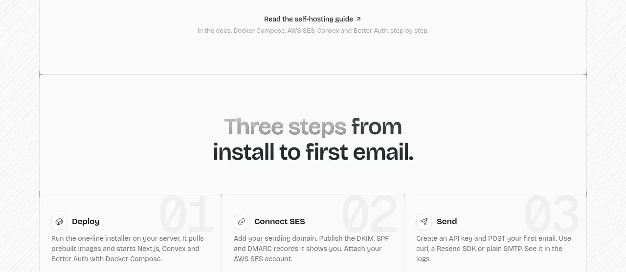
A short instructional section uses oversized step numerals behind three concise cards to make the path from installation to first result easy to scan.
Prompt preview
## Reference images

Study these alongside the description below: hierarchy, rhythm, spacing, colour. Build for the product you are asked about, using this design language.

- Component: https://kage-design-assets.t3.tigrisfiles.io/components/opensend-cc/cb8c9d86-a0e5-47f8-893c-550f6137189a-1791180191-6.webp
- Full page it was cut from: https://kage-design-assets.t3.tigrisfiles.io/screenshots/opensend-cc/cb8c9d86-a0e5-47f8-893c-550f6137189a-1791180114349-full.webp
- Component on Kage: https://kage.design/component/opensend-feature-grid-4

## Before you start
Ask what the user's product's shortest successful onboarding path is, then apply the principles below to that product.

Build a three-step horizontal onboarding section. Center a two-line heading above three equal cards. Each card should show a very large, low-contrast step numeral in the background, then an icon, concise title, and two-to-three-line explanation in the foreground. Divide cards with subtle vertical rules, use 18px padding, 14px semibold titles, 12–13px body text, and an airy white canvas. On mobile, stack the cards while keeping numerals visually subordinate.

Never: use logos, product names, copy, illustrations, or imagery from the reference.
More components

 Three-step process cards
godaylight.com · Feature grid
Three-step process cards
godaylight.com · Feature grid

 Use-case selector with vertical video preview
Spira Maxima · Feature grid
Use-case selector with vertical video preview
Spira Maxima · Feature grid

 Goal-oriented product capabilities
FastRouter.ai · Feature grid
Goal-oriented product capabilities
FastRouter.ai · Feature grid
 Routing reliability and model collaboration
FastRouter.ai · Feature grid
Routing reliability and model collaboration
FastRouter.ai · Feature grid
 Insights and enterprise model access
FastRouter.ai · Feature grid
Insights and enterprise model access
FastRouter.ai · Feature grid
 Solutions by organizational role
FastRouter.ai · Feature grid
Solutions by organizational role
FastRouter.ai · Feature grid