 kage
kage
opensend.cc
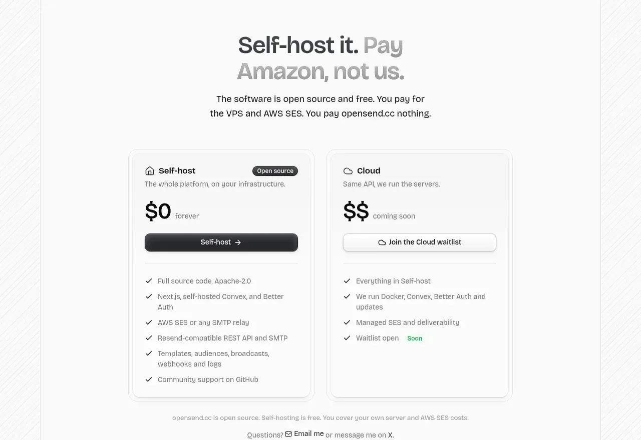
Design analysis
A two-card pricing comparison makes the free self-hosted option prominent while clearly labeling the future cloud option and listing included capabilities.
Prompt preview
## Reference images

Study these alongside the description below: hierarchy, rhythm, spacing, colour. Build for the product you are asked about, using this design language.

- Component: https://kage-design-assets.t3.tigrisfiles.io/components/opensend-cc/cb8c9d86-a0e5-47f8-893c-550f6137189a-1791180192-10.webp
- Full page it was cut from: https://kage-design-assets.t3.tigrisfiles.io/screenshots/opensend-cc/cb8c9d86-a0e5-47f8-893c-550f6137189a-1791180114349-full.webp
- Component on Kage: https://kage.design/component/opensend-pricing-table

## Before you start
Ask what plans the user's product offers, how pricing should be framed, and which capabilities differentiate them, then apply the principles below to that product.

Build a two-column pricing comparison beneath a centered headline and explanatory paragraph. Give each plan a compact title row, status badge, short description, large price treatment, primary button, divider, and checklist of included features. Make the recommended or available plan dark-button dominant while keeping the secondary plan outlined and clearly marked as forthcoming if relevant. Use white cards, 1px borders (#dfdfdf), 12px radius, soft shadows, 24px padding, 14px headings, 12–13px feature text, and a small muted footnote below.

Never: use logos, product names, copy, illustrations, or imagery from the reference.
More components
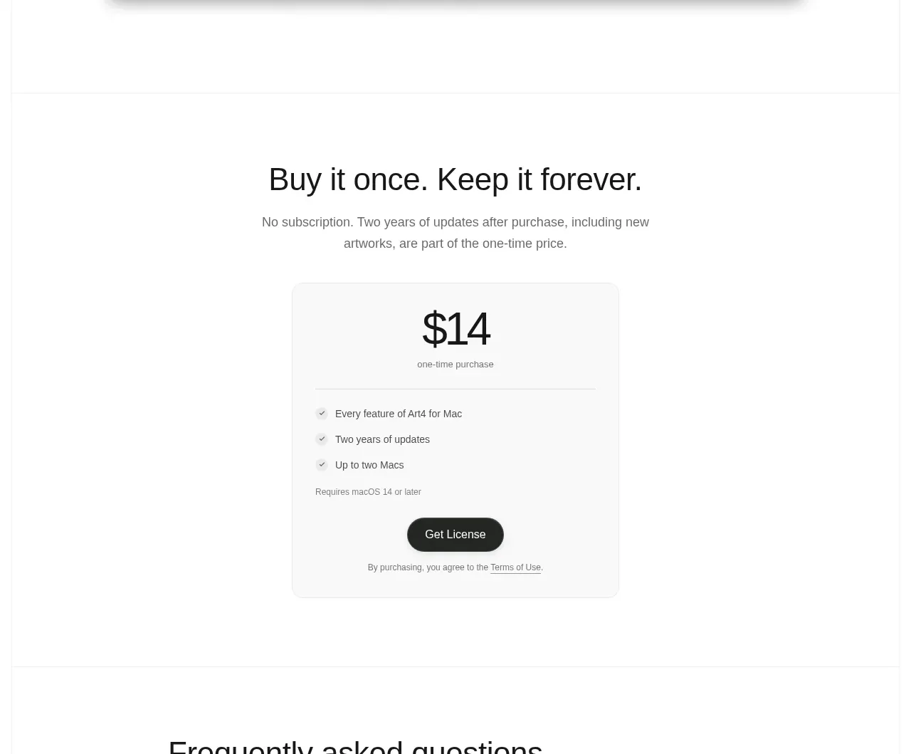
 Single purchase pricing card
Art4 · Pricing table
Single purchase pricing card
Art4 · Pricing table
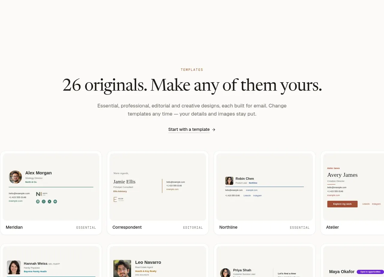
 Two-tier pricing table
esigna · Pricing table
Two-tier pricing table
esigna · Pricing table
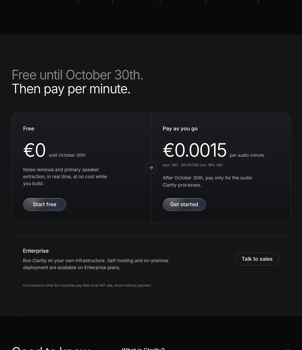
 Usage-based pricing
Clarity · Pricing table
Usage-based pricing
Clarity · Pricing table
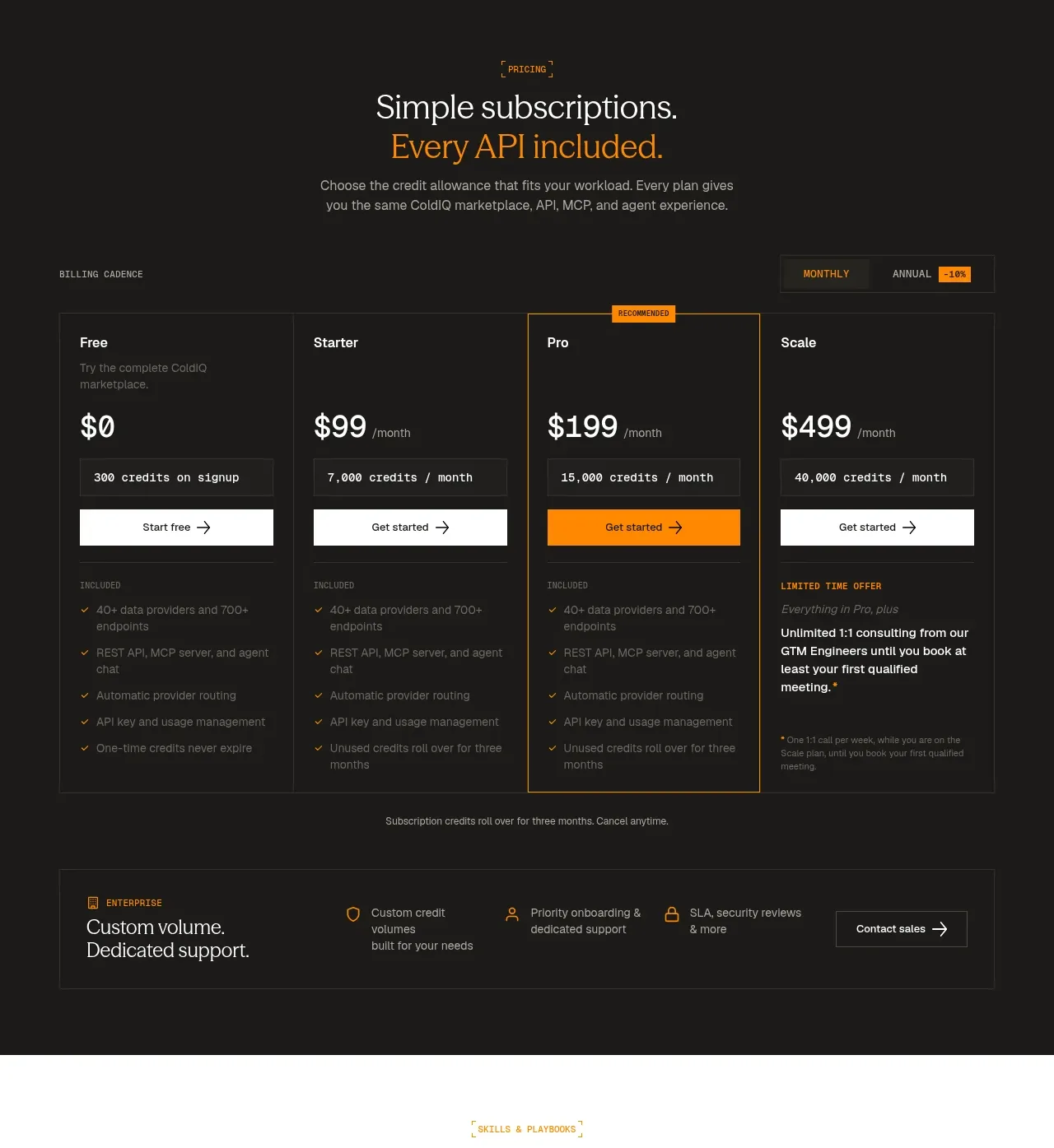
 Four-tier subscription pricing
ColdIQ x Slack · Pricing table
Four-tier subscription pricing
ColdIQ x Slack · Pricing table
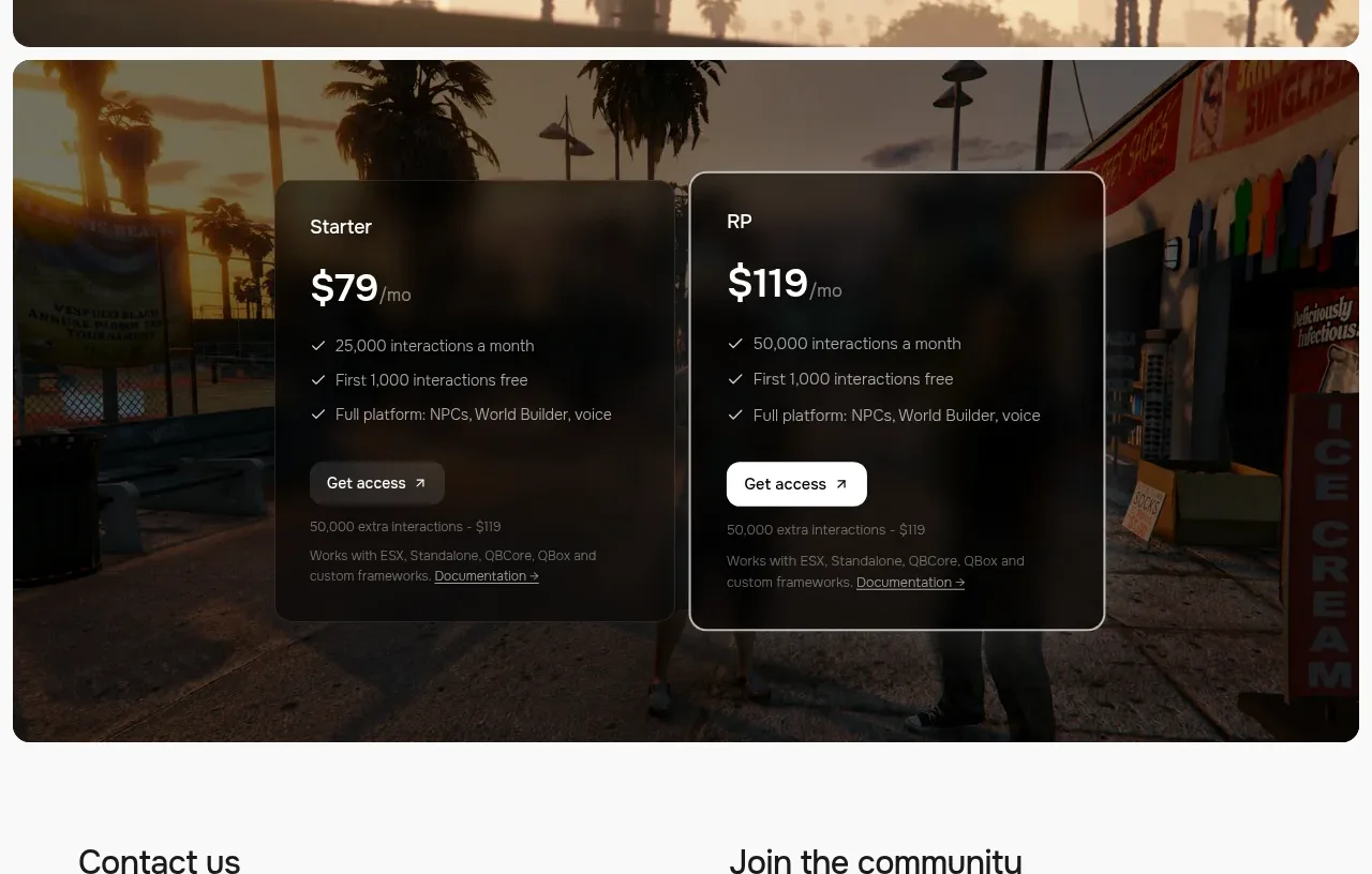
 Two-plan access pricing
Humalike x GTA RP · Pricing table
Two-plan access pricing
Humalike x GTA RP · Pricing table
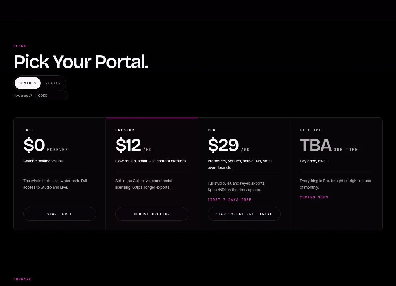
 Four-tier pricing selector
FRCTL · Pricing table
Four-tier pricing selector
FRCTL · Pricing table