 kage
kage
opensend.cc
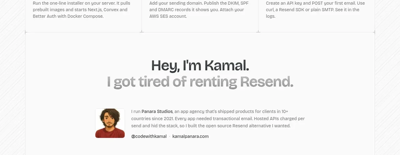
Design analysis
A personal founder statement adds emotional credibility through a portrait, compact biography, and social links rather than a conventional quote carousel.
Prompt preview
## Reference images

Study these alongside the description below: hierarchy, rhythm, spacing, colour. Build for the product you are asked about, using this design language.

- Component: https://kage-design-assets.t3.tigrisfiles.io/components/opensend-cc/cb8c9d86-a0e5-47f8-893c-550f6137189a-1791180191-7.webp
- Full page it was cut from: https://kage-design-assets.t3.tigrisfiles.io/screenshots/opensend-cc/cb8c9d86-a0e5-47f8-893c-550f6137189a-1791180114349-full.webp
- Component on Kage: https://kage.design/component/opensend-testimonials

## Before you start
Ask who should provide credibility for the user's product and what authentic origin story can be shared, then apply the principles below to that product.

Build a single centered founder-story band with a two-line heading, where the second line is lighter gray. Below it, align a small rounded portrait or avatar beside a short first-person biography and two understated profile links. Use ample whitespace, a thin top or bottom divider, 16px body text, 12–13px metadata, and a restrained neutral palette. Keep the composition editorial and human, not like a testimonial carousel; on mobile stack the portrait above the text.

Never: use logos, product names, copy, illustrations, or imagery from the reference.
More components
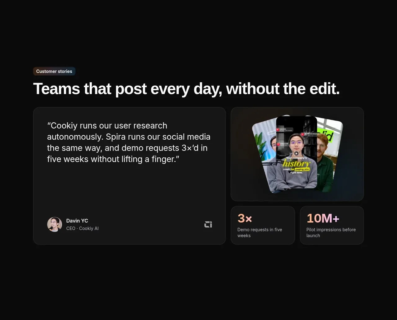
 Customer story and proof points
Spira Maxima · Testimonials
Customer story and proof points
Spira Maxima · Testimonials
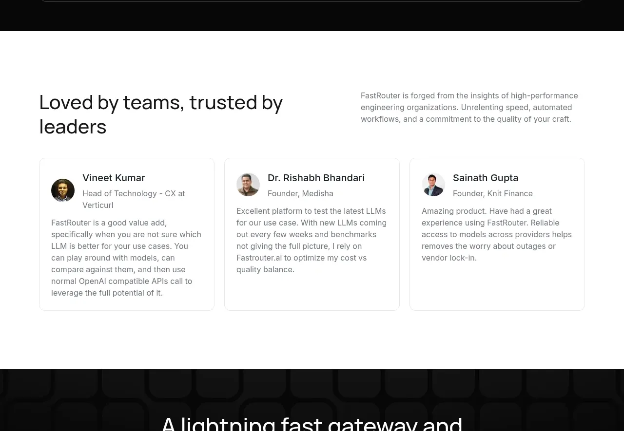
 Customer testimonial cards
FastRouter.ai · Testimonials
Customer testimonial cards
FastRouter.ai · Testimonials
P
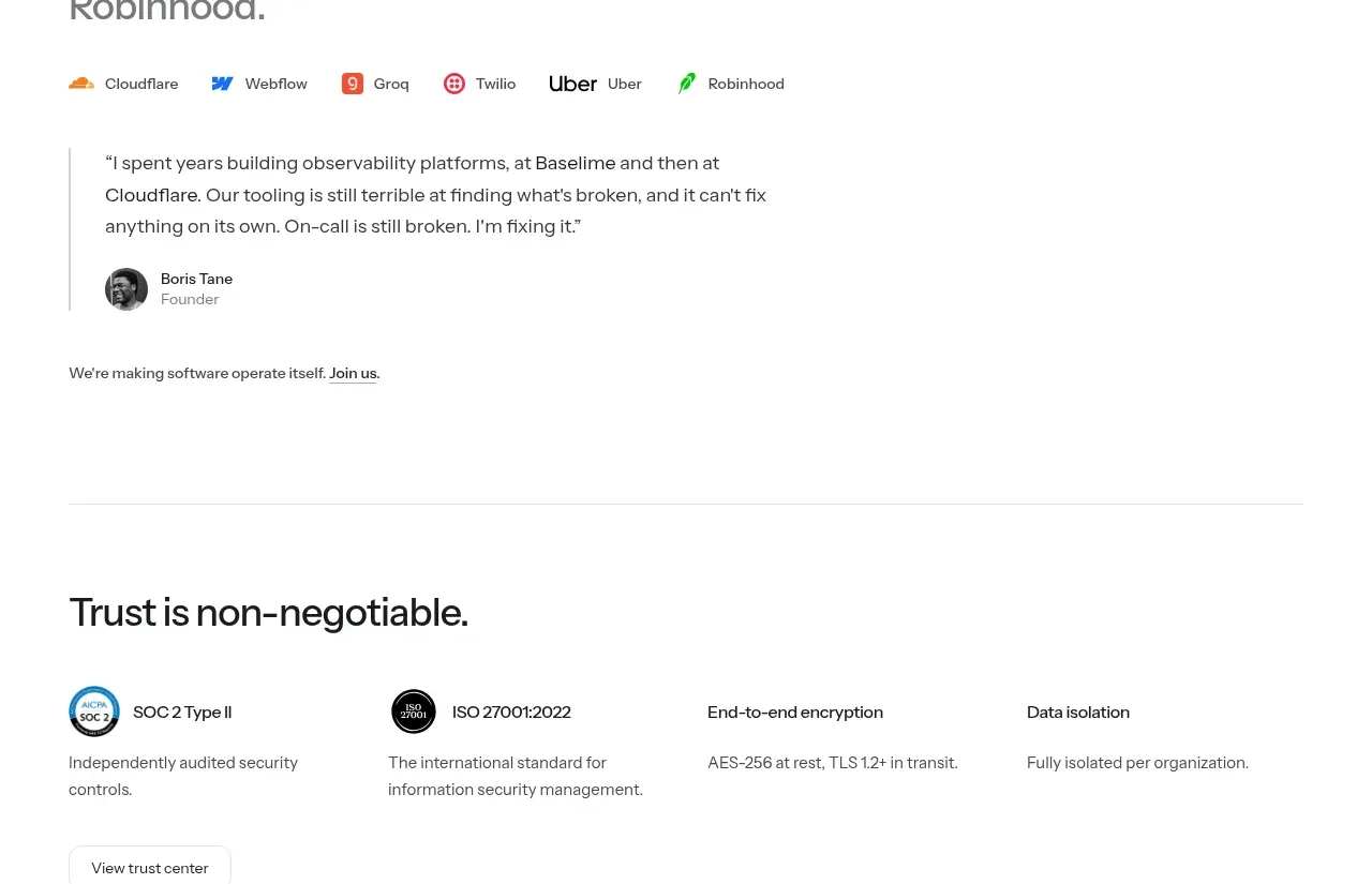
Founder testimonial
Polylane · Testimonials
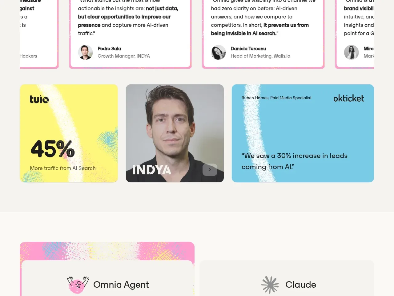
 Customer proof and outcomes
Omnia Agent · Testimonials
Customer proof and outcomes
Omnia Agent · Testimonials
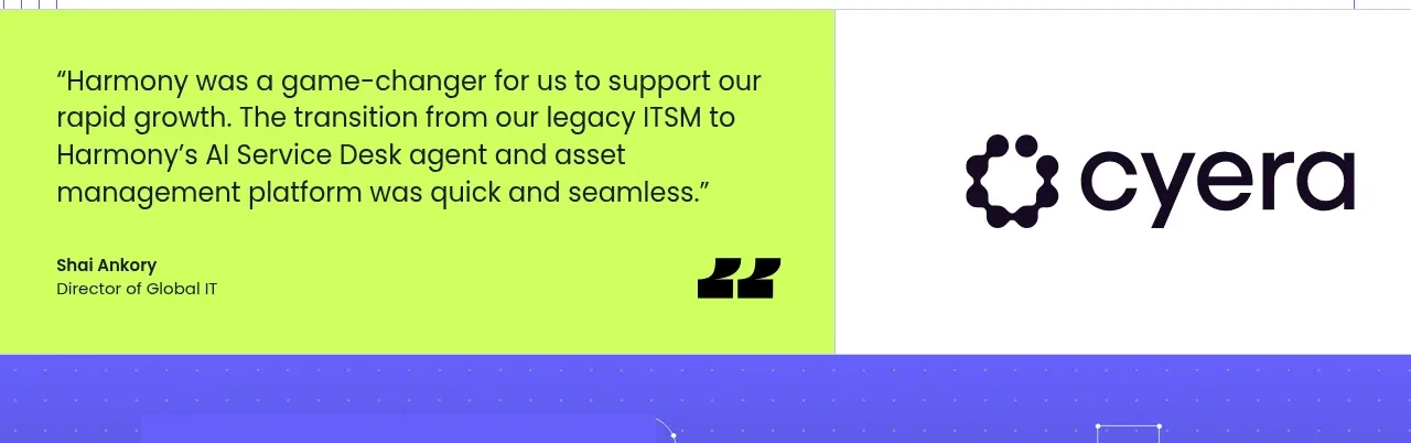
 Customer proof statement
Harmony · Testimonials
Customer proof statement
Harmony · Testimonials
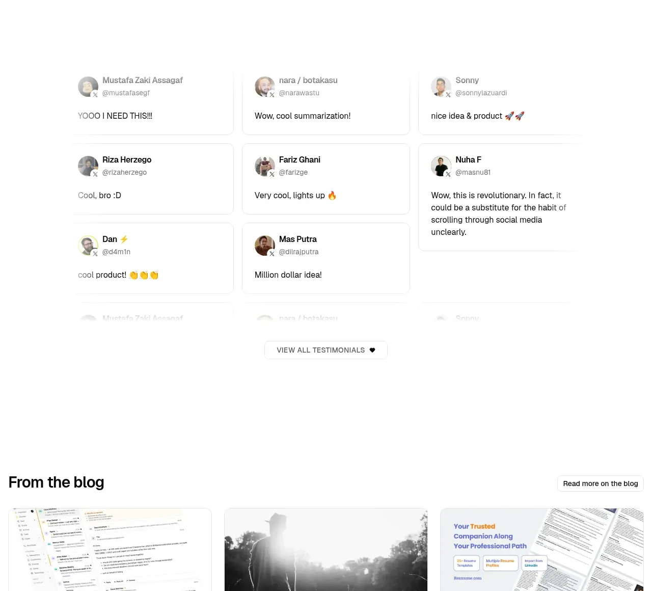
 Community testimonials
LaterOn v2: The agentic email plaftform · Testimonials
Community testimonials
LaterOn v2: The agentic email plaftform · Testimonials